
I decided to look at some typefaces to use for my postcard design for my History of type postcard as I would like it to fit the Manuscript theme although I am designing the drop cap in the more modern style. I have looked for a Medieval type of typeface to match this look.


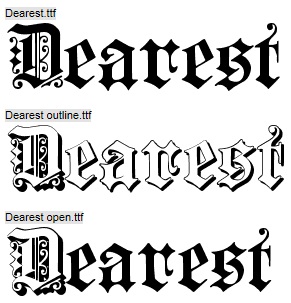
After looking at the fonts and deciding that I am choosing the letter ‘d’ describing drop cap, I have decided on the font ‘Dearest’ as I feel that it is the most manuscript looking. However I am going to alter the letter and remove the patterns that’s are on the letter as I would like to personalise it to my own drop cap look. I will be removing the swirls on the inside of the letter and on the left side, including the swirl that’s separated from the letter at the bottom. I feel like this Medieval look captures the Manuscript look from the book of Kells and History of Type itself.
