
I have started to play around with different designs after drawing up my initial ideas and chosen and have decided to look at some different ways to make the type more appealing to others.
Here i have been looking at how to join the typeface to make the letters flow within the postcard. I have tried to join the serifs using different angles which was inspired by the piece by Daniel Zalewski, after doing this I decided to look at how i can play around with making the typeface a bit more exciting and eye catching.

I tried repeating the word Clarendon for recognition of the typeface using a positive and negative effect as I liked the way the black type on a white background created such a bold effect which again describes the typeface in itself. Although doing this was a good experiment it was too jumbled and busy and distracts the audience with where to look and blends more into the background which didn’t work at all so i decided to try something a bit different.

Here I looked at doing something a bit more subtle but still using the positive against negative effect I got my inspiration from the design by Kevin Gorisnic I looked at before. I felt like this worked well although there was still something missing.
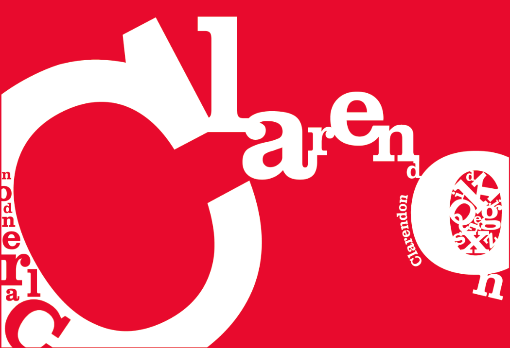
I then decided to add some finishing details. I used the Clarendon font using different sizes and caps/lowercase letters to give the ‘o’ an interesting touch which I was inspired from the design HannahTDesign that I had looked at when looking for something to make the design more interesting to the audience. I also used a curvature in the word clarendon to give the ‘o’ more shape emphasizing the curve giving more movement to the letters. After adding the smaller touches I also decided I needed a change of colour which was inspired by the colourful vintage designs I looked at, so I decided to play around looking at a bright colour which I then decided that bright and playful wasn’t the fonts personality so I decided that I would need to change it.


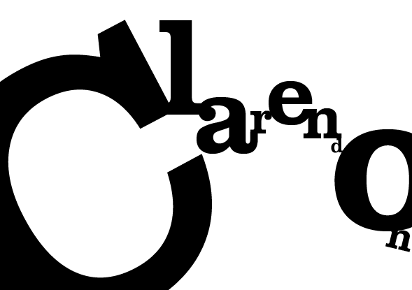
Here is my final outcome. I decided that black and white was the most effective as I believe it describes the personality of the font with it being quite bold for it as a headline font, but with the difference in sizes of the letters shows that the font can also be effective in smaller sizes as well as big.
