Evaluation.

Evaluation of my final book cover.

IMG_3154IMG_3150IMG_3148

My finished book cover, back and spine I feel fits the brief and very eye catching to the audience. I think that the imagery I have created describes motivation and more specifically motivational thinking, I feel like the imagery catches the audiences eye to attract them to the book. I feel the imagery created and colours used are very classic and are all there for a reason which makes them work they are attracting the correct audience I am aiming at and the imagery is intriguing making the audience want to read further. I feel like the direction which the silhouette face is looking attracts the audience inside the book as well as the imagery on the back also facing inwards to the book. I think the fonts used work very well together and are appropriate for the book I have been designing for. The colour scheme used I think works well as I went with the meaning of the colours to make sure the colours portrayed the correct signifier from the signified. However I do feel as if the imagery created could be a polysemic image as the imagery is not obvious to motivation although with the motivation title I feel it is obvious what I am trying to signify. I feel that the spine works well in catching the audiences attention especially with the white lines. However I do feel the authors name could have been more prominent although due to print quality I feel that was the issue there.

If I could change anything about this piece it would be to maybe have tried out a few different colours to see what type  of effect that could have made. I would have also played around with the imagery of the light bulb maybe adding items relating to the subculture coming out of the burst of light I have created to give more of an obvious meaning to the imagery. If I was to produce this in industry I would like the front cover to be printed on Card Stock for a more professional, glossy finish.

After looking at the piece overall I feel like although It could be improved it does fit the brief well.


Step By Step.

 Here is my step by step of creating my final imagery, book cover, spine and back cover.

dimensions: width 110mm, spine 18mm, height 180mm

Screen Shot 2014-12-10 at 11.09.14

I began with scanning in my sketch of the light bulb and silhouette of the head. I inverted the colours of the sketched light bulb so I could place the bulb in the head. After inverting the light bulb I brought the silhouette of the head in and traced the head in Photoshop before placing the light bulb in the head portraying ‘motivational thinking’. I then thought back to my research on colours and decided to try a green to signify ‘dependable, and steady’ as well as ‘power’ as I felt after reading the blurb and researching that these were traits of motivational people and makes the audience feel that this motivational book can help the reader become motivated and steady gaining power by reading this book.

Screen Shot 2014-12-10 at 11.15.24

After using this lighter shade of green I thought it was too bright and needed something to make it eye catching but work well with the imagery. I decided to go for a darker shade of green as in my colour chart it told me that ‘Deeper greens signify money, prestige, and power’. Which from my research attracts people to motivate themselves, I felt this was the most appropriate colour and worked better in a darker tone with the imagery.

Screen Shot 2014-12-10 at 11.16.15

After finalizing my imagery I started with my layout choice. I decided to use the traditional penguin layout the Marber Grid but in my own style. Using this grid will make my book cover proportionally correct.

Screen Shot 2014-12-10 at 10.55.02

Using the ruler I added guide lines to create a similar style. For the main title of motivation I used Times New Roman as when researching fonts for book covers I found that using a mix of a serif and sans serif works well and I found out what fonts work well together. It was a more classic typeface and worked well as the title so I decided to stick with this font however the font Helvetica which I originally used for the authors name personally did not fit so I decided to look at other fonts that would fit with my title font.

Screen Shot 2014-12-10 at 12.10.26

I then added the penguin logo. I decided to stick with the classic logo as I wanted to keep the book professional and serious and would appeal more to the target audience of adults which I am aiming for as well as with my imagery. However I decided to remove the orange colour and change it to white to keep within my colour scheme.

penguin logo

When looking at other typefaces I decided to choose TW Century for the authors name as this worked better with the title than the other font. I decided to use the same font as the title for the blurb as it worked well with the theme of the book and looked better than the TW Century when I tested it out. I also began creating the spine and decided to put it in the same direction as other spines I have seen as this worked well in the existing book I have looked at and was the most common direction of spine text. I felt this worked well and used a smaller point size of text to keep the eye original on the front page however I still wanted to keep the font large to attract the reader from a distance when the book is on a shelf.

Screen Shot 2014-12-10 at 12.34.53

When looking at the piece I decided it needed something to break up the text from the imagery and added 5 point lines along the layout guides on the front and spine which I thought was appropriate in separating the text and worked well visually. However when I looked at the penguin logos I felt that they were disproportionate to the design so I decided to move them to the bottom of the pages/spine using guides to assure they were level.

barcode

Screen Shot 2014-12-12 at 09.25.49

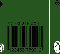
I then decided to add a barcode using penguin 2014 above in the font TW Cen. Using the ‘multiply’ tool I got rid of the white background to keep with the page but not stand out too much as this isn’t an important graphic until the book is brought. I placed it in the bottom left hand corner using my guides to give it a bleed from the spine so it would be easily picked up when brought.

Screen Shot 2014-12-10 at 12.37.25

IMG_3148

When looking at my design I felt the head needed to face the spine for a better composition. I also added the imagery on the front to the back of the book smaller in size also facing towards the spine to create an even composition that works well on the book attracting the reader inside the book. I also added the penguin logo aligned with the others but in a slightly smaller size fitting next to the barcode.

IMG_3153

When printing the piece I noticed the title was too close to the edge and needed more of a bleed so I made the title slightly smaller and moved it central with more of a bleed along the side this looked much better when printed. Above is the final product which I was happy with.

Sketches of Ideas.

To begin I sketched ideas i go from reading the blurb and picking out words doing searches for them. When I searched ‘motivation’ it came up with the images below which caught my eye for an idea.

head Screen Shot 2014-12-10 at 10.10.05

This is what I came up with. I decided the lightbulb would be a good idea as it will show ‘motivational thinking’ which describes the book in itself. I brought it on further by making it more visually appealing and less simplistic by adding dots as light.

IMG_3138

IMG_3139

I then saw the image of the head sillhouette which I drew and thought would work well with the lightbulb in the head making it more obvious the message I was putting across. I believe the title and the imagery will work well together showing motivational thinking.

IMG_3140

After looking at this I decided to look further into what motivates people and money came up a lot when searching this. I saw the relation of the image I had drawn to the queens head on the coin, which I decided to try to put these together to make an interesting piece that could be looked into.

Screen Shot 2014-12-10 at 10.21.44

IMG_3142

This is what I came up with. Although it is an interesting idea I think this is very much a polysemic image but not by intention and possibly not in a good way. I do not want people to think that I am trying to say money is the only motivation and only money can motivate you as that is not the case. And is not appropriate for the book. I think I am going to play around with the lightbulb and the head and see what I can create as these are more appropriate to the book.

Font Research.

When you read a book, what is the first thing you notice? Not the font unless you are a real type fanatic, or it is just simply awful. If the font choice immediately jumped out at you and said “look at me” then it was probably the wrong font for that book. Whilst researching I found the best fonts for books are:

Serif:

  • Baskerville
  • Bodoni
  • Caslon
  • Century
  • Garamond
  • Times New Roman

These fonts are designed to be easily readable and legible as body text — a neutral font which would work well as a book title. When looking at these fonts I decided to choose Times because of its legibility and it being neutral.

Sans Serif:

  • TW Century
  • Optima
  • Myriad
  • Helvetica
  • Univers

I initially decided on Helvetica however when seeing the fonts together on the design it just didn’t match so I decided to use TW Cen as this worked well with Times on the book.

Type in Non-Fiction Books through the years.

I have decided to look how type has been handled in books for roughly the past 50 years. I am going to be looking how type has or has not changed in non-fiction books through the years. Researching what works and has been improved throughout the years.

1950s book

1972

1960s

1980

1980s

1995

best-selling-non-fiction-of-the-1990-s

2000

 blood-will-out

2014

When looking at these books it shows how the typefaces have changed on non fiction books. There is a mix of serifs, sans serifs, thick and thin typefaces. The colours used I found were less bold at the beginning including the typefaces and became much more bold but with a more simple design and colour scheme. I will be taking this into consideration for my design and possibly looking into this further.

The Penguin Logo and Books.

As I am doing a Penguin book I have decided to look into the logo, where it is placed and what the existing books look like. I feel that this will help me design in an acceptable Penguin style to fit in the category.

penguin-logo

This is the penguin logo that I will be using in my design. I have been looking at different penguin books to see where the logo is usually placed and the sizing of the logo when it is placed on the book. I have also decided to look at the layouts of the penguin books to incorporate my style with it.

penguins

 spinesp

penguin

106218403_penguin_338755c

back cover

Marber_grid

After looking at existing penguin books and there chosen layout I have found the classic ‘Marber Grid‘, created in 1961 by Romek Marber to decide upon the composition and placement of elements of the book. This is a simple layout yet effective I have decided that I will use a similar design layout to this here.

‘Marber intricately analysed what was needed from the layout and designed his grid based on his observations. He was careful to consider that the mystery and crime series style had remained practically unchanged since Edward Young’s typographic designs were first adopted 25 years prior.

As the crime series was one of Penguin’s most popular and recognisable series, he decided to keep the familiar green hue of the covers, but chose a ‘fresher’ shade.

By collating the typographic information and the colophon together within the top third of the page, he allowed for over two thirds of the cover to be used by the illustration, effectively giving the cover artwork the space needed to capture a browser’s attention and sell the book.

Facetti was so inspired by Marber’s design that he also used it for Penguin’s fiction range, and would later apply it again, practically unchanged, to the blue Pelican books. Eventually Marber’s layout became the standard layout for the entire range of Penguin paperbacks.’

http://thebookdesignblog.com/book-design-articles/history-marber-grid – Information extracted from.

The penguin book that I will be using for size is : width 110mm spine 18mm, height 180mm

Existing Blurb and Spines.

I decided to look at the back covers of book and the spines to look at the layout. I saw that in almost every book the bar code is placed on the bottom right. The blurbs are in a slightly different layout depending on imagery etc. Here are a few books I looked at.

BookBackandspine

Here on this book the spine goes down the book like the majority of books it is easily read and works well. The layout of the back of the book is very simple and looks similar to the Fibonacci sequence. The colours used work well with the theme of the book and is very legible. The font used is a simple san serif quite small however works well for the blurb.

bookcoverbackandspine

Again here the spine is written in a similar style, however some of the text is written upright rather than going down the spine, this works well and breaks up the information being give down the spine. The font used is a sans serif which suits the design of the book and what the book is about. The theme yellow, white and black is continued onto the back of the book. I think this works well having a limited colour scheme and slight imagery on the back design. This simplicity makes the reader focus more on what the blurb is saying rather than being distracted from the design itself.

Empowering-Women-Final-Back

In this design the information on the spine is directed down the book; the font used is similar to a Times New Roman typeface which is easily legible and is a classic professional look describing the book. The colours used in this book also describes the book well making the woman look cool and sophisticated the colour scheme goes through to the back. I think this works well having a limited colour scheme and lines separating text to make it easier to read. This simplicity of colour and font makes the reader focus on the blurb.

From looking at existing back covers and spines of books I now know what type of layout works well and how to separate information if needed. I also am going to take into consideration the direction of text down the spine and where the bar code is usually placed.

Target Audience.

Target Audience

Who is my target audience… Well my book will be aimed mainly at adults. The book I would like to keep professional and classic, with a slightly old style feel as that is what the penguin books portray.

I will need to be considering, process/visual communications and make sure that it appeals to my target audience. I will need to try to prevent negative signifiers that could prevent the book from being successful.

Existing Motivational Covers.

I decided to look at existing motivational book covers and analyse each one to see what works and what doesn’t. I feel that doing this will make my book cover successful and fit the brief and describe motivation in the best way.

terrible

When looking at this piece I decided that it was very simple and the fonts used are very in your face. I feel like the large font would catch you eye but the details are not refined. I feel the colours use are not appropriate after looking at moods of colours I feel that colours clash and do not create any meaning within the piece other than to just jump out at you. I feel that the font used is appropriate, however there are many different fonts that are more pleasing to the eye to attract the audience in the same way they are trying to initially.

untitled

When looking at this piece I decided that the font used is appropriate as the serif typeface relates to a professional environment. however the layout of this book cover design is to me not proportioned correctly. The book is slanted in a way which to me make its slightly illegible that its a book. I think the colours used are nicely faded however is too dark and dull. I like the tones and texture of the background however being a classroom motivational book I feel it is not attracting their target audience I need to be more bright and light rather than so dark.

story

When looking at this cover I think the gradient in the title is not eye-catching and for me although it relates to the colour use in the imagery it almost blends in to much. it is not bold enough. I feel as if the imagery tells a story and describes motivation very well it is very appropriate to the message the book is trying to get across to the audience. The authors name however on the bottom of the page doesn’t work well with the change of opacity on the back box it keeps the imagery well however the font used is far too thin and looses legibility.

chicken

This is a cover i found in particular that I think works well. I feel the the font used could have been slightly thicker on the title however its still works nicely. I think the imagery in this piece is the most important part of the cover as it creates a story and to me is a polysemic image but in a good way, it almost asks the audience a question in a way that the readers could answer differently for example. Why did the chicken cross the road? or Motivation… is it a risk? This works well and gets the audience thinking and would attract them to read the book.

After looking at these existing book covers it has given me inspiration of what I could incorporate into my book cover and also what NOT to do.