
Aims – To create an object, space or system that is an experience for a young child using design.
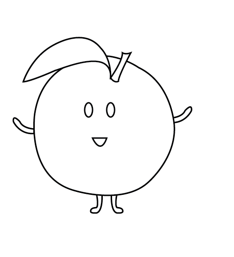
– To make the design educational as well as enjoyable for the child.
– To make sure the design will appeal to parents buying the experience for their children as well as the children themselves.
Production Plan :
Part 1 – 1 board of exhibition response and analysis – dissect the effect it might have on the user.
Part 2 – 1 board of research – defining the user and the circumstances for intention, not the intervention itself – Identify and investigate a potential user, and how you want them to feel about themselves.
Part 3 – 1 board for development, and a second for the design solution, plus a written statement of 500 words (Design, development and solution).
Contingency Planning: My plan is that if my design doesn’t work I will either go back to my initial ideas and choose another however I will be constantly be reviewing my work with different stages of research to make sure the design I wish to pursue will work.
Research Methods:
Internet Sources – Research of existing products, collages and any other simple research.
Library Books/Nursery – Looking at existing children’s books and toys. Other necessary research .
The General Public and Peers – For surveys and opinions.
Learning Outcomes:
Specialist –
- Understanding of the needs and requirements of professional practice specialisms.
- Ability to articulate in various modes the implications of critical theories for design practices and visual culture in general.
- Effective visual communication through the medium of graphic design specialism.
- Critical research and analytical skills relevant to contemporary practice.
Generic –
- Independent study
- Critical thinking and analysis
- Learning through reflection
- Ability to abstract meaning from information
- Ability to work with complex material, analyze problems and identify appropriate solutions
How my work will be tested – I will be carrying out a survey to find out which of my designs will be most appropriate with peers and the general public.
Reflection – Look back on the learning outcomes and make sure it fits with them and everything is included.
Reaching my proposal.
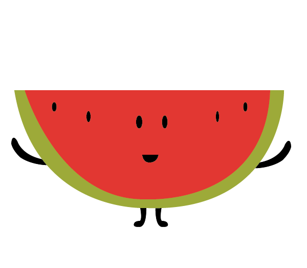
I believe I have reached my proposals aim. I feel that my design works very well in creating an experience for children.
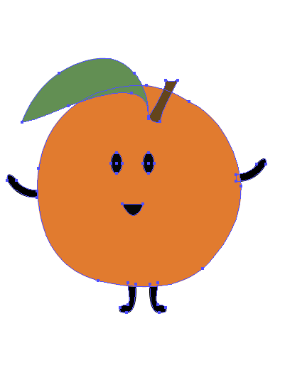
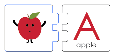
To reach my aims I carried out surveys to ensure that my idea will work and create a unique and exciting experience for young children. I carried out research on existing designs that were out there to ensure it would be suitable for children as well as an educational aspect to create the experience that I had planned in my proposal. I learnt how to reflect on my ideas and improve them to achieve the best design it could be developing them throughout using different typefaces including condensed and uncondensed typefaces criticizing my work throughout. I managed to identify the most appropriate solutions after analyzing the problem that I faced for example considering using letters with descenders etc. I feel like my final fits with my learning outcomes and would work well with the education of children as well as enjoyment.


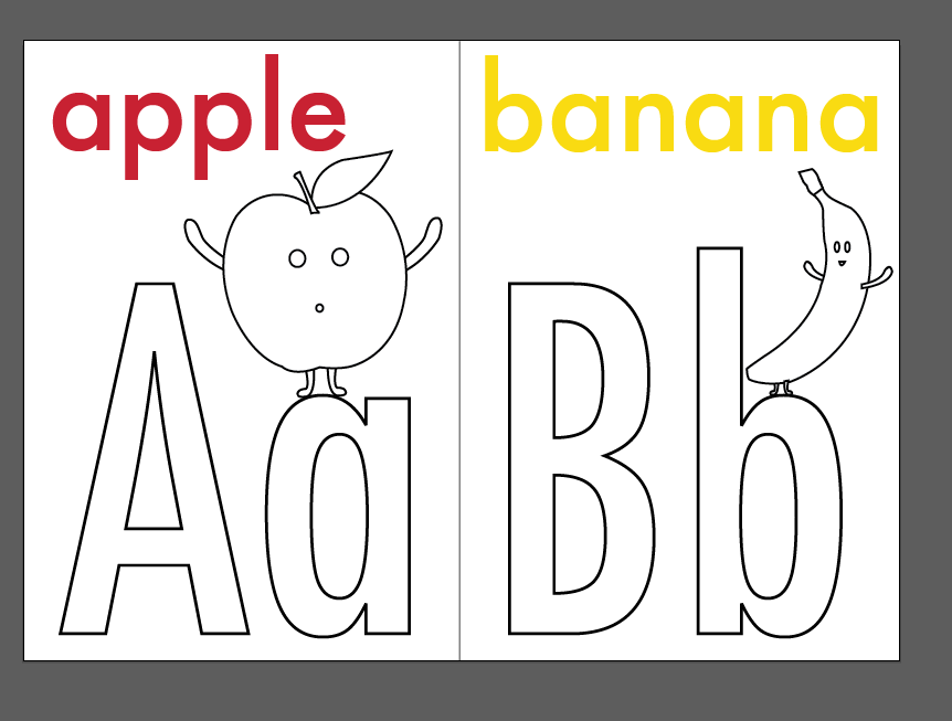
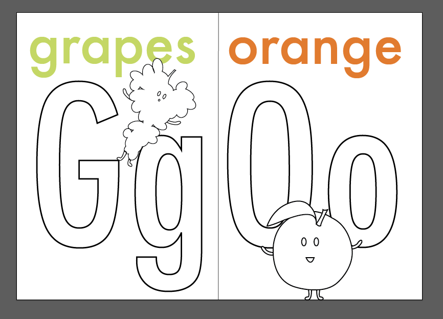


 I used Century Gothicas a typeface and found the layout of the lettering did not work when using my guides. The letters couldn’t be in the same point size as the typeface isn’t condensed. I realised this typeface did not work so I needed to look for a condensed typeface that is legible and suitable for children.
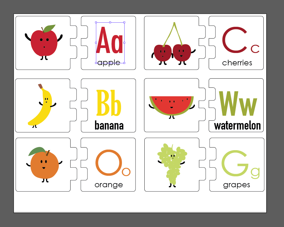


