

 I used Century Gothicas a typeface and found the layout of the lettering did not work when using my guides. The letters couldn’t be in the same point size as the typeface isn’t condensed. I realised this typeface did not work so I needed to look for a condensed typeface that is legible and suitable for children.
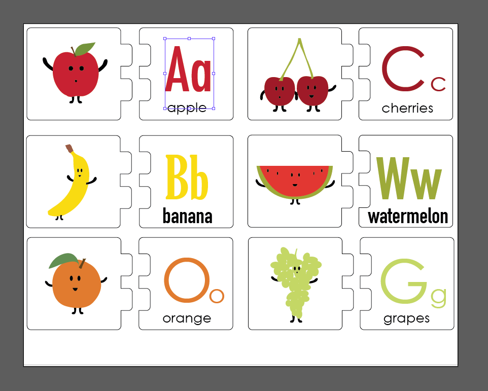 I tried out Gloucester MT Extra Condensed, Helvetica Condensed and Futura Medium Condensed. Withe Gloucester and Helvetica I found some letters were too mature for my age group, the difference of the two types of a etc. So I decided that the most suitable would be Futura Medium Condensed.

I found this typeface also worked well with lower and uppercase in the same point size. It made arranging and aligning my typography much easier using my guides.


Here is the puzzle final outcome.
