Here is my step by step of how I will be creating my double page spreads I have taken into consideration what I am trying to signify and with my photos and research I will be putting together my work to fit the brief I have been given.
Firstly I began with my grid I decided to work in millimetres as for me that was the best measurement to work in personally. I decided on a 9 column grid. 12mm bleed and 5mm margins. I decided on this grid asI found it would work well for a magazine and work well for a well balanced layout. Here are some of the steps I carried out.


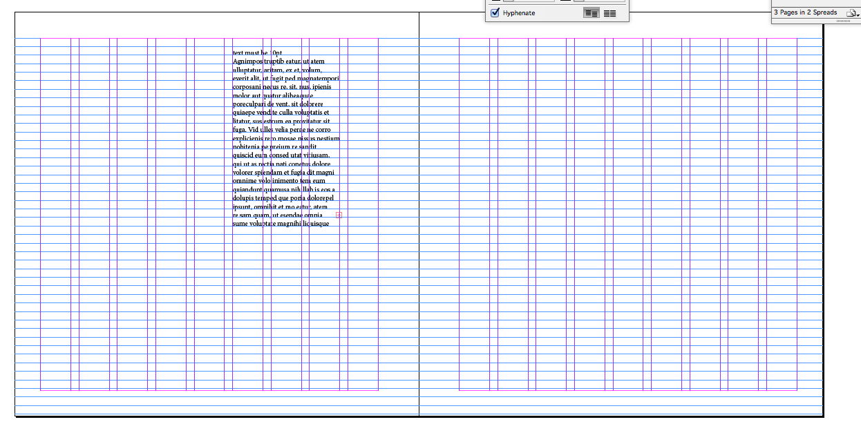
When creating my grid I decided to change the size of the inner margin to 12mm as the magazine is 200×200 I thought it would work better with my layout.
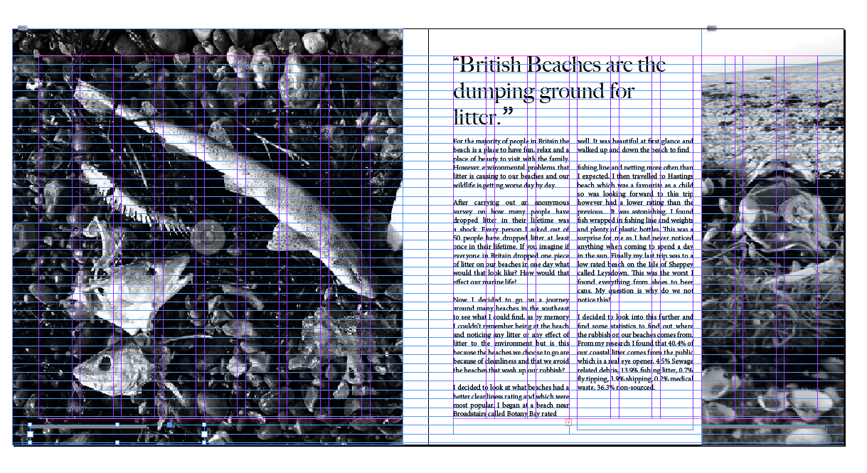
From my initial layout sketches I placed my images in cropping them to fit my grid. I found that on this piece the image of the beer can needed to be cropped to fit the layout of my text and header so I decided to change it a crop to size.
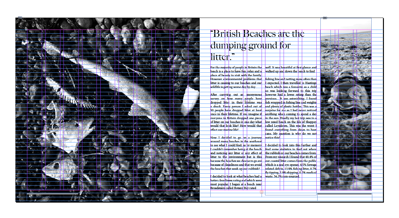
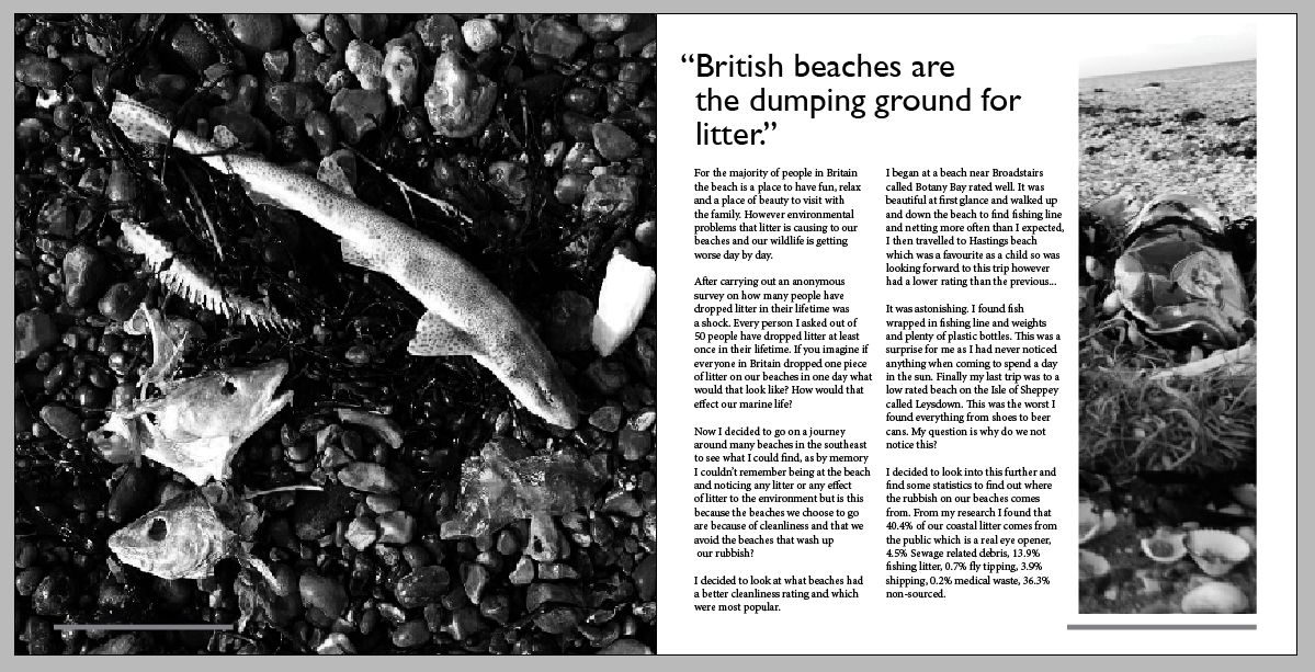
I found this worked well and I believed that it was well proportioned to the text and the imagery throughout. I decided to keep to the black and white theme to signify the dullness and who dirty beaches in Britain can be.
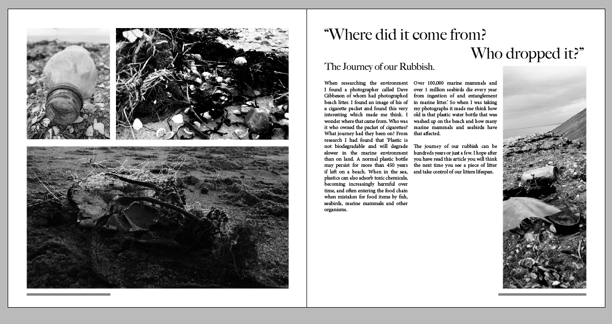
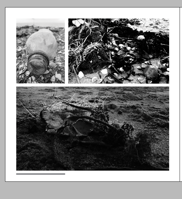
When I created my second double page spread I decided there was something missing. I played around with adding further imagery relating to the article I had written to make sure the signified and the signifier worked well together.
This worked well I kept gutter space in-between the images to make them balanced and lined them up with the text to ensure a consistent layout throughout. However I still thought there was something wrong. I looked at my choice of fonts for my header, sub header and paragraphs and realised I had used both serif typefaces. So I decided to research what typefaces work well together in and editorial and found that using a serif and sans serif typeface on the same page work well together as a contrasting font so I tried out typefaces and found Gill Sans instead of Big Carlson. This worked very well so I decided to use this consistently throughout my spreads.
After doing this I realised that I wanted my sub header to not be the main focus so to use a different style of Gill Sans which was the light version. This worked well at giving the subtitle the 2nd main focus of typography which was intended.
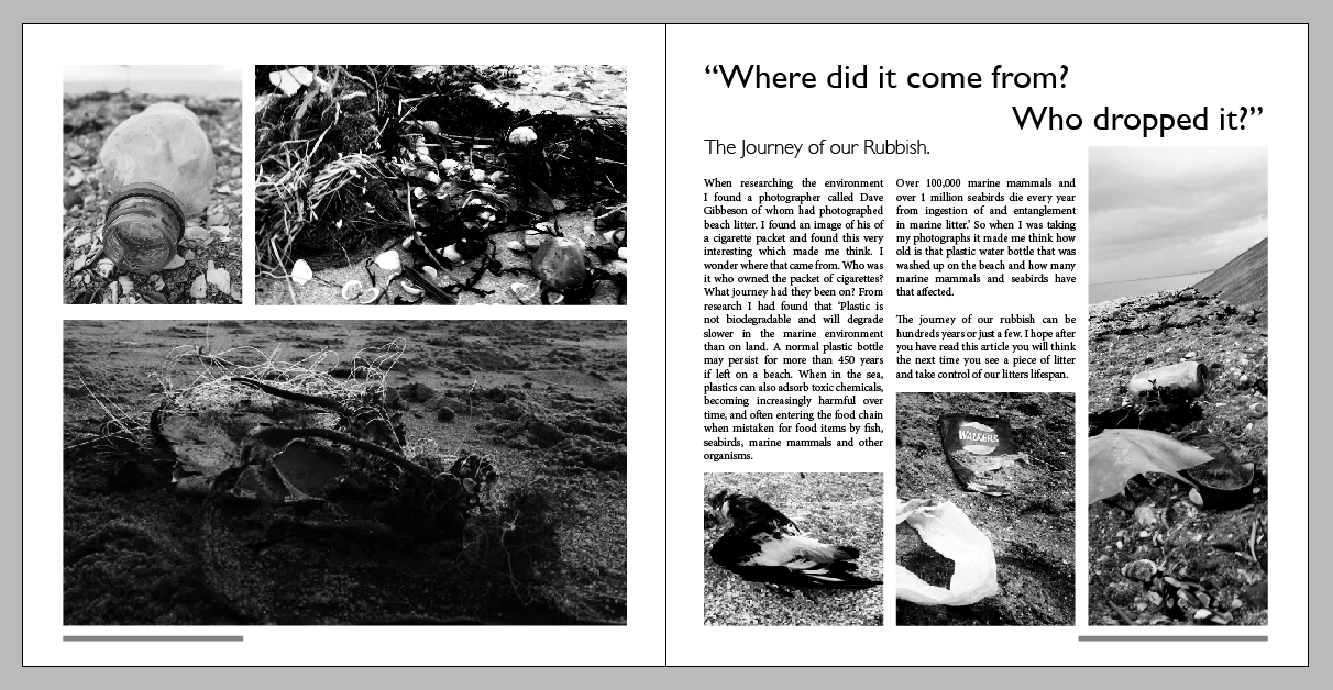
I then came to these outcomes. I decided to give some finishing touches by editing the titles and overhang the speech marks to give it more a magazine look. I also noticed a capital letter on beaches and changed that.
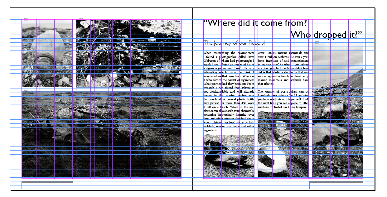
From this I noticed that in my text there was too much spacing throughout and was not proportionate this needed to change I also noticed the title of ‘British beaches’ the lettering wasn’t aligned correctly so from this I have decided to align my text to the left and also make sure the title was aligned properly as well as the over hang of the speech marks.

At this stage I then realised that there was a inconsistency with the spacing in-between the imagery (left side) so I need to make sure that is consistent.

Here our the final outcomes.