
Here is my step by step of creating my website.
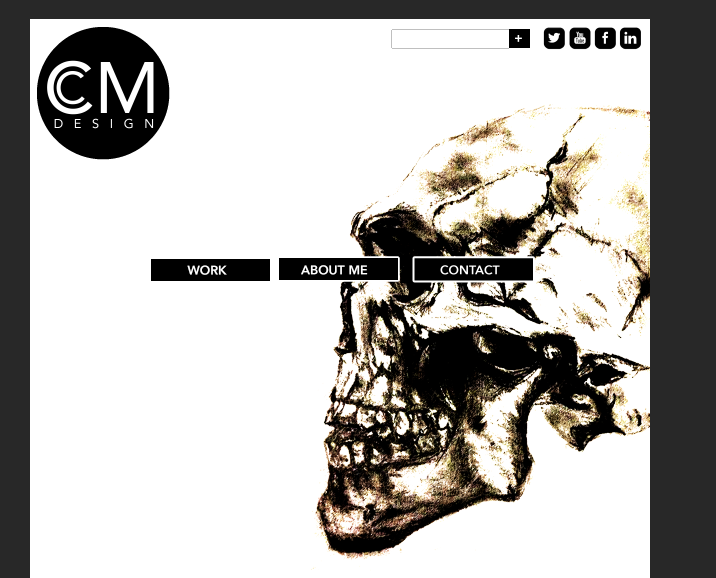
To begin I looked at my initial sketches and decided to try out on photoshop putting my work together to then create an idea of what I would like my website to look like. My main inspiration for this was the Sagmeister&Walsh website so I decided to put the buttons in the middle of the page and keep my logo and colour scheme simple.
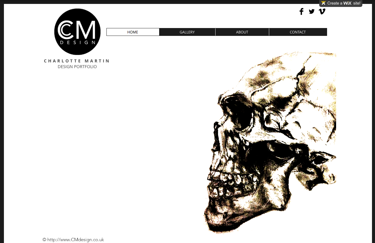
From creating my initial layout on Photoshop I decided to then design my website on Wix and began with a blank canvas. I started adding my logo and decided to add a bit more information below to explain what the webpage is plus my name. I then added a series of buttons in the style I had originally designed on Photoshop. I decided to have my buttons change colour when clicked on on ensure the audience knows what page their on plus what they are hovering over. I then added a simple bar of social networking sites to signify that we are aware of the audiences interests.
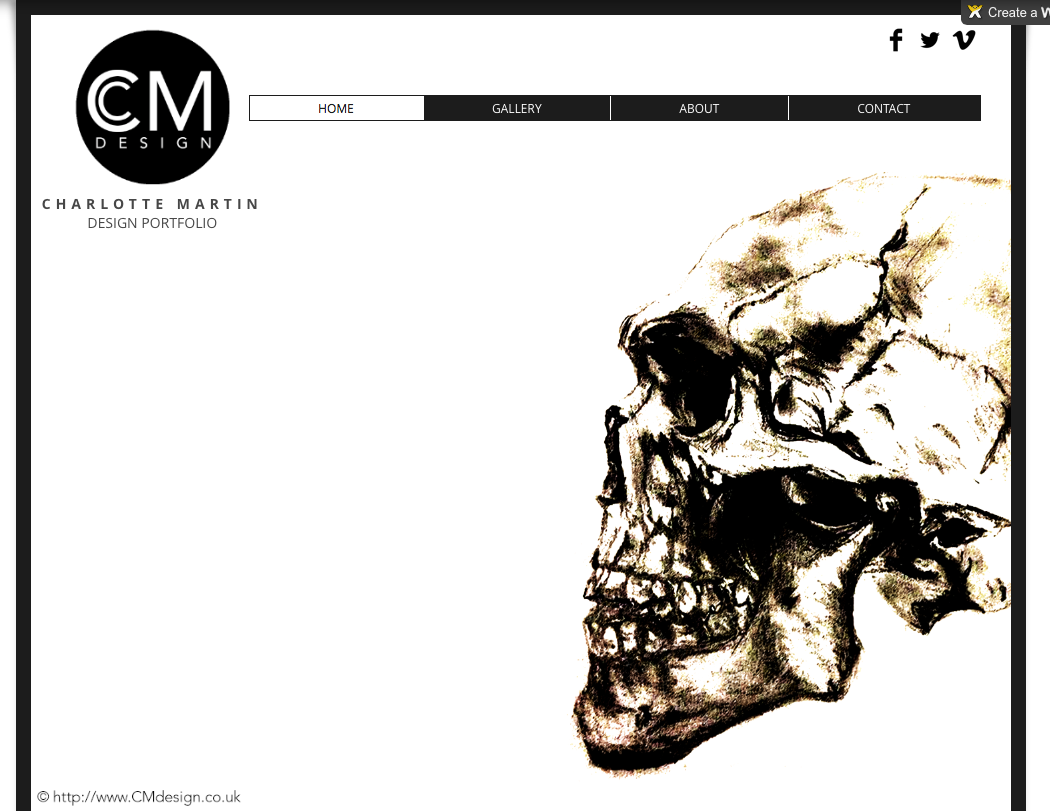
I decided on my skull sketch as my main imagery for the front page to show my skill and attract the audience to looking at my work as illustrating is one of my best skills. I feel the skull worked well also because of the colour scheme in place and wanted this to be consistent. I also tried using a bold outline on my webpage which was again inspired by Sagmiester&Walsh. However when doing this I found that on different sized computer screens it was different in size and certain things could not be seen which didn’t work so I decided to remove it.
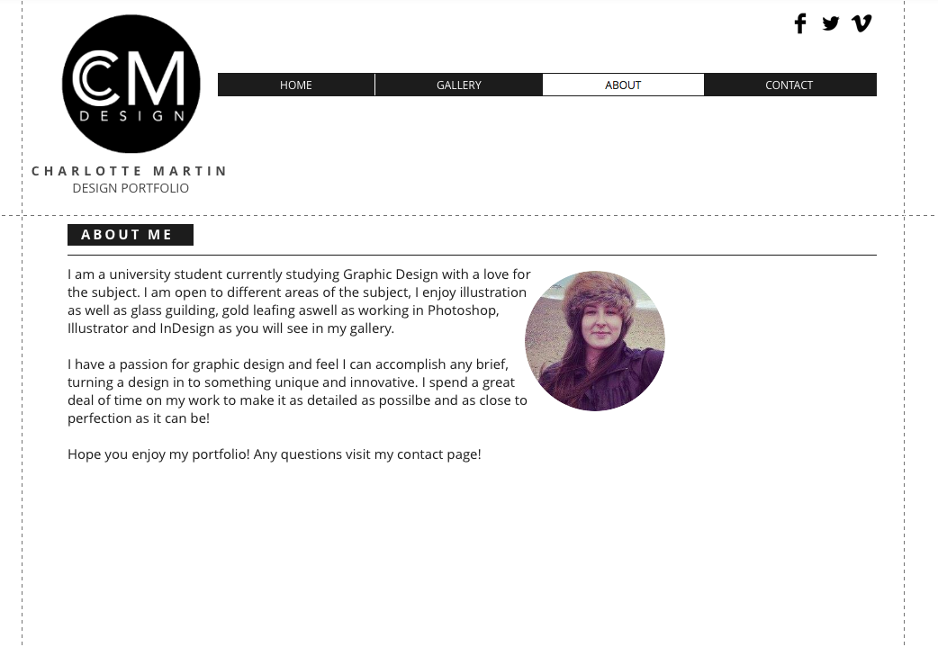
On my ‘About’ page I decided to keep the colour scheme again consistent throughout and again with the page titles in the simple black box. As you can see I have used different versions of the typeface to then show the different heirarchy of text throughout. I decided to add a thin line above the title and the text to create a focus on the imagery and text together to make sure the information doesn’t get too jumbled which I think works well here. i chose to have a circular image to fit with the theme of my page and also to fit with the paragraph of text which I feel brings them together. Still here there was something missing.
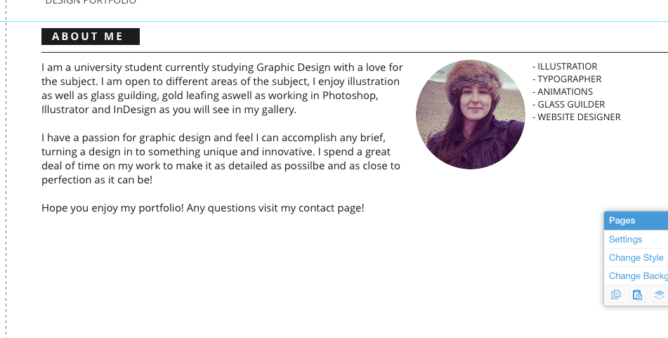

When I found there was something missing I decided to add more text next to the imagery to make the page feel more balanced throughout. I aligned it central with the imagery still making the text aligned up from the paragraph as well.

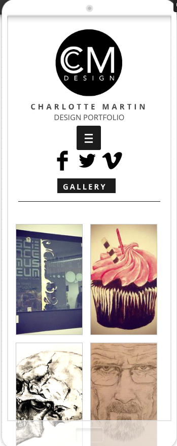
For my gallery page I decided to play around with different grid layouts for my content, I found many of the different layouts were a bit too much and cut out a lot of the imagery which didn’t work. It was also very jumbled which I didn’t want so I decided on something more simple.
I decided on a simple 4 column grid to keep it simple with about a 5mm gutter throughout to make sure it was balanced. I again have kept with the same title throughout to keep it consistent and am going to add a line again to keep the focus of the work.


I decided to create a darker filter over the images when hovered over to ensure the audience knows they can click on it. It also shows a description and name of each of the pieces.

When I was happy with my website I decided to design what it would look like on a mobile device I kept the design the same but mainly all central for the layout to make it easy to read and scroll. Also for the mobile site I decided to use a drop down menu to make it simple and easy to navigate. Here are the finished mobile views.


 charlottemartindesigns