
To begin I started on designing a logo for my webpage. I sketched out ideas and then began designing on Photoshop.
To begin I came up with this idea which was aligned using the ruler tools however I felt it wasn’t in proportion so then tried to make it larger to fit the circle and visually look balanced.
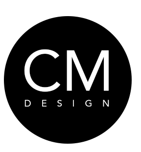
Here is the more balanced looking design with the larger typeface which I feel worked better however I still though there was something missing.

From this I decided to add an oval shape inside the c to make it more visually appealing however I feel that this looked too much like ‘COM’ rather than the initials of CM.
I then added a smaller c shape inside the larger c which i thought made it more visually appealing yet still balanced in the circle. This is my chosen logo.
