
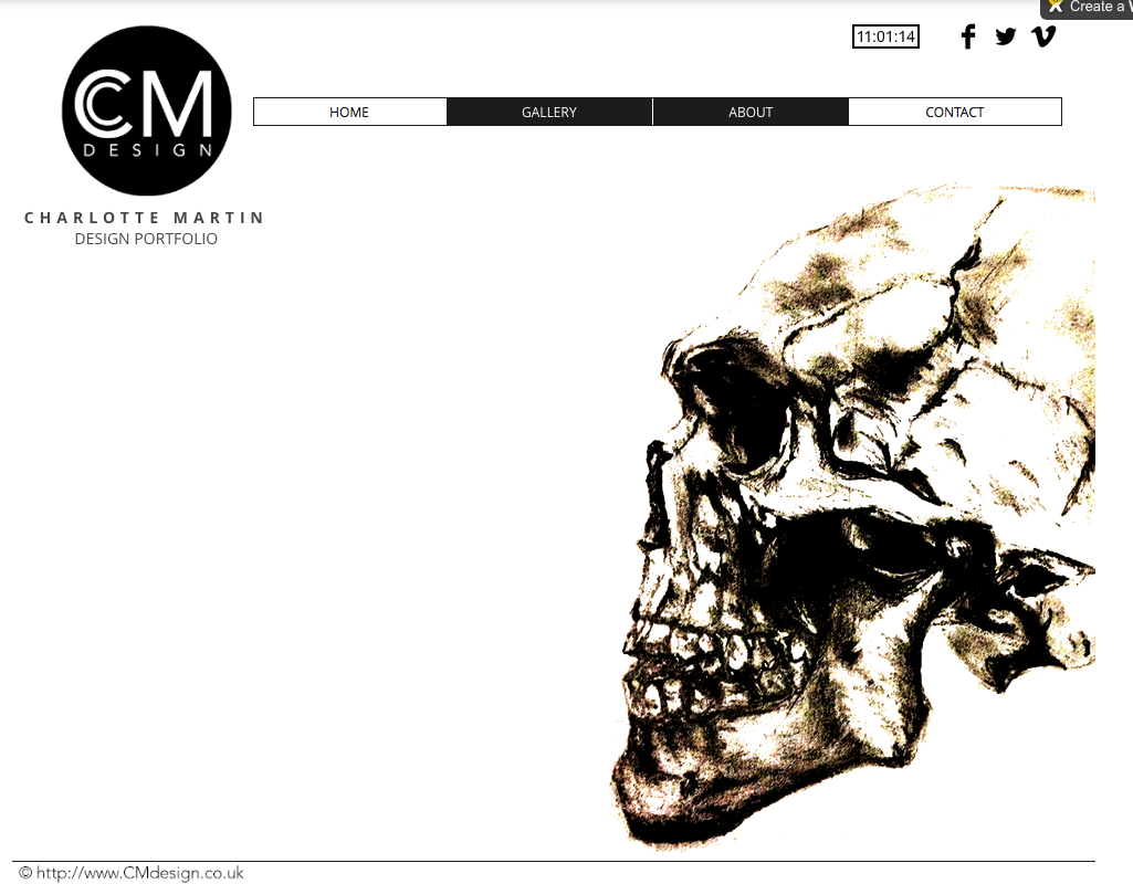

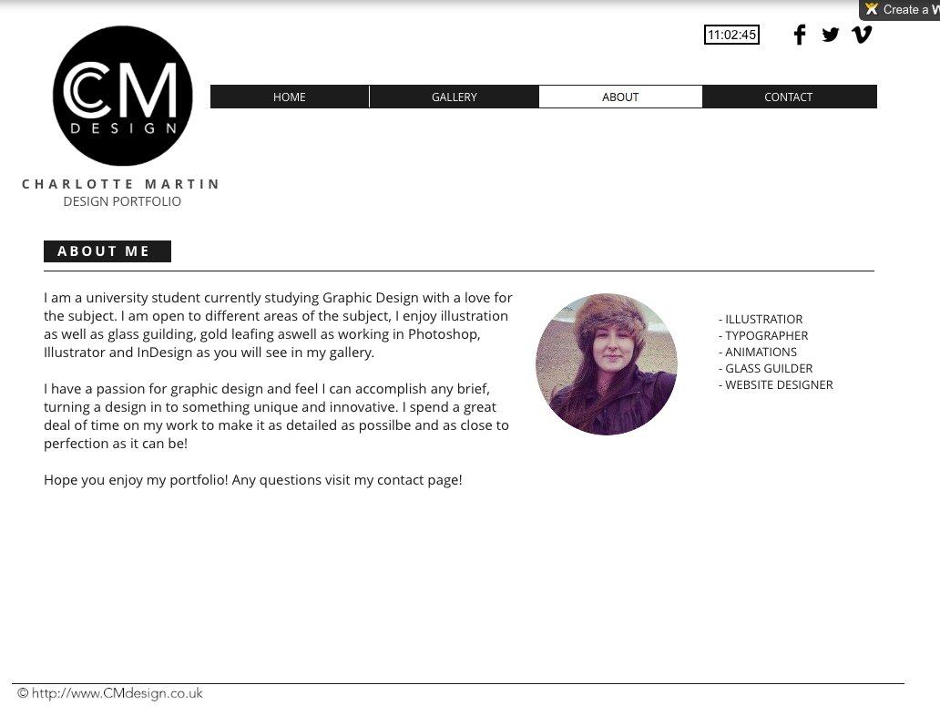


My finished web design I feel works very well, it fits the brief and in my eye very well proportioned in layout. I think that my use of the minimal black and white colour scheme made the piece work very well and really attracts the attention to the imagery and signifies my workspace as being tidy and my work being professional. I kept my layout simple with the title to begin and then to the imagery and links. I also think that the headers and footers work well in separating the images and text along with the lines I have used consistently in my pages. I feel the layout design is consistent throughout my website. I think the black and white imagery on my home page worked well with my chosen theme keeping it minimalistic to focus on my work itself. I also feel that my design worked well and relates to my inspiration of Sagmiester & Walsh which I researched previously. I feel the navigation is very simple and works very well, I feel that I have designed the webpage well enough to make sure on any screen it will be able to show the website in the way I want it to as well as designing my webpage view on a mobile.
If I could change anything about my page it would be to maybe have tried out a more unique layout and also experimented with colour to see how that would have worked.
After looking at the piece overall I feel it does fit the brief well and is a well proportioned layout design and signifies the point I was trying to getting across of me as a designer.
