Evaluation of Punctuation Mark.

Evaluation of Punctuation Mark Describing Sarcasm.

Screen Shot 2015-06-01 at 11.10.54

Screen Shot 2015-06-01 at 11.11.11

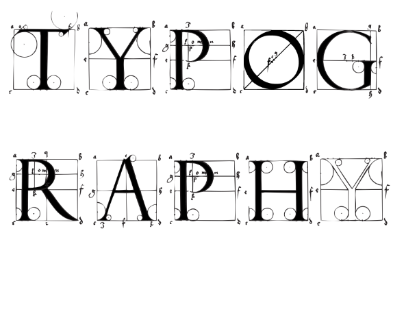
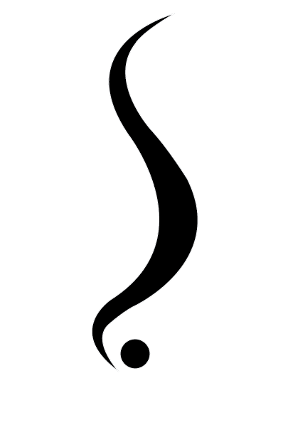
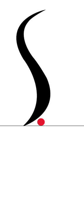
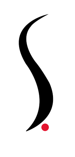
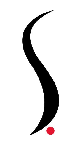
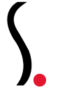
My finished punctuation mark I feel works very well, it fits the brief and in my eye very well proportioned with the typeface Avenir. I think that my use of the minimal black and red keeps the idea of being a punctuation mark and works well. I feel the consistent use of thickness works well with being consistent with the typeface and the full stop works well with showing it should be at the end of the sentence. I think the us of the ‘s’ shape works well with describing sarcasm and the playfulness of the mark works well with the description as well . I also feel that my design worked well and relates to my inspiration of History of type which I researched previously. Seeing the mark in a sentence I feel really shows how the punctuation mark works and shows that it is effective.

If I could change anything about my page it would be to maybe have tried out a more unique style and also experimented more with colour to see how that would have worked.

After looking at the piece overall I feel it does fit the brief well and is a well proportioned design and signifies the point I was trying to getting across.

Evaluation of Poster Design.

Evaluation of Poster Design.

Screen Shot 2015-06-01 at 12.51.41

After looking at my final design I feel like it does fit the brief well, it attracts my target audience and is legible to my reader.

If I could change anything about my poster It would be to try out different colour schemes and also filled more of the dark space to give it more of a personality

I am happy with the programmes used. If I could have taken this project further and could have used different materials rather than it having to be computerised I would have played around with materials to make it more interesting to my target audience.

The colour scheme I believe came out well and I thought that it was a good subtle attraction to the audience signifying professionalism throughout.

I feel the typefaces used work very well in creating a hierarchy for the information I have put on the poster itself. I think the centre alignment works very well here is creating a well balanced poster. I feel my poster works well with showing the anatomy of type and how typography is created explaining the exhibition itself.

Overall I feel like the design works and fits the brief intentions.

Step By Step.

Here is my step by step of creating my poster.

typface

To begin from my initial sketches I decided to design something similar to type anatomy that I had researched and hand rendered sketching to relate to the typography exhibition. I began using a typeface that would do that and added in extra circles and dots etc when necessary.

Screen Shot 2015-06-01 at 12.03.18

Screen Shot 2015-06-01 at 12.02.55

From this I decided to fill the letters to make the title stand out as before it was very plain and did not catch the eye from a distance when test printing.

Screen Shot 2015-06-01 at 12.01.37

I decided that the black on white was too plain and I did not want to go for colour as I wanted the poster to signify professionalism and attract my target audience. From this I decided to change everything to white using the paint bucket tool.

Screen Shot 2015-06-01 at 12.19.59

After this I added a black background which really made the title pop out. This colour scheme was inspired by my research of posters using type and Craig Ward’s piece ‘you blow me away’.

Screen Shot 2015-06-01 at 13.17.41

I felt this worked well although had a huge blank space below. I decided to add the date and list of typographers that are in the show. I decided to try a white box with black text inside however when I did this I found It was too much and did not work with the theme I was going for. The font used for the information is Gill Sans as I wanted it to go against the main serif title. I feel this works well.

Screen Shot 2015-06-01 at 12.38.38

From this I decided to remove the white box and align the text so it was centred with an equal gap between to make it balanced however with the different sized names this made the line up unbalanced.

Screen Shot 2015-06-01 at 13.04.17

As this was unbalanced I decided to centre align the text and make sure everything was centred. I felt this worked well and achieved my brief. Below is the Final.

Step By Step.

Here is a step by step of how I created and developed my punctuation mark describing sarcasm.


Screen Shot 2015-06-01 at 10.37.47

I began vectoring from my initial drawing.

Screen Shot 2015-06-01 at 10.43.40


Here is the outcome I produced. I decided to use the full stop as this punctuation mark is to be used at the end of the sentence to show to the reader that what has been written is to be read sarcastically.

Screen Shot 2015-06-01 at 10.43.52Screen Shot 2015-06-01 at 10.51.34


I then decided to play around with the full stop to see what it would look like as I flat at this point it did not look right.

Screen Shot 2015-06-01 at 10.44.07


When looking at this I decided the curved line did not look enough like an ‘s’ for sarcasm as planned so I decided to change the bottom curve to make it more obvious to the reader.

Screen Shot 2015-06-01 at 10.32.50

After doing this I decided to play around with the full stop further as to me it did not seem to work with the typeface I have used to put on the end of.


Screen Shot 2015-06-01 at 10.53.29 Screen Shot 2015-06-01 at 10.53.51 Screen Shot 2015-06-01 at 10.54.45 Screen Shot 2015-06-01 at 10.55.14

As you can see from the steps I have done I have played around with colour, movement of the full stop and the placement on the baseline.

Screen Shot 2015-06-01 at 10.57.25 Screen Shot 2015-06-01 at 11.01.27 Screen Shot 2015-06-01 at 11.01.47

After playing around with adding the punctuation mark to the sentence using the typeface Avenir I found the thickness of my punctuation mark needed to be consistent along side the typeface so from this I played around with the anchor points on illustrator and came to my final design below which I feel works well in describing the sentence as sarcastic and also works well alongside the typeface.

Screen Shot 2015-06-01 at 11.11.11

Initial Ideas.

I decided from my research to sketch some ideas of different punctuation marks with the meaning of sarcasm. Here is what I came up with.

After looking at the designs I feel that the second design looks best and describes sarcasm perfectly. I thought my initial designs of the s through the exclamation mark looked too much like a dollar sign so developed further to create an s shaped exclamation mark.