Branding.

What is branding?
‘The process involved in creating a unique name and image for a product in the consumers’ mind, mainly through advertising campaigns with a consistent theme. Branding aims to establish a significant and differentiated presence in the market that attracts and retains loyal customers.’
Why is branding important?
‘Branding goes way beyond just a logo or graphic element. When you think about your brand, you really want to think about your entire customer experience…everything from your logo, your website, your social media experiences, the way you answer the phone, to the way your customers experience your staff. When you look at this broad definition of branding, it can be a bit overwhelming to think about what is involved in your brand.

In short, your brand is the way your customer perceives you.

It is critical to be aware of your brand experience and have a plan to create the brand experience that you want to have… a good brand doesn’t just happen… it is a well thought out and strategic plan.’

BRANDING PROMOTES RECOGNITION.

People tend to do business with companies they are familiar with. If your branding is consistent and easy to recognize, it can help people feel more at ease purchasing your products or services.

YOUR BRAND HELPS SET YOU APART FROM THE COMPETITION.

In today’s global market, it is critical to stand apart from the crowd. You are no longer competing on a local stage, your organization now competes in the global economy. How do you stand out from the thousands or millions of similar organizations around the world?

YOUR BRAND TELLS PEOPLE ABOUT YOUR BUSINESS DNA.

Your full brand experience, from the visual elements like the logo to the way that your phones are answered, tell your customer about the kind of company that you are. Are all of these points of entry telling the right story?

YOUR BRAND PROVIDES MOTIVATION AND DIRECTION FOR YOUR STAFF.

A clear brand strategy provides the clarity that your staff needs to be successful. It tells them how to act, how to win, and how to meet the organization’s goals.

A STRONG BRAND GENERATES REFERRALS.

People love to tell others about the brands they like. People wear brands, eat brands, listen to brands, and they’re constantly telling others about the brands they love. On the flip side, you can’t tell someone about a brand you can’t remember. A strong brand is critical to generating referrals or viral traffic.

A STRONG BRAND HELPS CUSTOMERS KNOW WHAT TO EXPECT.

A brand that is consistent and clear puts the customer at ease, because they know exactly what to expect each and every time they experience the brand.

YOUR BRAND REPRESENTS YOU AND YOUR PROMISE TO YOUR CUSTOMER.

It is important to remember that your brand represents you…you are the brand, your staff is the brand, your marketing materials are the brand. What do they say about you, and what do they say about what you’re going to deliver (promise) to the customer?

YOUR BRAND HELPS YOU CREATE CLARITY AND STAY FOCUSED.

It’s very easy to wander around from idea to idea with nothing to guide you…it doesn’t take long to be a long way from your original goals or plans. A clear brand strategy helps you stay focused on your mission and vision as an organization. Your brand can help you be strategic and will guide your marketing efforts saving time and money.

YOUR BRAND HELPS YOU CONNECT WITH YOUR CUSTOMERS EMOTIONALLY.

A good brand connects with people at an emotional level, they feel good when they buy the brand. Purchasing is an emotional experience and having a strong brand helps people feel good at an emotional level when they engage with the company.

A STRONG BRAND PROVIDES YOUR BUSINESS VALUE.

A strong brand will provide value to your organization well beyond your physical assets. Think about the brands that you purchase from (Coca-Cola, Wrangler, Apple, Ford, Chick-Fil-A, QuikTrip)… are these companies really worth their equipment, their products, their warehouses, or factories? No, these companies are worth much more than their physical assets…their brand has created a value that far exceeds their physical value.

The best branding is built on a strong idea… an idea that you and your staff can hold on to, can commit to, and can deliver upon. Your brand needs to permeate your entire organization. When your organization is clear on the brand and can deliver on the promise of the brand, you will see tremendous fruit while building brand loyalty among your customer base.

If you need assistance with your brand, from creating your initial brand strategy to the visual identity elements, contact us for a free consultation…we’d love to help you identify and proclaim your story!

http://www.strategynewmedia.com/why-is-branding-important

The Brief.

The modules comprises of 2 parts:

Part 1 of 2.

You are to develop the branding of a given celebrity. The aim of the project is to design a branding that will project a positive image of the given person. It is important that you create your branding in a way that you believe the celebrity would wish to be portrayed rather than how you feel about them.

You must research around the topic of branding and personal promotion with a view to demonstrating the key concepts regarding branding.

Typography must, of course, be well considered throughout.

Deliverables

You are to produce a logo, letterhead, business card and compliment slip. These items are to be of standard size. You will also produce a style guide for your client and this will include instructions as to how the logo, typeface(s) and colour systems are to be used. We would also like you to consider the making or visualising of a promotional item. Again, you will need to research these.

Part 2 of 2

Using the skills and knowledge developed in the fist part of the module, you will now apply this to the development of self-promotional materials; essentially self-branding.

This is can be deceptively difficult, as being both client and designer can be problematic in terms of remaining objective. It is essential that you consider the audience that you intend to address and be able to explain how you know your design to be appropriate for communicating with the professional design community.

Deliverables

The deliverables are a logo, letterhead and business card.

Evaluation.

12042184_10156336036295508_156198705_n

12032571_10156336036355508_493688114_n

12029127_10156336036250508_1886776839_n

12022974_10156336036425508_1118486894_n

My finished double page spreads I feel work very well, I feel as if they fit the brief and in my eye very well proportioned in layout. I think that my use of the 4 and 5 column grids made the piece work very well and really attracts the attention to the imagery and title to begin and then to the information. I also think that the gutters/margins work well in separating the images and text especially the sequences. I feel the layout design is consistent throughout my double page spreads. I think the black and white imagery worked well with my chosen theme and signified the sharpness of skating very well.

If I could change anything about this piece it would be to maybe have tried out a more unique layout and also experimented more with colours to see how that would have worked.

After looking at the piece overall I feel like although It could be improved it does fit the brief well and is a well proportioned layout design and signifies the point I was getting across about skateboarding itself.

Step by Step.

I began with creating my grids that I have planned for my spreads. And made sure that my canvas was of the correct size

Screen Shot 2015-09-23 at 12.18.08Screen Shot 2015-09-21 at 13.12.37Screen Shot 2015-09-21 at 13.12.37Screen Shot 2015-09-21 at 13.19.36

From this I began adding my imagery playing around with the layouts throughout.  Screen Shot 2015-09-21 at 13.19.36Screen Shot 2015-09-23 at 12.15.45Screen Shot 2015-09-23 at 12.15.45Screen Shot 2015-09-23 at 12.15.45

Screen Shot 2015-09-23 at 12.15.45

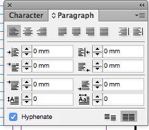
When adding my text to my page using my grids I decided to make sure all of my information was aligned to the baseline grid to make sure it was aligned. I played around with the different typefaces here to get a similar one to the magazine itself. I decided to go with Clarendon Regular, Medium and Gill Sans. I also played around with the placement on information on the page to make sure it worked well and ensured hyphenations were turned off.

Screen Shot 2015-09-23 at 12.15.30

Screen Shot 2015-09-23 at 12.15.10

 Screen Shot 2015-09-23 at 12.15.24

On this page I played around with the placement of the text as it wasn’t working how I would have liked. I also played around with the title as again the page did not seem well balanced so I played around with moving text, adding text, making sure the text fit into specific areas and so on eventually I managed to have text on both sides of the page to create a balance in the page like the imagery.

Screen Shot 2015-09-23 at 12.47.55

Screen Shot 2015-09-23 at 12.55.50

Two of my pages were very simple therefor there wasn’t much to play around with because I wasn’t having much text on the page at all as a lot of the pages in Kingpin magazine are with just two or one images on. Here are them below.

Screen Shot 2015-09-25 at 13.26.41

Screen Shot 2015-09-25 at 13.26.47

Screen Shot 2015-09-25 at 13.26.53

Screen Shot 2015-09-25 at 13.26.41

Screen Shot 2015-09-25 at 13.26.58

Screen Shot 2015-09-25 at 13.27.13

Screen Shot 2015-09-25 at 13.27.24

 Here are the final spreads.

12022974_10156336036425508_1118486894_n 12029127_10156336036250508_1886776839_n 12032571_10156336036355508_493688114_n 12042184_10156336036295508_156198705_n

Typography and pt sizes.

I decided to look in to different typefaces that would fit into my magazine I began using different typefaces to try to fit the scheme. Here is a picture inside my magazine.

12049021_10156336036750508_1844894140_n

From this I tried different Clarendon fonts like Clarendon Bold, Regular, Thin, Light, Medium and Roman. I also tried a Chaparral Pro which was close but too rounded for the typeface.

Using an app called ‘What the font?’ I managed to find the exact font used which was Freight Micro Pro which unfortunately I couldn’t get because of the cost of the font. I decided to go for Clarendon Regular and Clarendon Mediums to have different hierarchy in information on the pages. For the main information on the pages I decided to go for the Gill Sans typeface to again signify hierarchy within the information on the page and keep with the scheme of the magazine itself. I decided to play around with having a mixture of serifs and sans serifs on the spreads to separate text and have ranges of information separate on the page.

I decided to go for font size 10pt for the information as that is standard for this magazine. Titles range in sizes but all roughly around 24pt as well as picture tags being 9pt again to signify the hierarchy within the pages.

Article for my spreads.

Skateboarding

What’s it all about?

Skateboarding is an action sport which involves riding and performing tricks using a Skateboard. People take part in Skateboarding as a recreational activity, an art form, a job, or even as a method of transportation.

Skateboards have been around for almost 100 years and over the years their shape and design have changed dramatically. Early Skateboards were just pieces of wood with roller skate wheels nailed to the bottom of them; some event had milk crates nailed to them with handles for control and looked more like a Scooter.

Getting involved in the sport: The best place to go Skateboarding to learn is a Skate Park. These are great places to improve your boarding skills as there are loads of other skaters to watch and get tips from.

As Skateboarding is becoming more recognised, Skate Parks are being built in local Parks and Recreation grounds. There are a number of Skate Parks already in place across the County. Here we are in Borough Green skatepark in Kent looking at different sequences and tricks by some of the local skaters in this area.

History of skateboarding.

Skateboarding starts shrouded in mystery.  We do know that it first started in the 1950s, when all across California surfers got the idea of trying to surf the streets. No one really knows who made the first board – instead, it seems that several people came up with similar ideas at the same time. Several people have claimed to have invented the skateboard first, but nothing can be proved, and skateboarding remains a strange spontaneous creation.

Jumping the ollie

Invented in the late 1970s by Alan “Ollie” Gelfand, the ollie has become a skateboarding fundamental, the basis for many other more complicated tricks. In its simplest form, the ollie is a jumping technique that allows skaters to hop over obstacles and onto curbs, etc. What’s so amazing about the ollie is the way the skateboard seems to stick to the skater’s feet in midair. Seeing pictures of skaters performing soaring 4-foot ollies, many people assume that the board is somehow attached to the skater’s feet. It’s not. What’s even more amazing about the ollie is that to get the skateboard to jump up, the skater pushes down on the board! The secret to this paradoxical maneuver is rotation around multiple axes. Let’s take a closer look.

Grids.

I have decided to look at what layout I am going to use so I am researching further into grids in InDesign. I am going to look at some more different layouts to see the potential of what my page could look like.

1280px-van_de_graaf_canon_in_book_design-svg

fibonacci_spiral

Here are a few different layouts I looked at to think of interesting ways to layout my page. (fibonacci sequence, the golden section). After looking at these I have decided to go for a high number column grid for my sequences of tricks to be able to fit a large amount of imagery on the pages.

Grid Research.

I decided to look at existing magazines and what layout grids they have used to create the page design. Looking at whether the pages are mirrored and the sizes of the margins, gutters and how many columns/bars they have used in their grids and whether the grid is consistent throughout the magazine.

I looked at the magazine Kingpin which I am using to look at what type of grids they us. Below are a few o my images of the test I carried out using tracing paper on the top of the magazine.

12028951_10156322862830508_1618834867_n

12026678_10156323049855508_306505793_n

4 bar grid – 4cm columns – 0.3cm + 0.4cm gutters – this layout is almost constant throughout but varies with the design.