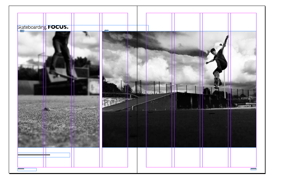
I began with creating my grids that I have planned for my spreads. And made sure that my canvas was of the correct size

From this I began adding my imagery playing around with the layouts throughout. 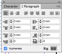

When adding my text to my page using my grids I decided to make sure all of my information was aligned to the baseline grid to make sure it was aligned. I played around with the different typefaces here to get a similar one to the magazine itself. I decided to go with Clarendon Regular, Medium and Gill Sans. I also played around with the placement on information on the page to make sure it worked well and ensured hyphenations were turned off.
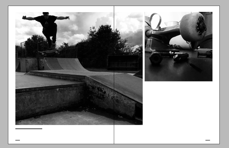

On this page I played around with the placement of the text as it wasn’t working how I would have liked. I also played around with the title as again the page did not seem well balanced so I played around with moving text, adding text, making sure the text fit into specific areas and so on eventually I managed to have text on both sides of the page to create a balance in the page like the imagery.


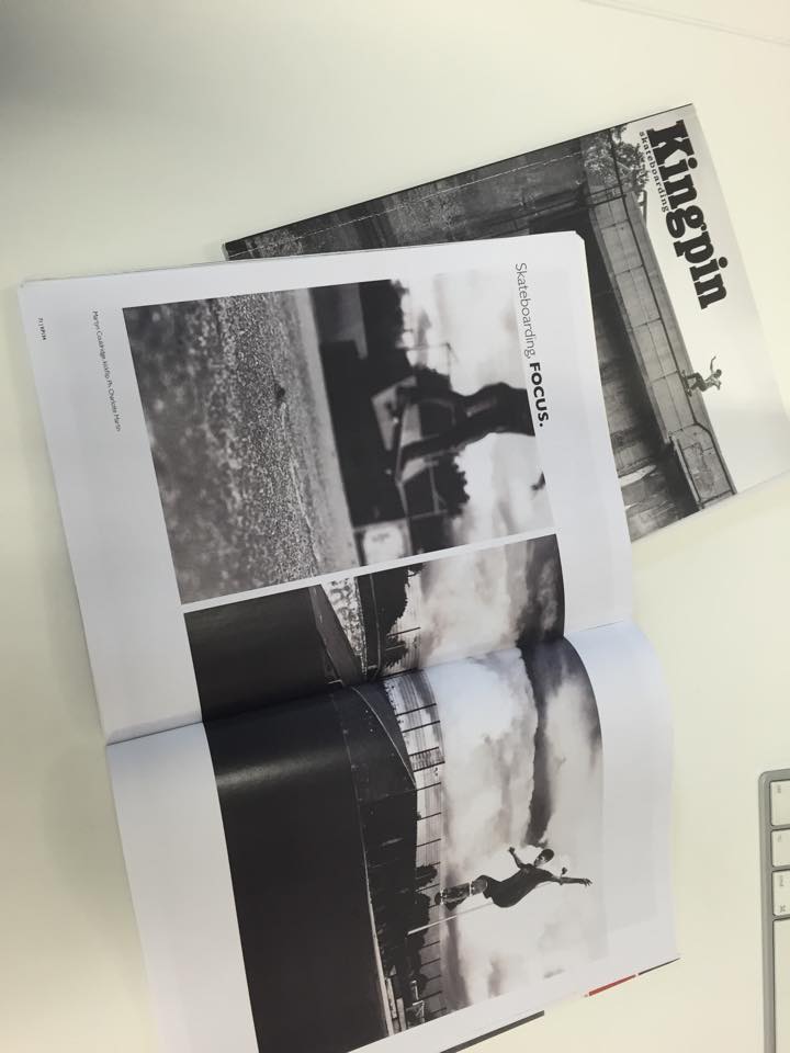
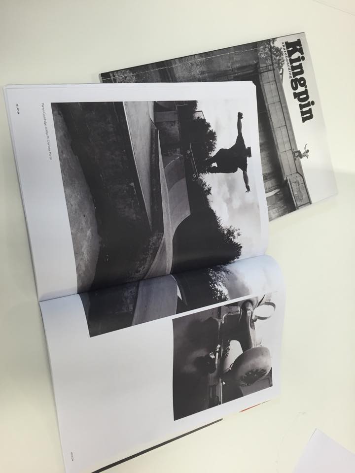
Two of my pages were very simple therefor there wasn’t much to play around with because I wasn’t having much text on the page at all as a lot of the pages in Kingpin magazine are with just two or one images on. Here are them below.
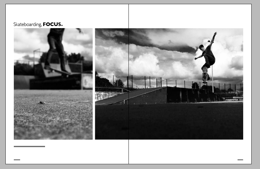
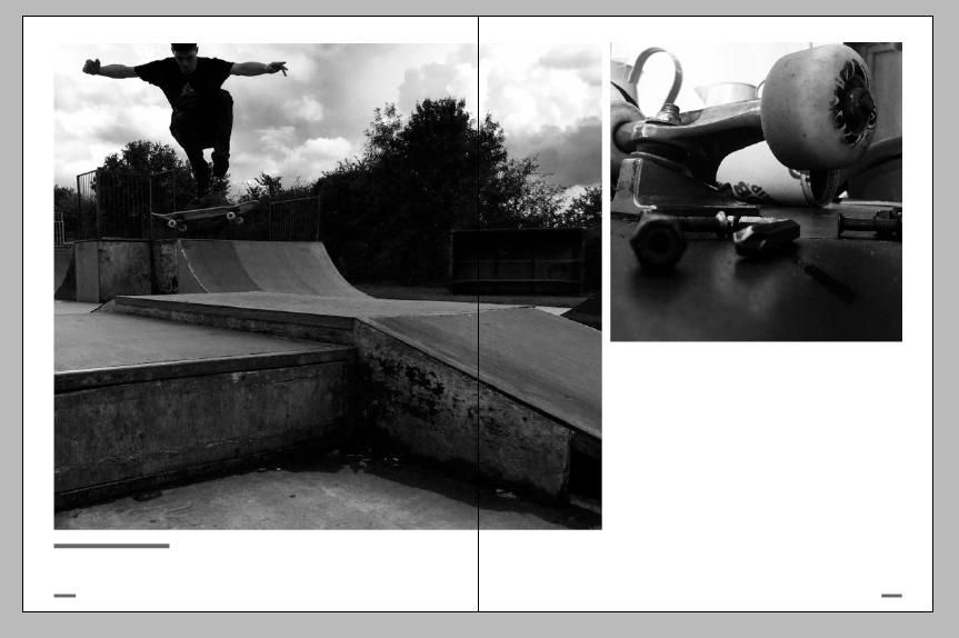


Here are the final spreads.