Evaluation.


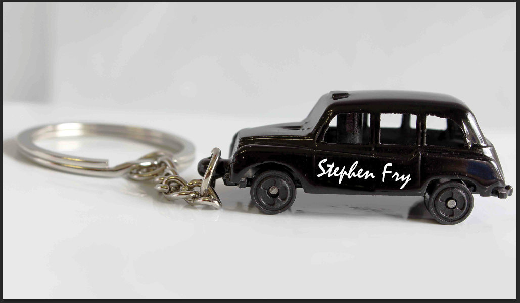
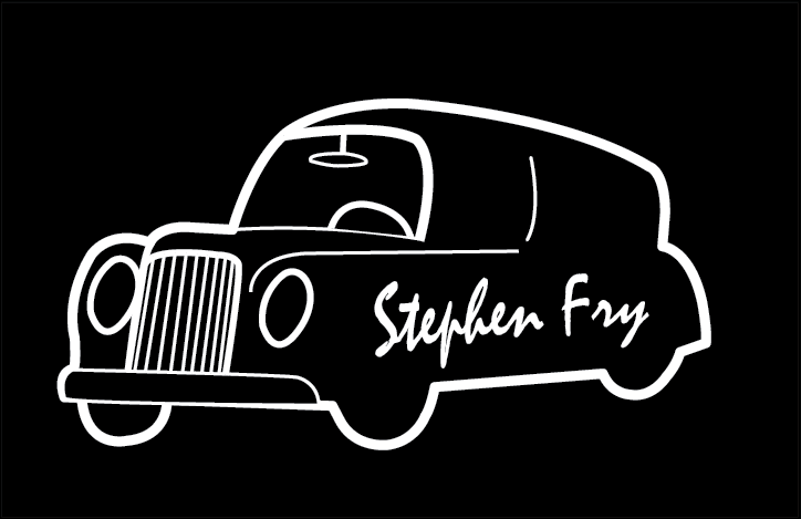
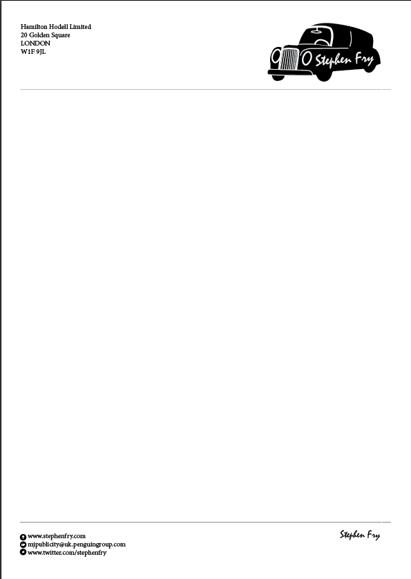
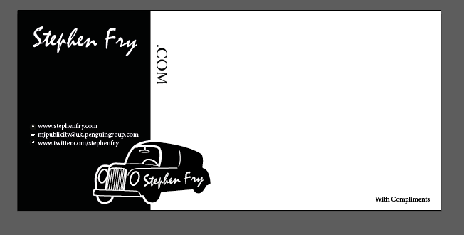
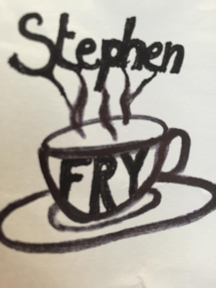
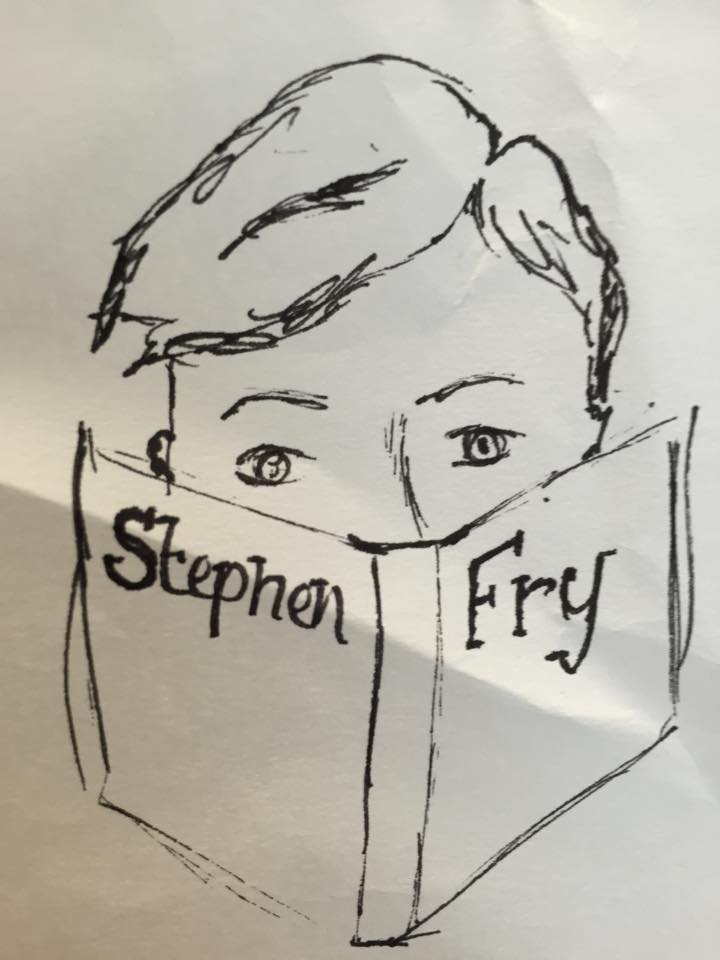
My finished Stephen Fry Branding I feel fits the brief and very eye catching to the audience. I think that the use of positive and negatives work well and really attracts the attention to the logo and makes it feel very classic and professional but still has the comedic side of the black cab. I also feel for the post card the slight distortion of the text makes it a bit more interesting than just the initial logo design but is still recognisable as the logo. I feel that my style guide is a clear and simple indication of what fonts and colours should be used when designing for Stephen Fry himself.
If I could change anything about this piece it would be to maybe have tried out a few more colours to see what they type of theme would have looked like and what type of effect that could have made.
After looking at the piece overall I feel like it does fit the brief well and signifies Stephen Fry in the way I believe he would want to be.


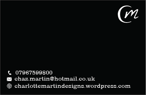
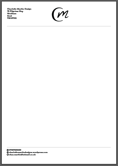

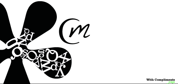
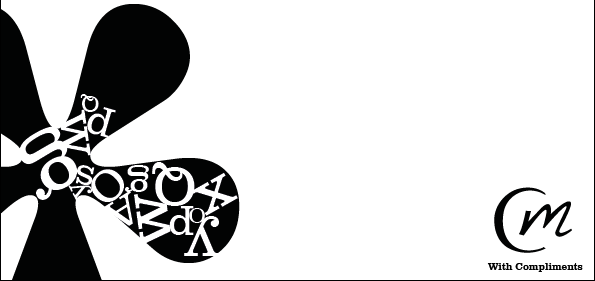
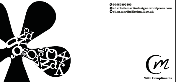
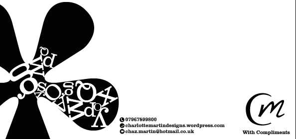
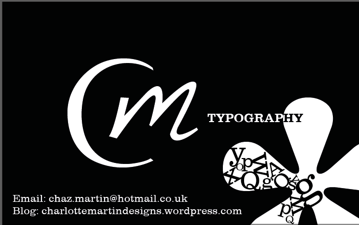
My own personal branding I feel fits the brief and very eye catching with the use of positive and negatives and really attracts the attention to the information on the outcomes. I also feel the addition of the imagery created by texts really signifies me as a typographer which is what I was trying to get across. I feel the use of just simple black and white really works way in portraying me as classical yet a modern designer and very clean cut which Is the way I was again trying to portray myself as being. Overall I feel it works well and fitted the criteria. If I could change anything about this piece it would be to maybe have tried out a few colours to see what they t would have looked like and what type of effect that could have made. I would have also played around with my logo a bit more to see what I could adapt to making it more interesting.