
Here is my step by step on creating my business card, letter head and compliment slip for Stephen Fry.

Here I played around with the information on the business card and working out different placements of the information to see which was most suitable.

Here is the front of the business card with the main logo on the front. I felt like this still needed some tweaking to make it a bit more exciting for the front of the business card.


I decided that the back way too busy and played around with different ways in which I could place the information which suited Stephen Fry. I found this was the best suited layout and looked most professional.
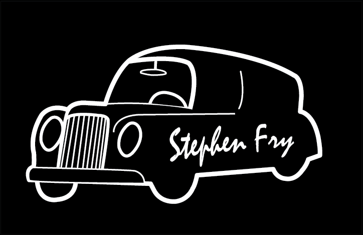

Here i played around with tools to make the front image more interesting but still capturing the logo for recognition. I morphed the typography to fit with the car which I feel worked well in creating the wheel of the car which I feel it worked well in making it more interesting for the front of the card.
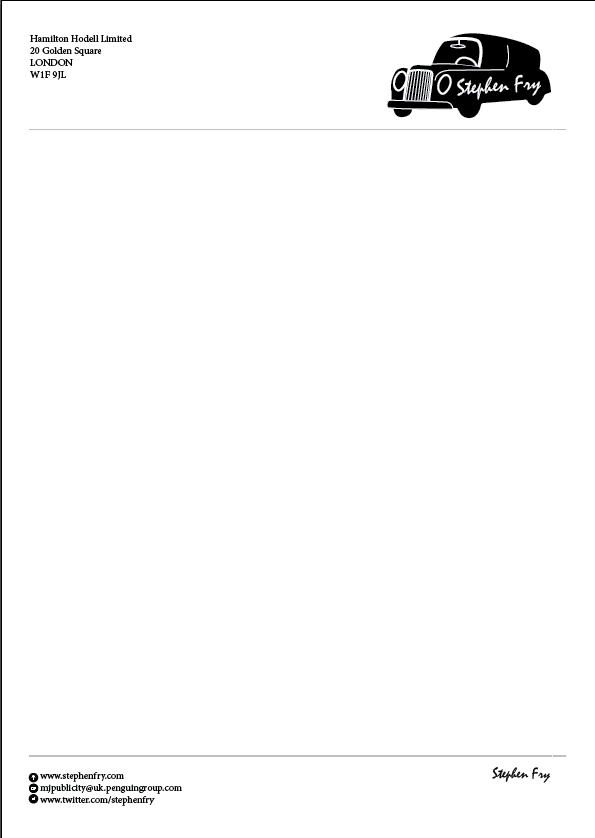


Here is my letterhead which I played around with a little bit but overall it worked well so just a few tweaks like lifting the bottom footer up and playing around with the information at the bottom and the top.

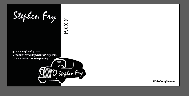
For my compliment I played around with having text different angles and positions keeping to the black and white theme. I felt the .com didn’t work so when adding his information I felt it wasn’t needed so kept it simple. Below is the final.

