
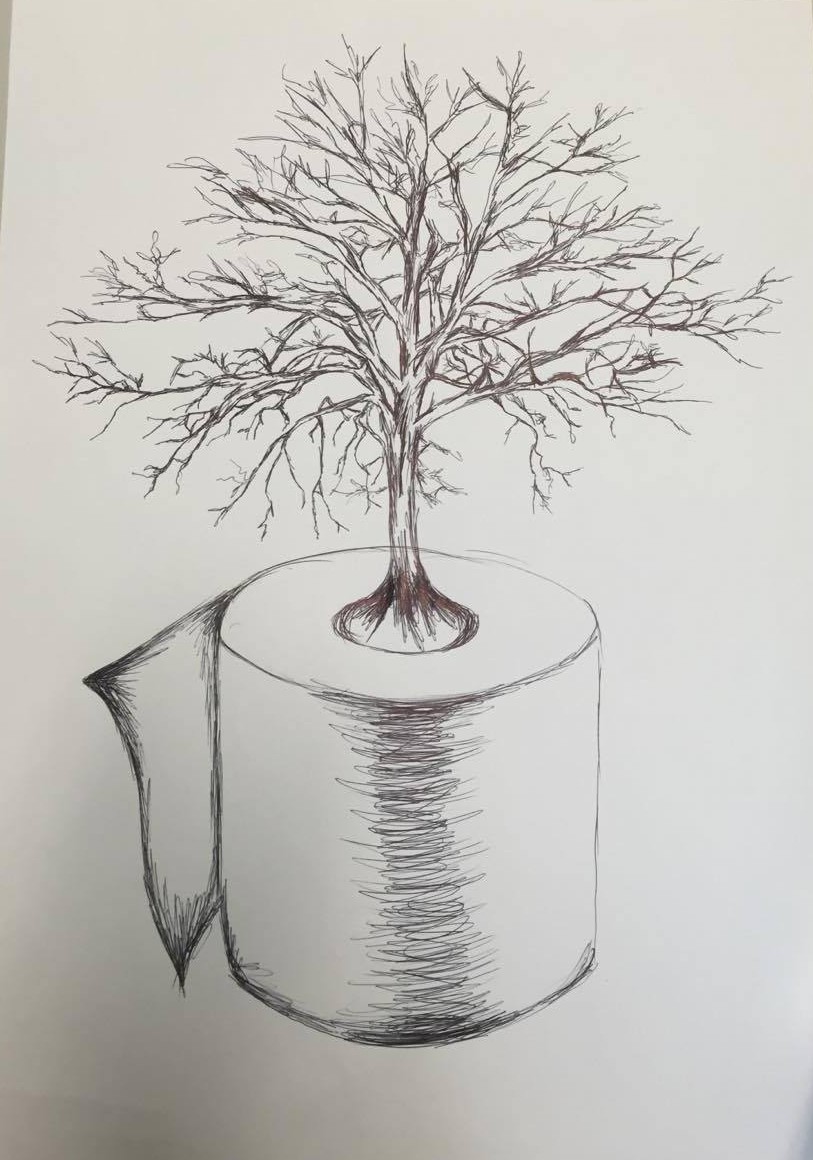
To begin I scanned my illustration in and designed a mock up toilet roll package to work from. I removed the background from my illustration to make it easier to work with. I also played around with layers to make the sketch darker to create a more bold effect on the packaging.

![]()
I began playing around with composition with my illustration and also typography as well as adding the FSC logo. When researching existing toilet paper packaging I found that a lot of the typography used were playful types signifying softness and comfort so I decided on a typeface called Oliver Regular which I felt was most suitable. I also played around with adding colour into the design by putting the leaf behind and playing around with colour. I found the leaf made the text slightly harder to read and the main focus of illustration was being over ridden.
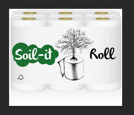
I then decided to try experimenting with the oval tool creating a bubbly comfort shape to signify that just because the toilet roll is eco friendly it is still soft and comfortable.

I then began playing around with different shades of green to see which was suited best. But still thought there was something missing.
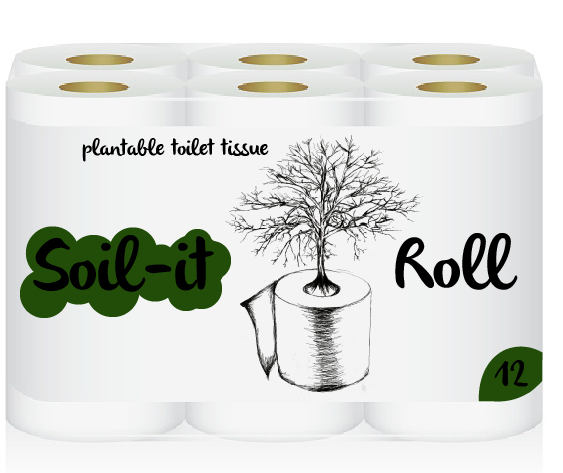
From this I decided to play around further with colours and adding more information onto the packaging itself. I added the words ‘plantable toilet tissue’ to make it obvious the the audience what the eco friendly points were which linked to the imagery playing around with composition more.

I found that the information needed to be below the type to create a hierarchy in the information shown on the packaging.

I found that the information was jumping out a bit more than I had liked so then decided to reduce the opacity to create more of an impact of hierarchy.

I found that the text ‘Soil it’ was being hidden in the colour green as well as the number ’12’ in the corner so decided to change the colour to white which I found was more eye-catching and really made it pop out on the packaging.
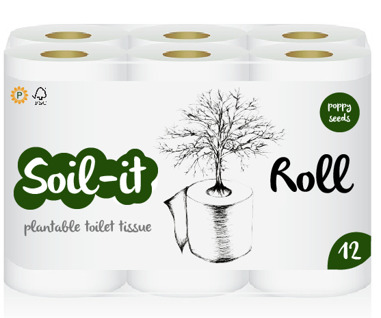
I then added my Plantable Product logo on the packaging which I feel worked well on a small scaled which I had considered when designing it. I also was playing around with adding more information about what this particular style can plant in this instance ‘poppy seeds’. I was playing around with colour of the circles and couldn’t figure out which would work best.
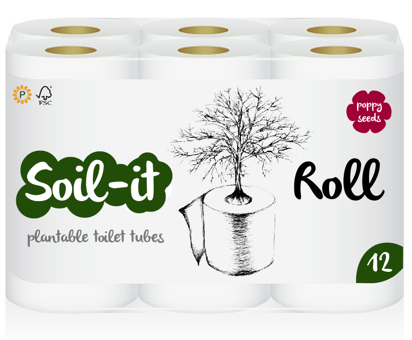
From this I designed a poppy shaped object to signify the poppy as well as the wording, using a pink/red colour which I felt was most suitable. Above is my final design.
