
Here is a step by step of the development of my final outcomes analysing and explaining the visual communication throughout.

To begin I sketched each of the fruit in an illustrative style aiming to appeal to the audience trying to create such a style that this image would attract my target audience more than once.


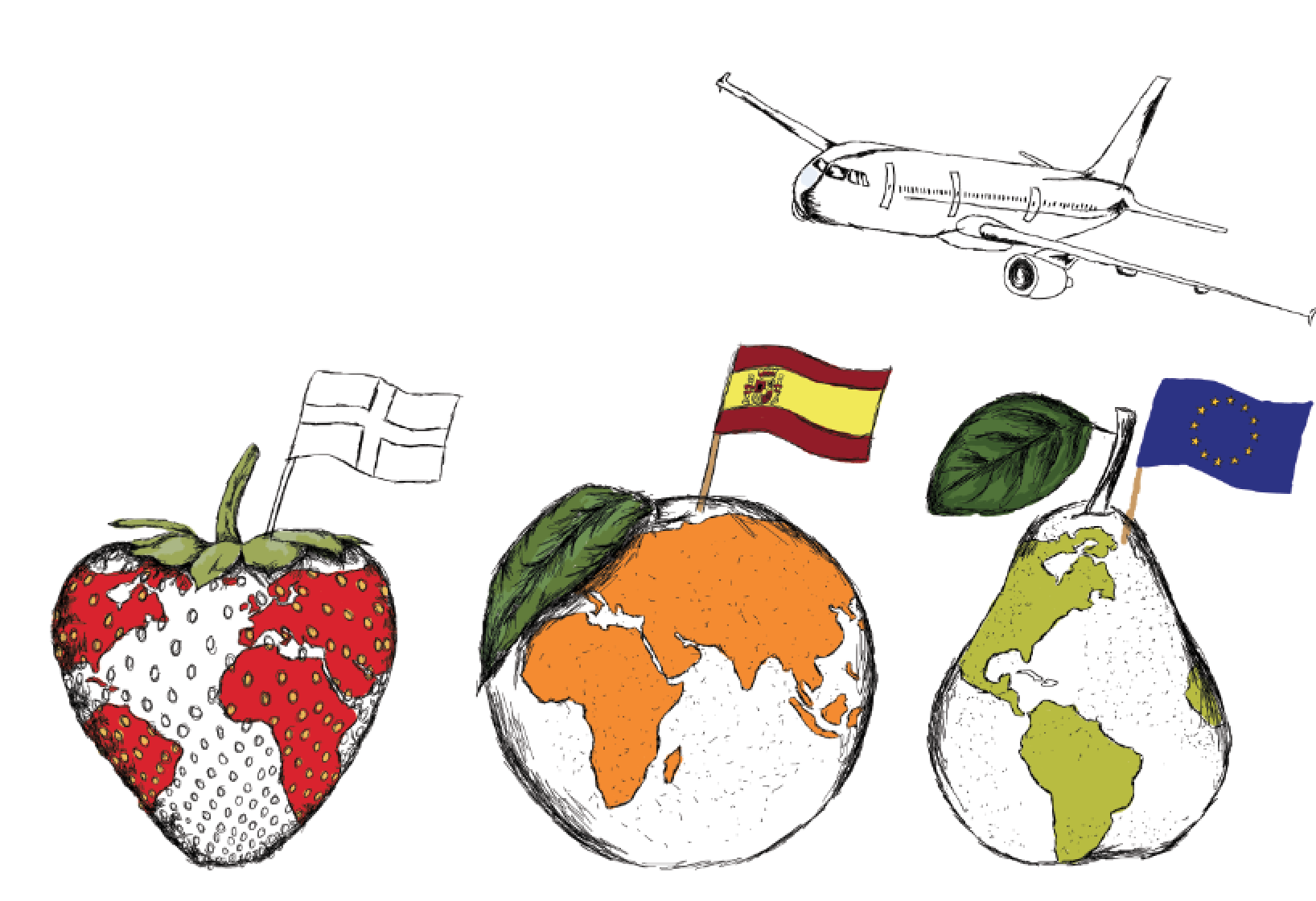
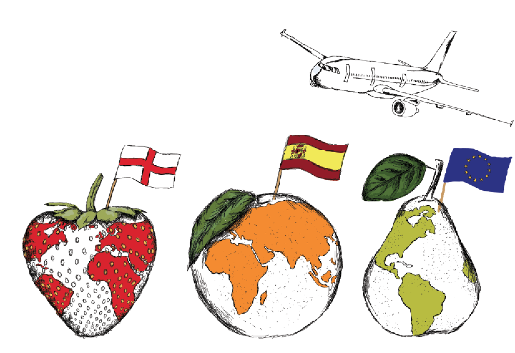
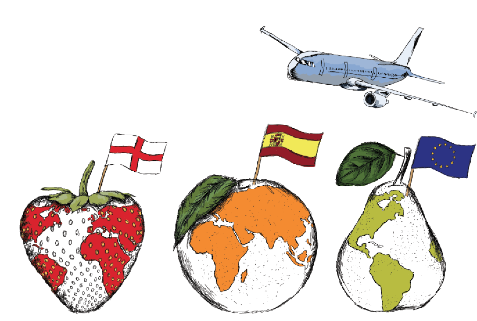
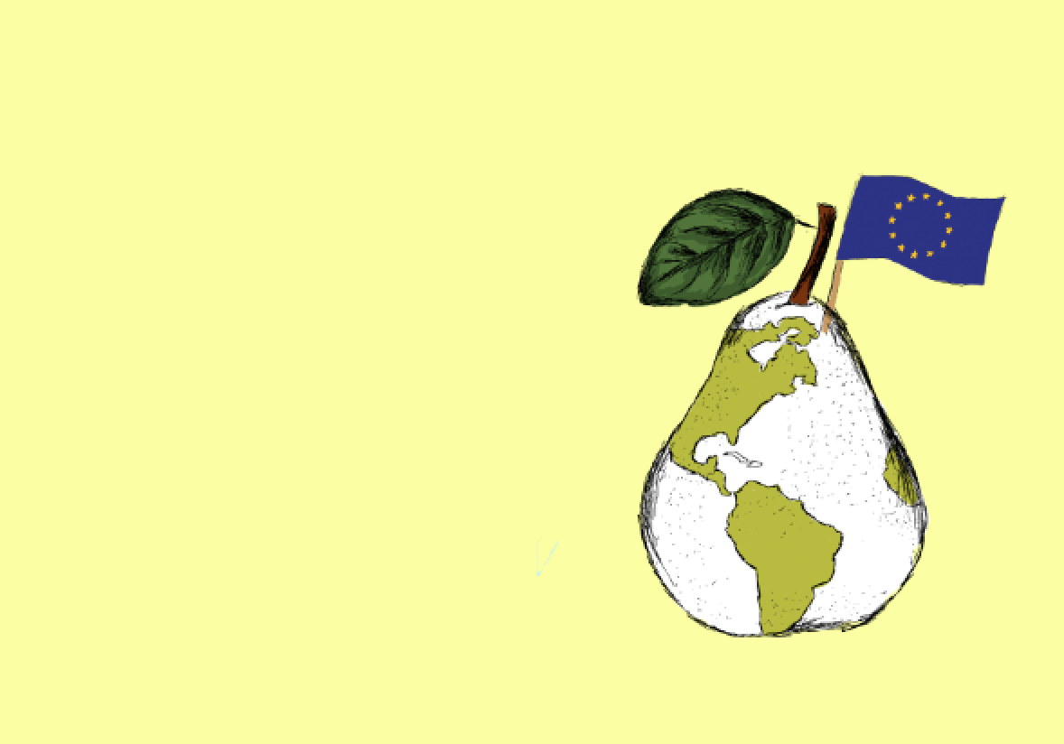
I then began adding flags to ensure the message was easily recognised from the target audience. I added the colour of the fruits to the countries to signify the world being part of the fruit themselves and the skewer flags ensuring the audience to know exactly where these fruits have travelled from.


I then began creating 3 separate outcomes adding in extra globally recognised items to ensure the message I was getting across for example the farming tools. I decided on having one side of the design to be purely visual being the first point of focus to ensure the audience can understand the first message. Then with a simple word in the four languages discussed previously to add to the visual communication.


Here is an example of the development of the second outcome visually communicating the travel of the fruit from the farming of the fruits.

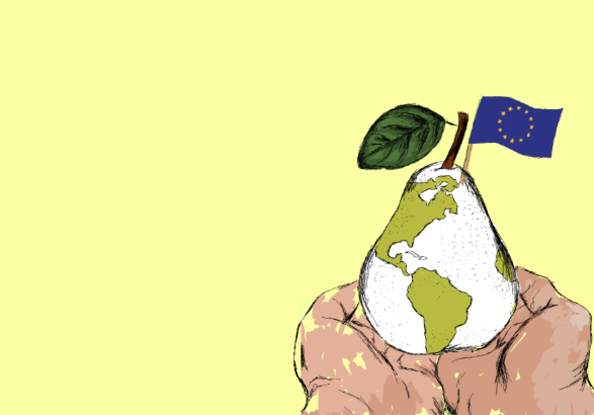
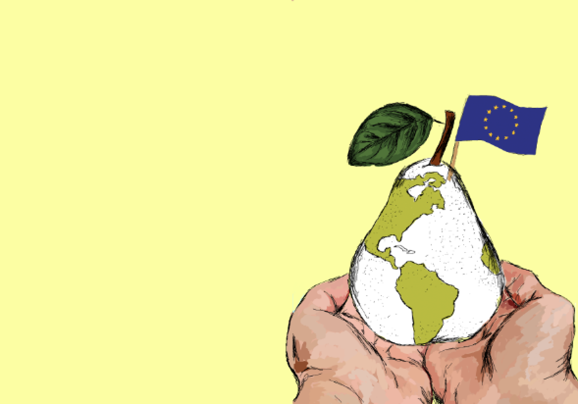

Lastly it was the final outcome that had to have a lasting effect on my target audience. The idea was to have the fruit in the workers hands communicating to the audience that the fruit has been produced from around the world by many different people is now in your hands. This has been developed in this way to suggest the preciousness of what is in their hands relating it to the world. The colour schemes used in these outcomes are to relate to the fruit used in each outcome ensuring that it was consistent throughout along with the layout design which I feel works well in creating a hierarchy of information throughout giving visual communication also.


Here is the final outcome. This is to be displayed on screen in a loop to ensure cleanliness of the workplace as well as creating an interesting loop for the workers themselves also showing a journey. I feel on screen this will be a much better way of displaying these kind of graphics due to the waste of paper by posters themselves. This means that the graphics can be changed regularly ensuring that the workers do not get bored without wasting lots of paper by changing posters.
