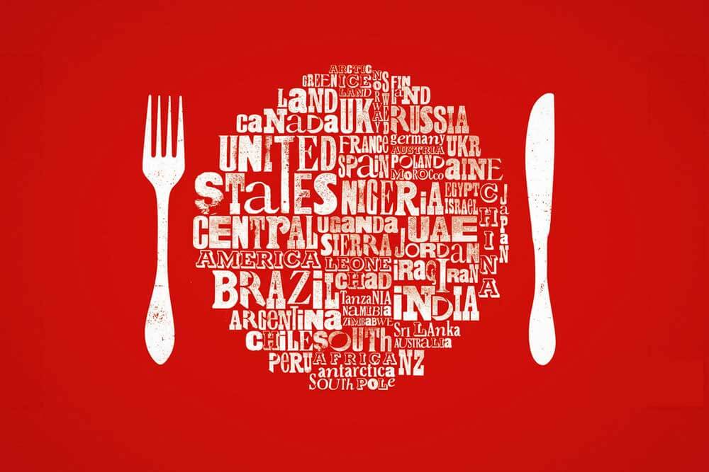
From my previous research of famous quotes I am going to be looking into much smaller quotes which would focus more on the typographic side of this project.
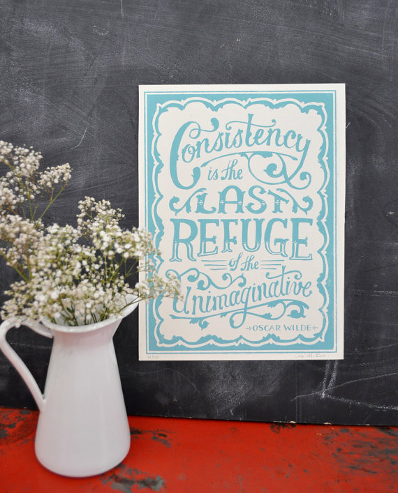
I don’t want to earn my living; I want to live. –Oscar Wilde
Work hard. Dream big.–Unknown
Be the change you wish to see in the world. –Unknown
‘”Live and let live.” — Yiddish Proverb
“Life teaches, Love reveals” — Anonymous
“Life is a choice.” — Anonymous
“Reach for the stars.” — Anonymous
“Nothing ventured,nothing gained.” — Anonymous
“Whatever happens, take responsibility.” — Tony Robbins
“Dance lightly with life.” — Jonathan Lockwood Huie
“Earth laughs in flowers.” — Ralph Waldo Emerson
“Happiness Is A Choice.” — Barry Neil Kaufma
“Creativity is like electricity.” — Maya Angelou
“Happiness depends upon ourselves.” — Aristotle
“Nothing succeeds like success.” — Walter Winchell
“Success can’t be forced.” — Loretta Young
“Be curious, not judgmental.” — Walt Whitman
“Nature is my medicine.” — Sara Moss-Wolfe’
(http://hubpages.com/education/4-word-quotes, 20/1/17)
‘Change is Good’
‘Believe in Yourself’
‘Never Stop Dreaming’
‘Learn From Yesterday’ *
‘I ‘M Possible’*
‘Make it Happen’*
‘Never Look Back’*
‘Be As Water’ – Bruce Lee
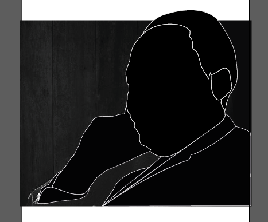
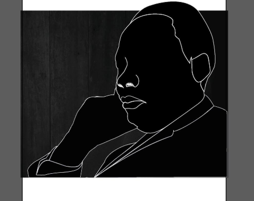
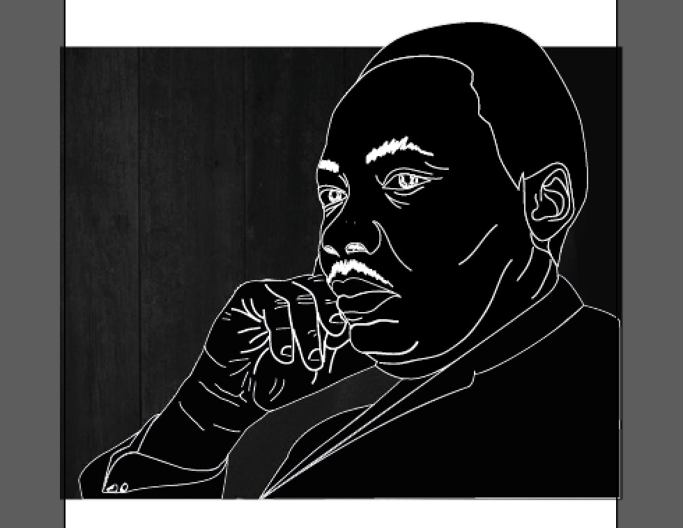
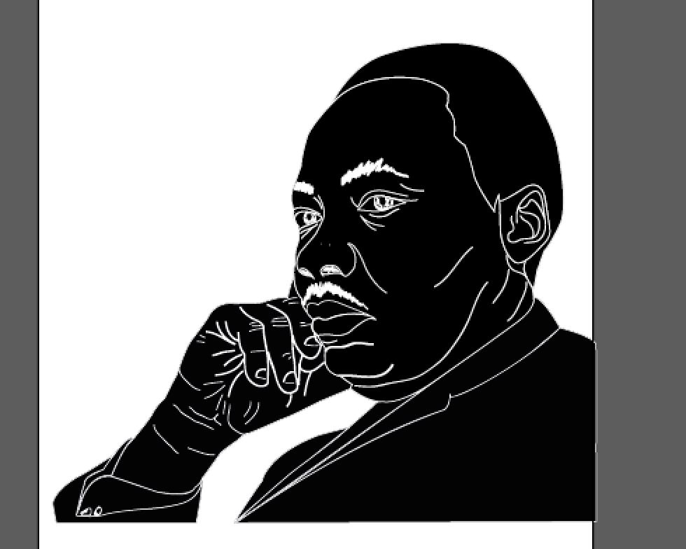
‘I have a Dream’ Martin Luther King Jr.
Lord Tennyson
Knowledge comes, but wisdom lingers.
Charlie Chaplin
In the end, everything is a gag.
William Shakespeare
Frailty, thy name is woman!
Virgil, Aeneid
Fortune favors the brave.
Winston Churchill
A joke is a very serious thing.
Will Rogers
Everything is funny as long as it is happening to somebody else.
Mohandas K. Gandhi
Where there is love there is life.
Mohandas K. Gandhi
An eye for eye only ends up making the whole world blind.
William Shakespeare
Brevity is the soul of wit.
An eye for an eye leaves the whole world blind. –Mahatma Gandhi
Familiarity breeds contempt.–Aesop
You can’t always get what you want.–The Rolling Stones
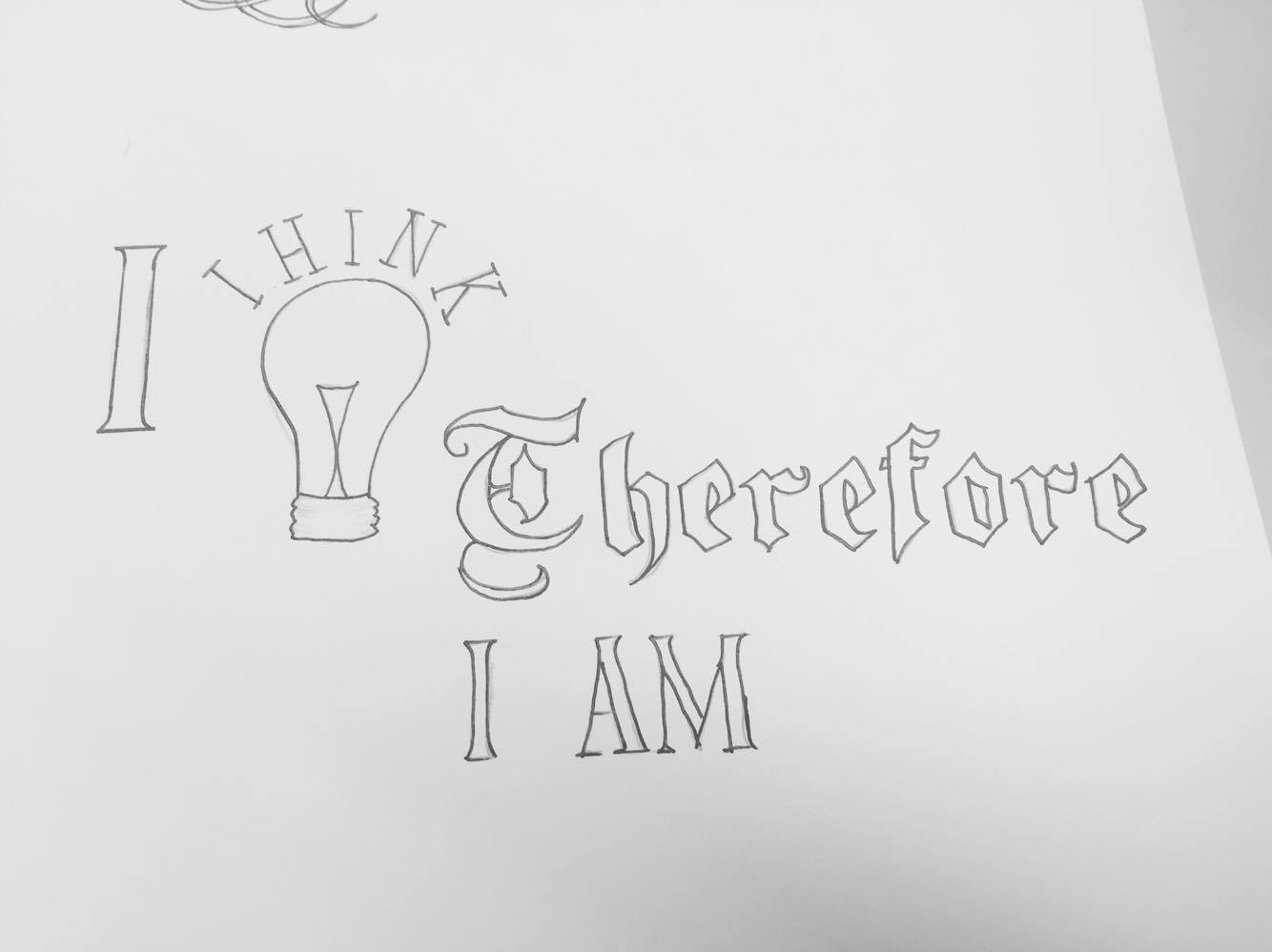
I think therefore I am. – Descartes
Time is money.–Benjamin Franklin
“Be yourself; everyone else is already taken.”
― Oscar Wilde
From this research I have been considering using a quote that could be relatable or to adults and early adults both men and women. From looking at these quotes in depth I have decided to experiment ‘I think therefore I am’ as I feel this quote is recognisable and could be interesting is playing around with different stresses and sizes of words can really be developed to describe the quote itself. I also feel this quote is appropriate for a t-shirt design for both men and women.
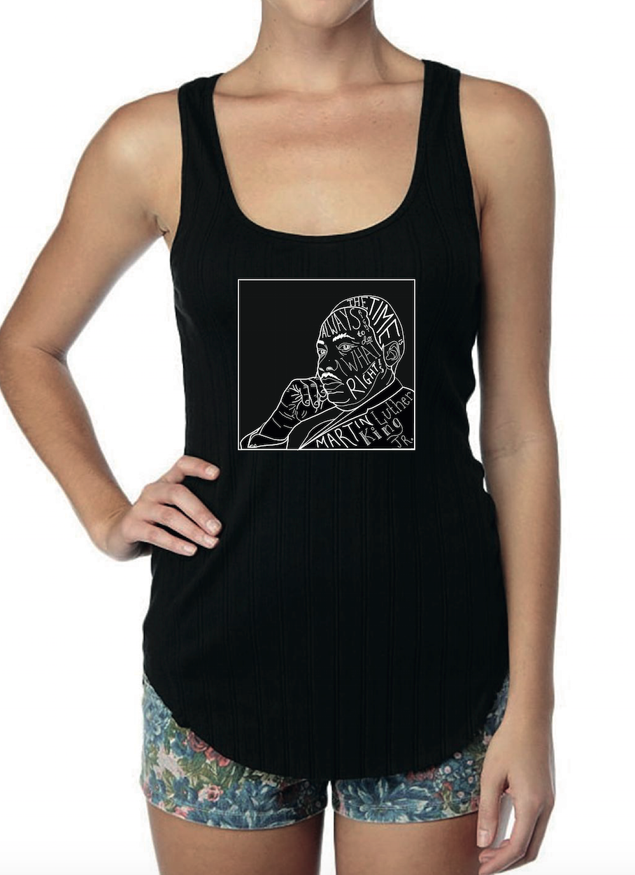
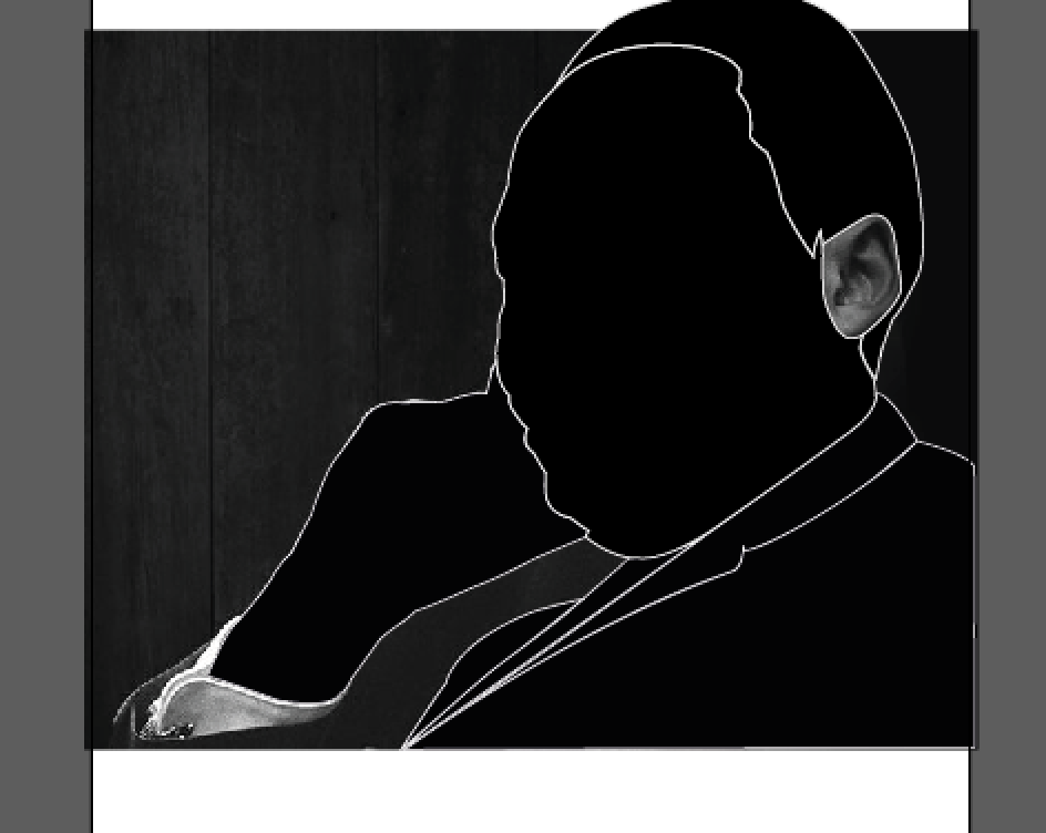
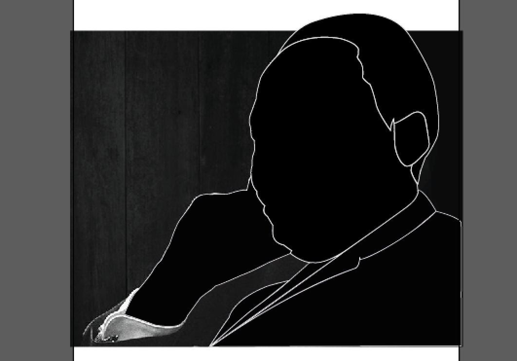
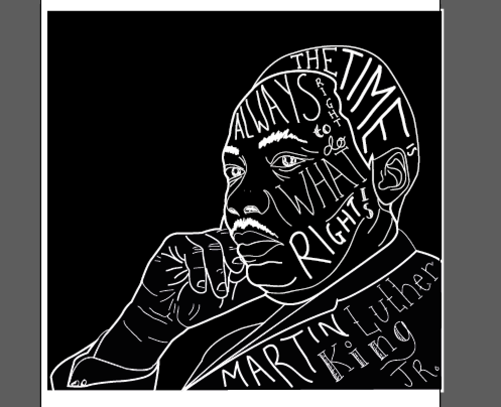
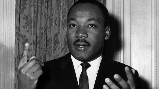
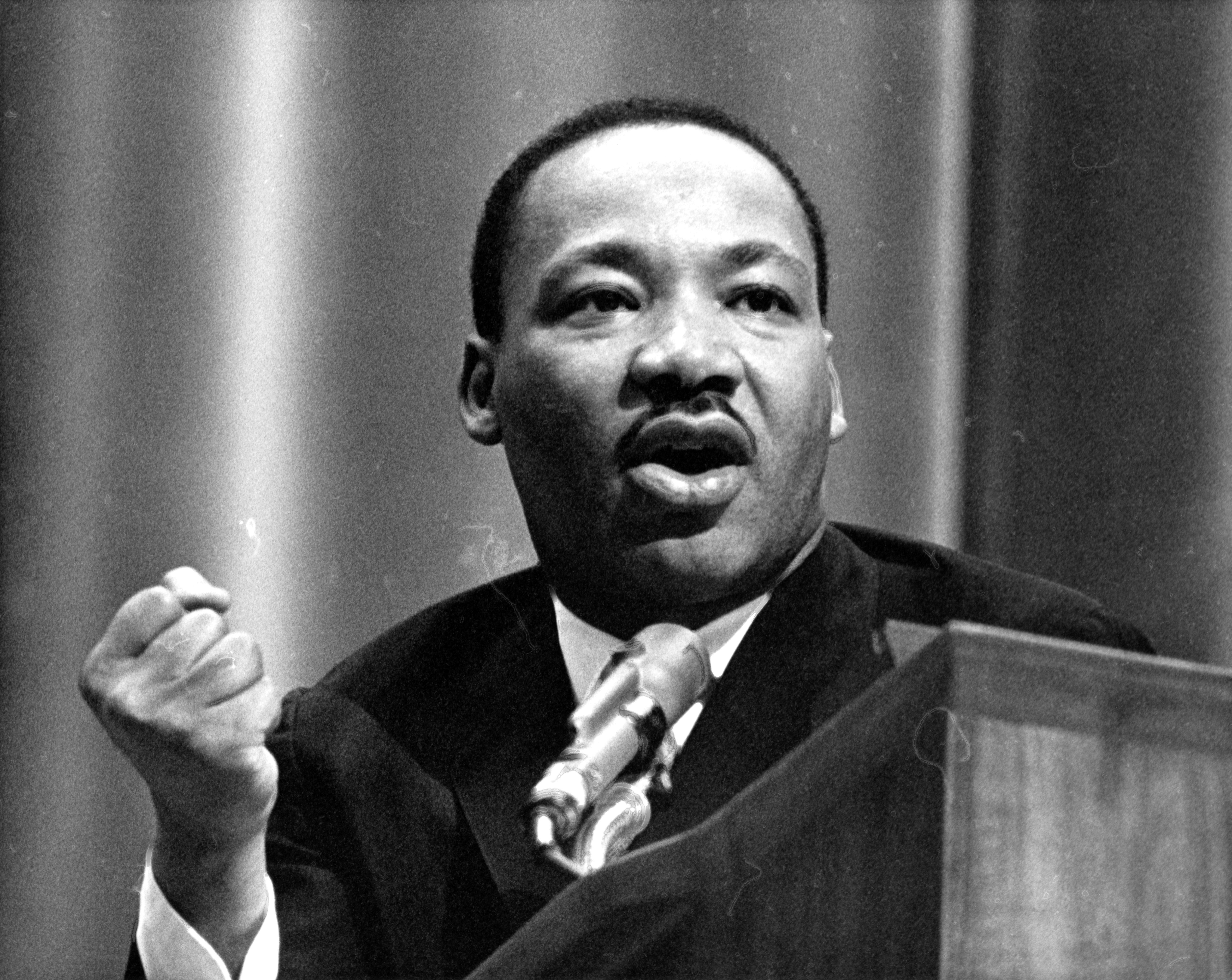
Another quote in which I will be experimenting with is ‘The time is always right to do what is right’ (Martin Luther King Jr.). As I feel this is also a very relatable quote to both men and women and could open up many pathway in which this could be designed. I feel this quote is also appropriate for a t-shirt brand on quotations.