Toy Machine Characters.

Before beginning the design process I feel it is important to know the most commonly used characters to have a basis to work from to create designs that would consistently be recognised to the brand itself.

From this I will be using these characters or possibly creating a new character from these to create designs for the new summer series of skateboards.

Research – Promotional Items

I have decided to look into different existing promotional items to see what different routes I can go down with my brief.

Here are a few examples that I found.

The most common promotional items I found were the simple mug, memory stick and pen. For this project I didn’t want the promotional item to be too typical and plain so I decided to look for more unique promotional items that would attract an audience to a company.

When looking at these promotional items I found they had used something quite simple as a promotional item but turned it into something interesting that is unique to that company which would be more likely to attract the target audience.

Research – Drawing Characters.

Before I begin the design process I feel it is important to look into the process of drawing characters as this is the basis of the brand toy machine. This video explains the design process of creating different characters and how it can be done.


This video has given me an insight into proportion and creating different faces on characters. On the other hand I need to ensure I am fitting with the characters of Toy Machine to ensure that it is recognisable.

Glass Skateboard – Is it possible?

I began looking into if it was possible to get a glass skateboard for my advertisement piece and this was impossible with my budget but I did find a mirror skateboard which could also have the same effect.


When looking into this I wanted to check that I could sandblast my design onto it so I called the company and asked the questions which were all fine. He also suggested I could use a sandblast effect spray to create the same effect which I going to experiment with.

Advertising Item Mind Map.

To create some unique ideas I decided to carry around a divergent thinking task to think of as many different things that would ‘make a skateboard interesting’

From this what caught my eye was a glass skateboard. To me this would be a interesting way to catch my target audiences eye as its something yes you cannot necessarily skate on but something they may not have seen before. I thought the design could be sandblasted on which would create a unique interesting design.

Skateboard Company Advertising.

For the advertisement piece for the new summer range of decks I decided to look into different existing advertisements from skateboard companies to get some inspiration and see what works well in catching the audiences attention.

To begin with I decided to look at some interesting advertisements that Toy machine have done to help me think of different things I could do for my advertisement piece.

Above is an advertisement piece that caught my eye for an item that Toy Machine sell called bearings. I felt this was a more interesting way to attract an audience rather than the typical poster. I think the way they incorporated the character was an effective way in promoting the brand as its recognisable to skateboarders which I would like to get across to my target audience.

I found this as something they posted from their fan art which to me was very interesting and although wasn’t intended as an advertisement piece could be a good one as it is unique and interesting which will make an audience interested.

I decided to have a look at route one a company which sells many brands of skateboards and clothing for the skate scene to look a the way they advertise these brands through visual merchandising. I found that typically skateboards are placed on a wall in some way stacked together with different brands hiding some of the graphic which to me wasn’t exciting in any way.

From this research I have decided that I would like to create something unique and interesting to attract my target audience to these new brands of skateboard decks.

‘Skateboard Ranges’ – Visual Communication.

I felt it was important to look at different existing seasonal ranges of skateboards to see how they relate to the seasons using either there graphics or typography to put the message across.

Firstly I will be looking at an existing spring range analysing how they relate to spring or if they do at all.

When looking at these I like the way they have incorporated summer in some aspects into characters like the ice cream but also how they have used some aspects of summer and created things that you wouldn’t necessarily relate. I think the colour schemes work well and like how they have used colour opposites to make the graphics stand out on the bottom on the board.

After looking at this I realised I have to take composition and layout very seriously in this design process to ensure that the graphic fits the board shape and works with it.

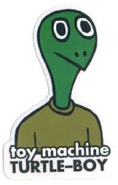
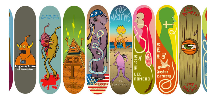
From looking at this range I decided to look at different ranges of Toy Machine decks to see what themes they use and how they make each of the designs in the range consistent.

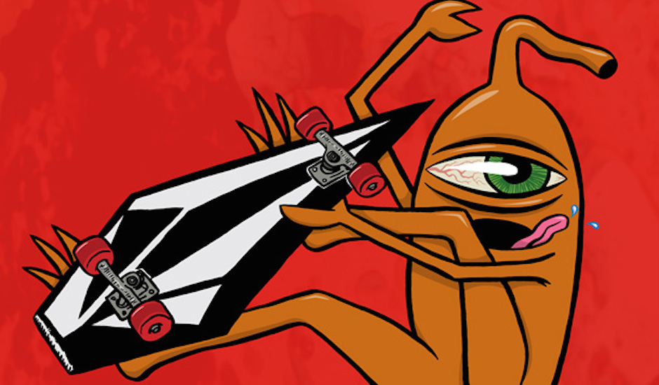
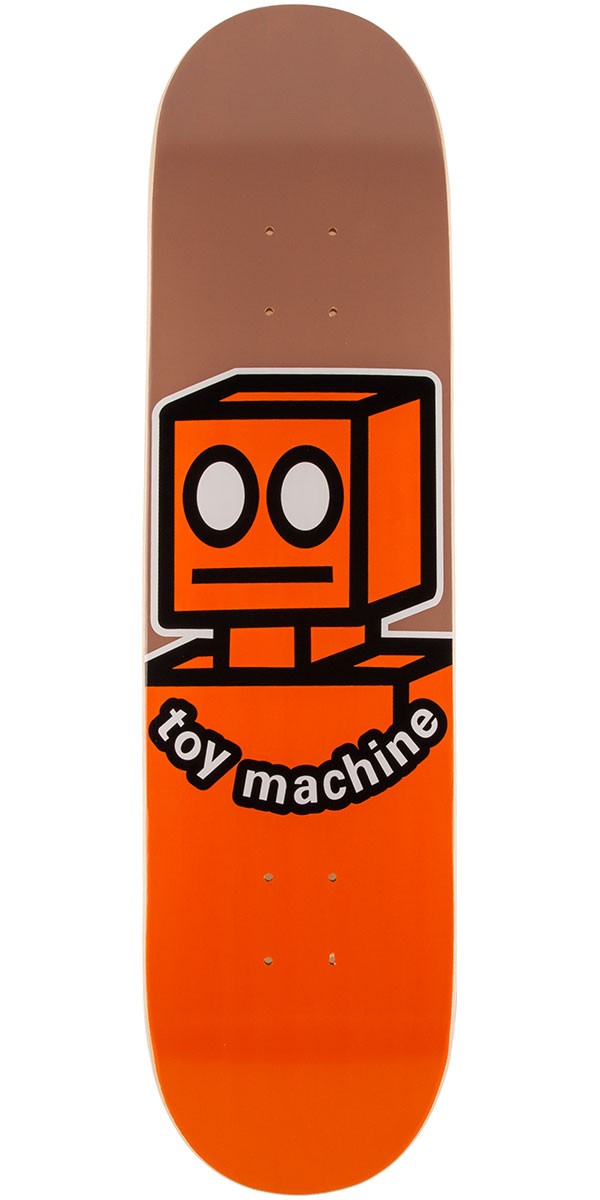
Looking at this series from Toy Machine They have used consistent theme of style and layout with the different characters. Each of the characters are the same length but different in colours and have mostly the same eyes and feet. I must ensure that my designs are consistent to ensure they look like a series and not completely separate.

When looking at this design I saw some inspiration which was the shark design which caught my eye with it being a summer range of skateboards. I thought it was interesting the way they had used one of the characters to create a shark to relating it to the brand.

Skateboard deck design research.

I decided that it would be important to look into different brands of skateboards to see what different designs they use for inspiration for my skateboard deck designs for toy machine. I have decided to focus on skateboard brands that use characters and similar designs to help fit the brief when I begin the design process.

To start I have decided to look at ‘Welcome’ skateboards. ‘Welcome is an inherently subjective and creative skateboard company. It’s about skateboards, sorcery, fun and dreams made real. They create skateboards that make you feel like you are a sorcerer! “While others take themselves seriously and not their product…we take our product seriously and not ourselves.” They are not only of the highest quality, but they are unique, with artwork that is hand-drawn and shapes that are fun to ride.’ (http://www.peopleofprint.com/general/welcome-skateboards/, 13,2,17)

When looking at these designs, although they are very different character styles they catch the eye with bright colour schemes like toy machine and would be good to try when designing.

I also found a style of ‘girl’ decks that caught my eye with the colours and unusual characters designs in which could be could inspiration for my design process. I feel the way the colours contrast work well and the colour scheme to  me gives a summer feel which I would like to communicate in my designs.

*From this I am going to be looking at different ranges of skateboards to see what elements relate them to different seasons or if they relate at all.


Research – Ed Templeton Skateboard Designer/Artist.

“Hi, my name is Ed Templeton. I’m from Huntington Beach, California, and depending on what hat I’m wearing, I’m a skateboarder, an artist or a businessman.” – ‘Edward (Ed) Templeton started skateboarding seriously in 1985, worked for and founded a skateboard company in the 1990s, where he was, among other things, a graphic designer. By 2000 his remarkable hyper-documentary “Teenage Smokers” won a $50,000 award in the Search For Art competition in Italy. He’s a featured artist of Beautiful Losers, a touring art exhibit, collectible art book, and featured documentary that depicts skateboarding and other urban themes. In 2008 he published “Deformer,” a summary of his personality as an artist that tracks his human and aesthetic growth in “the incubator of suburban outskirts” of Orange County, California.’ 

(http://blog.leica-camera.com/2012/06/13/ed-templeton-a-professional-skateboarder-turns-artist/, 13/3/17)

I decided to look at Ed Templeton as he is an existing designer/artist for Toy Machine skateboards. I want to look into his work to see what kinds of designs he does and how they fit/make the Toy Machine style.

When looking at his designs I found them very ‘alien-like’ and focuses on bright colours throughout. He also consistently uses a cartoon style which I need to create in my designs to make sure It fits with the cartoon style. I also need to stick to the mostly hand created type or the same style of the logo type.

FMP Proposal.

FMP Proposal – Charlotte Martin (BA)

Aims: The aim of the brief is to design 2 graphics for the exclusive summer 2017 range of ‘Toy Machine’ skateboard decks as well as an interesting advertisement item for this particular range and a promotional item. The focus point on this project is to make sure it is recognisable/consistent with the existing brand but to add a summer element to the designs to relate it to being a summer exclusive.

Specific Individual Outcomes:

2 Skateboard decks, 1 Advertising Item of choice, 1 promotional Item

Research & Methodology: I will be researching the company ‘Toy Machine’ looking at there existing designs to ensure that the aims are met using websites like http://www.routeone.co.uk, www.rollersnakes.co.uk to look at different designs of skateboards for research and of course there official website www.toymachine.com to ensure the consistency of the brand. I will also be interviewing local skateboarders carrying out surveys to ensure primary research from my target audience is met. I will also be looking into illustration artists like Ed Templeton and the style of pop art.

Testing Outcomes: To test the appropriateness of my work in progress I will carry out surveys with my target audience to ensure throughout the design process. I will be using a blog to evaluate the design process throughout ensuring I will be reflecting on the design process then acting upon those evaluations showing screen shots to explain the improvements of the outcomes. Throughout the process I will be carrying out research to improve the designs evaluating the research and concluding what I may have got from this.

Experimentation: During this project I am going to try to experiment as much as possible with different processes to see how far this outcome can go ensuring that it is appropriate for the outcomes.