Reflecting on these outcomes, I feel they fit the brief very well focusing on the summer theme and is consistent with the existing brand I was designing for. I feel the selection of outcomes work well as a consistent and suitable design and have a unique/interesting feel to them which I was trying to get across to attract the target audience of skateboarders and new people to skateboarding. I feel each part of the design process has been developed in great depth and every detail has been considered throughout each of the process’ of the final outcomes. I feel the experimentation with different styles of printing and cutting using a variety of materials throughout has given me more of an insight to the production of design and in reflection to this it is good to have learnt these different techniques for future design purposes.
If I could have developed this project further I would have considered designing and making a clothing brand for this particular series as a form of advertisement and brand recognition. I would have also like to have experimented with different process’ that I have used previously in my work for example screen printing the skateboards myself to make my design more sustainable. I also would have liked to design more skateboards to add to the series to really create a much larger scene for my target audience to choose from.
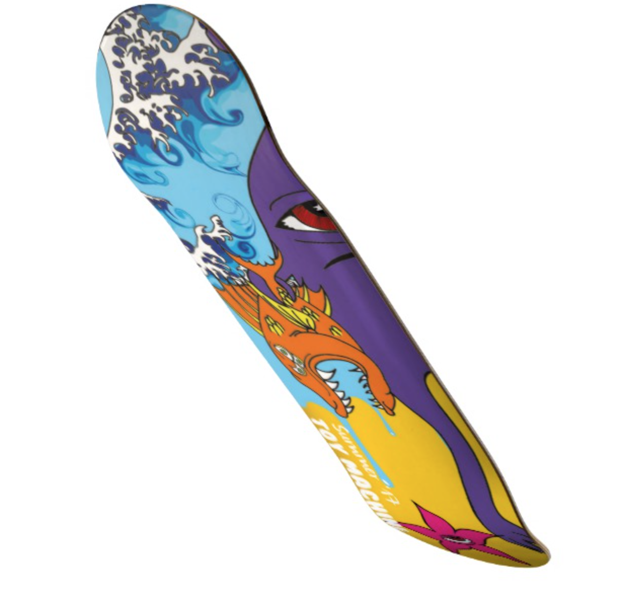
I think the illustrations for the skateboard decks work well in conjunction to the theme of summer as well as being consistent with the design. I also feel that I have adapted well to the style of the artist ‘Ed Templeton’ which I have got most of my inspiration from for this project. If I could change anything about the decks themselves I would have liked to make the design fit the skateboards better with the idea that the two fit together.
I feel the typography used in these outcomes work well within the design and also have a hierarchy of information which is necessary for this piece as well as a consistent typeface used between two items and the third being similar to create recognition within the brand itself. I feel this project has developed over time and has finished with three very successful outcomes suitable to the brief at hand.


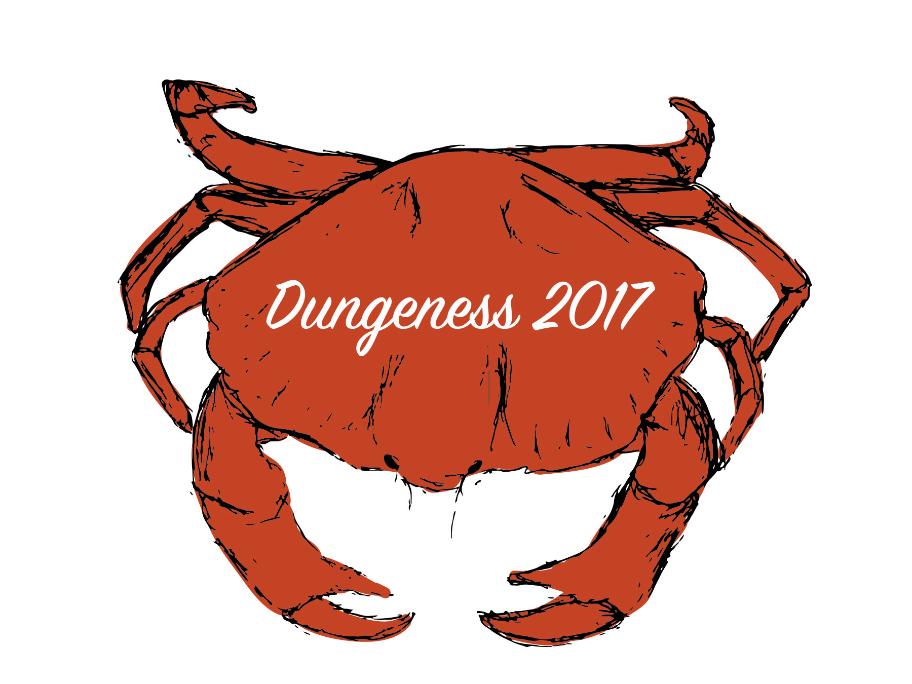
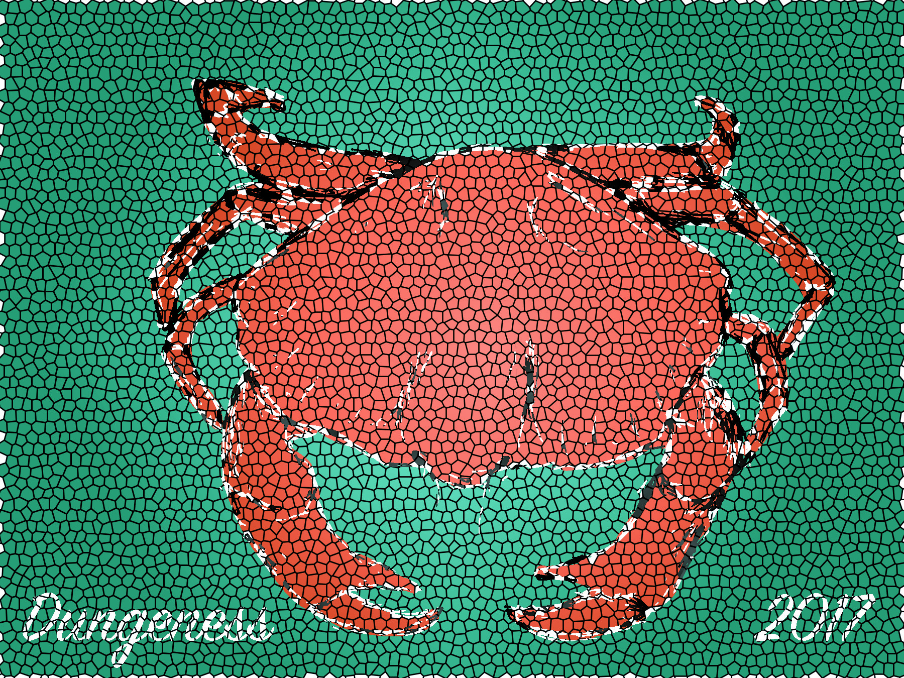
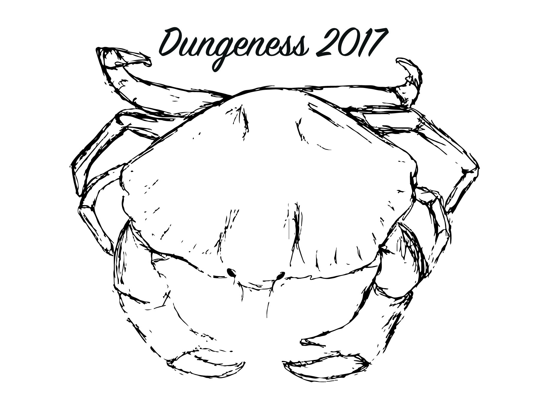 I began playing around with different tools to darker the sketch I had produced to keep the sketched look. I also began playing around with different placement of typography to see what worked and what did not.
 After doing this I decided to experiment with colour so make the image stand out on the white background. I also experimented more with the text placement as well as colour.