Development/Reflection.

To start I began sketching the designs from images of the typical brown crab found and caught at Dungeness and bringing it onto the computer for editing.
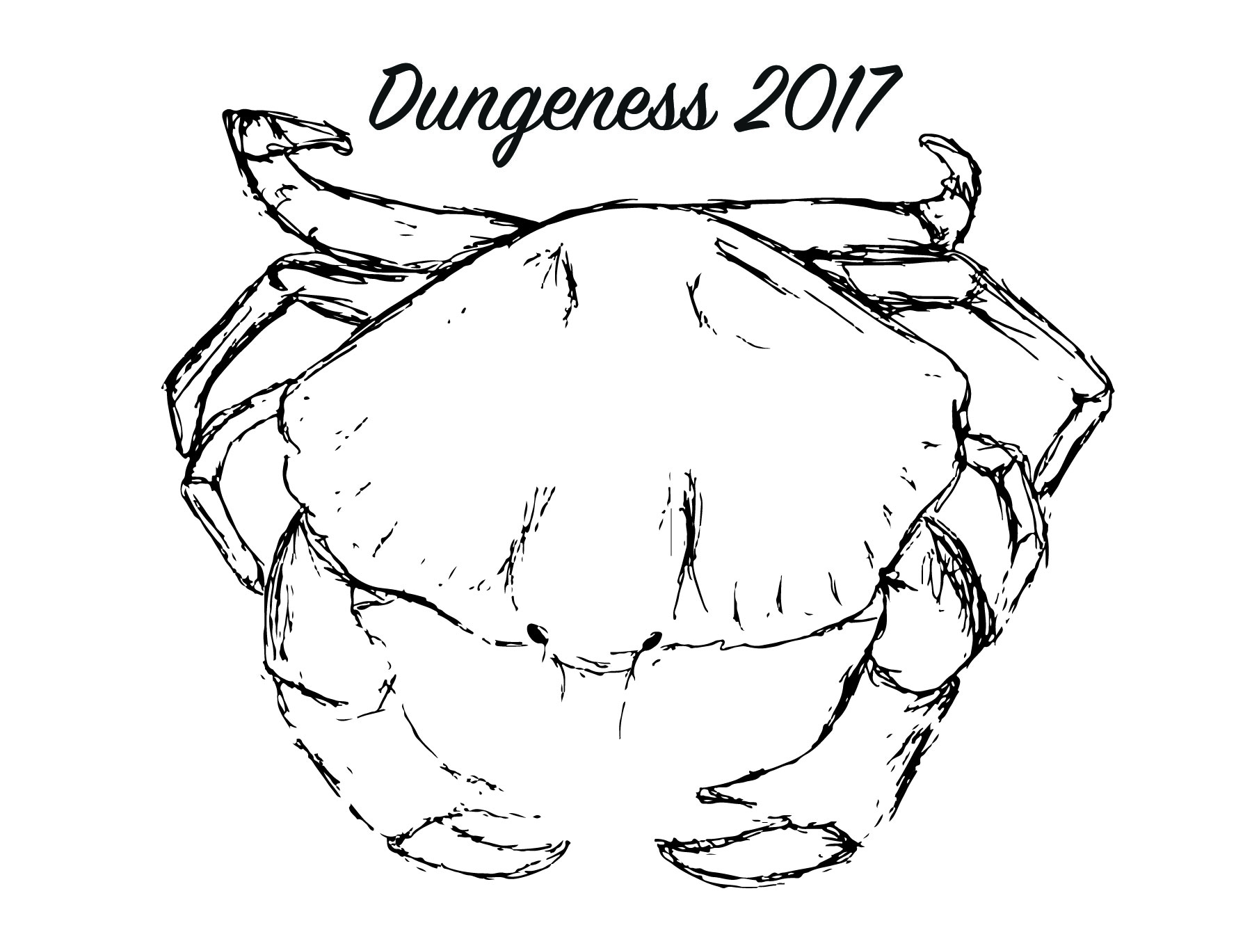
I began playing around with different tools to darker the sketch I had produced to keep the sketched look. I also began playing around with different placement of typography to see what worked and what did not.

After doing this I decided to experiment with colour so make the image stand out on the white background. I also experimented more with the text placement as well as colour.

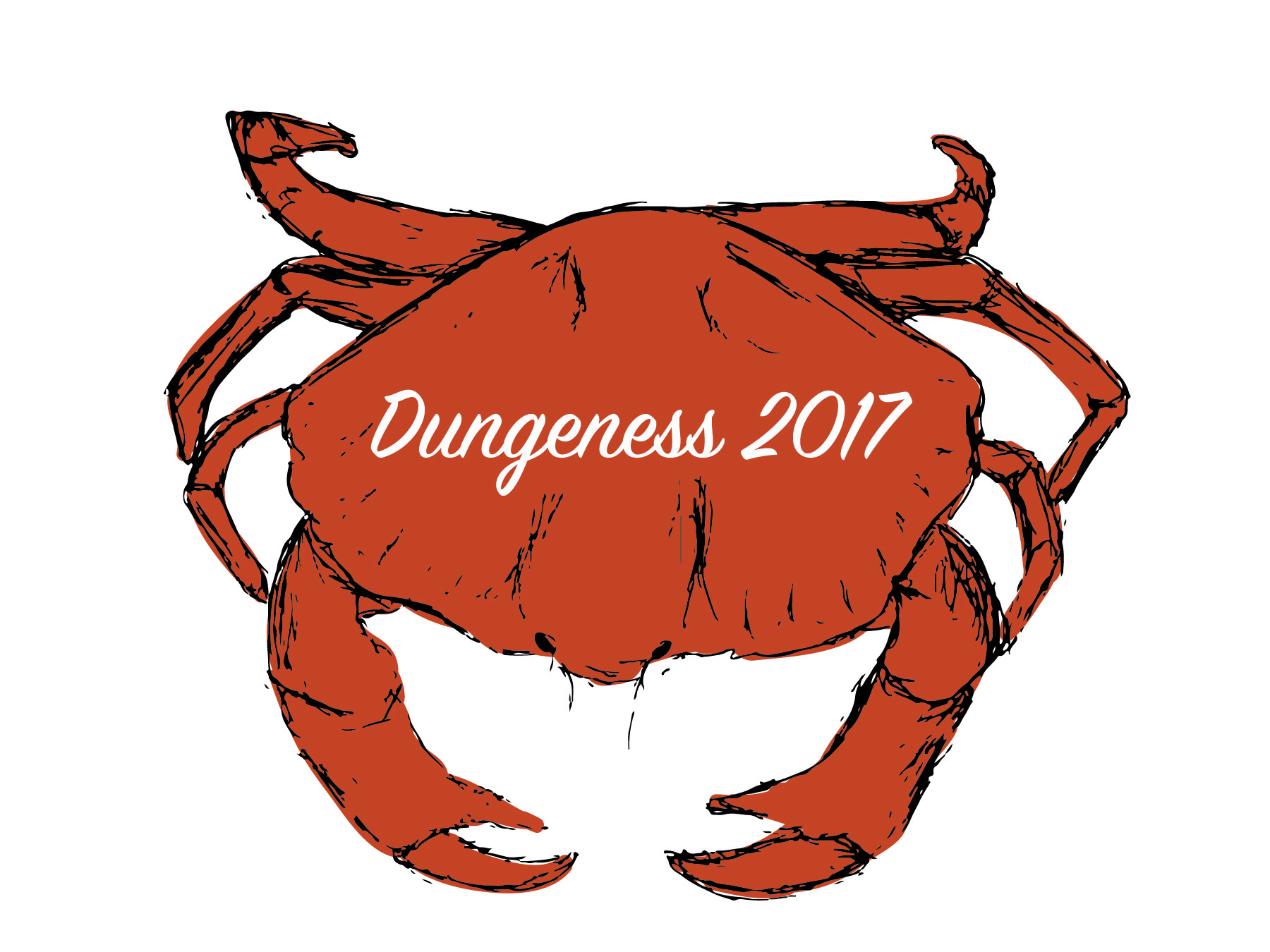
After looking at this piece I though it might be interesting adding a background. I chose this particular colour to signify the sea of Dungeness. I felt this worked well in conjunction to the colour of the crab.

I experimented further with placement of the crab and layout of the text but still felt it needed something else so I decided to experiment with the effects gallery and came up with the image below.

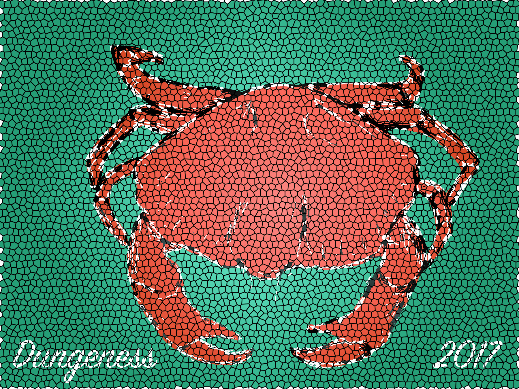
I felt this worked well with representing Dungeness with a arty mosaic feel as well as the element of the seaside.

Dungeness.

The brief for this project is to design a postcard based on the place Dungeness.

To begin this project I decided to visit the area and see what it was like to get a feel for it. I also decided it would be good to carry out research on things about Dungeness’ beach and what reminds people of it.

The things I found most was abandoned boats, interesting rubbish on the beach and little sheds and huts and some crabs. From this I decided to sketch some scenes and see what I came up with.

Evaluation and Reflection.

Reflecting on these outcomes, I feel they fit the brief very well focusing on the summer theme and is consistent with the existing brand I was designing for. I feel the selection of outcomes work well as a consistent and suitable design and have a unique/interesting feel to them which I was trying to get across to attract the target audience of skateboarders and new people to skateboarding. I feel each part of the design process has been developed in great depth and every detail has been considered throughout each of the process’ of the final outcomes. I feel the experimentation with different styles of printing and cutting using a variety of materials throughout has given me more of an insight to the production of design and in reflection to this it is good to have learnt these different techniques for future design purposes.

If I could have developed this project further I would have considered designing and making a clothing brand for this particular series as a form of advertisement and brand recognition. I would have also like to have experimented with different process’ that I have used previously in my work for example screen printing the skateboards myself to make my design more sustainable. I also would have liked to design more skateboards to add to the series to really create a much larger scene for my target audience to choose from.

I think the illustrations for the skateboard decks work well in conjunction to the theme of summer as well as being consistent with the design. I also feel that I have adapted well to the style of the artist ‘Ed Templeton’ which I have got most of my inspiration from for this project. If I could change anything about the decks themselves I would have liked to make the design fit the skateboards better with the idea that the two fit together.

I feel the typography used in these outcomes work well within the design and also have a hierarchy of information which is necessary for this piece as well as a consistent typeface used between two items and the third being similar to create recognition within the brand itself. I feel this project has developed over time and has finished with three very successful outcomes suitable to the brief at hand.


Good Design Evaluation.

When completing my brief I considered sustainability as much as I could throughout. During this project I considered making things to last rather than recyclable items as it wouldn’t necessarily have been suitable for this particular brief. During this project I used skateboard mirrors and a small metal keyring to ensure the product would not deteriorate fast to ensure the product could be used for a very long time rather than disposable and recylable. During this project I tried to consider the way the items would be used to ensure that the items would last. I definitely feel that I have considered ‘good design’ in this brief and feel the methods I have used have been successful in lasting.

Finished Promotional Item.

Below is the final outcome for the promotional item.

This promotional item came out exactly as planned. If I could have taken this further I would have liked to create mini skateboard decks from the summer series and put them on the keyring. However this was too expensive and impossible to produce for a one off. Overall this item fits the brief exactly as id hoped and is consistent with the other designs for this brief.

Promotional Item.

After researching exisiting promotional items and seeing how they relate to the brands itself I have decided to design something similar to my designs. I want to keep it simple yet consistent to my designs.

I have decided to go with a skateboard mirror keyring keeping the promotional item cheap to produce for the company and an item that wouldn’t break at first use.

I have decided to just use typography on this item as it is going to be very small in size and I wanted it to be legible.

I am going to keep my design simple but consistent with my other designs so will be metal to create the skateboard mirror recognition and the same typeface used on the skateboard decks in relation to those.

This is a very simple item and will just have ‘TOY MACHINE 2017’ engraved into it.

Promotional Item Sketches.

To begin designing this project I decided from my research to create some ideas.

This is what I came up with. I had to figure out what would work and what wouldn’t work from looking back at my research so after sketching I began writing things down to check up on to ensure I would get this right.

After seeing what was possible and what wasn’t I decided to go for the 3rd design with the two different views as this was going to be the cheapest and most suitable option for me. It could be made from metal to create the mirrored look like the advertisement piece and also engraved cheaply.

Step By Step – Skateboard Mirror.

I uploaded my design on to Cricut design space using my previous research and began cutting.

Above is a video I took of the machine cutting my design out.

I then began weeding the vinyl that was unneeded very carefully to ensure all of the mask stayed in tacked.


I finished the weeding process and begun using the transfer tape to transfer the vinyl to the skateboard mirror without loosing any of the details. This proved difficult and had to repeat the process again checking dimensions throughout because I lost some of the design.

After I fixed the vinyl on to the skateboard I began spraying the stencil every 30 mins applying many coats to ensure from my previous experiment using the spray that the design was completely opaque.

After leaving it to dry after copious amounts of spraying I peeled off the vinyl bit my bit to ensure I didn’t catch the design and below is the final outcome.

Overall I am very happy with the final outcome of this piece. If I could develop this technique further I would have liked to use different amounts of spray to create different depths to see how far this technique can go.

Preparing my design.

From my previous designs for the skateboard decks I wanted to ensure my designs were consistent to create recognition throughout so I began designing the cut out for the mirror skateboard based on my previous designs.

Here is what I came up with –

During the process I had to ensure I knew my design boundaries as there is trucks that cover the mirror in some places and how detailed the design might be.

I played around with different ideas based on my series of decks. Throughout I began simplifying the designs test printing throughout to see if the details would show well on the mirror and cut correctly using the Cricut cutting machine.

The designs all had to be simply black to ensure the Cricut design space would pic it up correctly so it knew exactly what I wanted cutting out and what I didn’t want cut.

After looking at each design and comparing the suitability for this particular design brief I decided that simplicity was key and to go for the last design to ensure this stood out to the audience and was not too busy or detailed. I also found that this would work best with applying the vinyl as using transfer tape is very tricky and can sometimes break detail in certain designs whereas this would not.

How to use Cricut Design Space.

To cut my design I will need to know exactly how to use Cricut Design Space. I have been looking at you tube videos to explain all of the tools and information on what you can use in this particular programme. It also gives information about how to set to cut with vinyl which is what I will be using for this project.

From this I know how I will use the machine and prepare my design for cutting.