
When completing my brief I considered sustainability as much as I could throughout. Using a paper/card material packaging as well as my labels to ensure the item could be either recycled or reused in some way. During this project I tried to consider the way the items would be printed to use the least amount of electricity possible which lead me to linoleum printing by hand. This form of printing can be used to create masses of the same thing pretty quickly with a nice quality hand made style which I was looking for. I definitely feel that I have considered ‘good design’ in this brief and feel the methods I have used have been successful. I also feel the design itself is a good way to make my audience think about ‘good design’ as I have been focusing on quotes by Martin Luther King Jr. which I feel makes people think about their personal impact on the world wether it being sustainable or just doing good in the world we live in.
Category: BA -APP – Project 2 ‘Quotations’
Evaluation.

Summing up these outcomes I feel they fit the brief very well focusing on typography and illustration using the word ‘quotations’. I feel the selection of outcomes work well as a consistent design and have a hand crafted feel to them which I was trying to get across. I feel each part of the design process has been developed thoroughly and every detail has been considered throughout this process. I feel the experimentation with different styles of printing and stamping using a variety of materials has given me more of an insight to the production of design and is good to have learnt for future designs. If I could have developed this project further I would have considered also designing and making a promotional item for this particular line as a form of advertisement. I would have also like to have experimented with linoleum t-shirt printing using fabric ink to make the design even more consistent. I also would have liked the bag to be of the correct size for the lino cut design so would have liked to make my own bag to ensure none of the design was missing.
I feel the typography styles work well within the design and also have a hierarchy of information which was experimented initially with hand drawn typography. I feel this project has developed over time and has finished with successful outcomes with layout, colour, and style.
Step by step screen printing t-shirts.
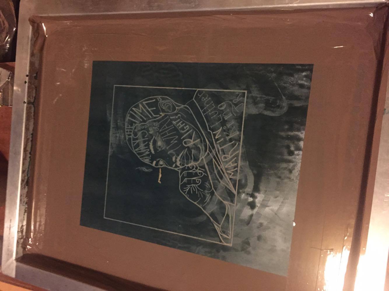
To begin the screen printing process I had to mix my emulsion and evenly spread it onto the screen using very little light as this could effect the print. This could not be photographed due to light exposure.
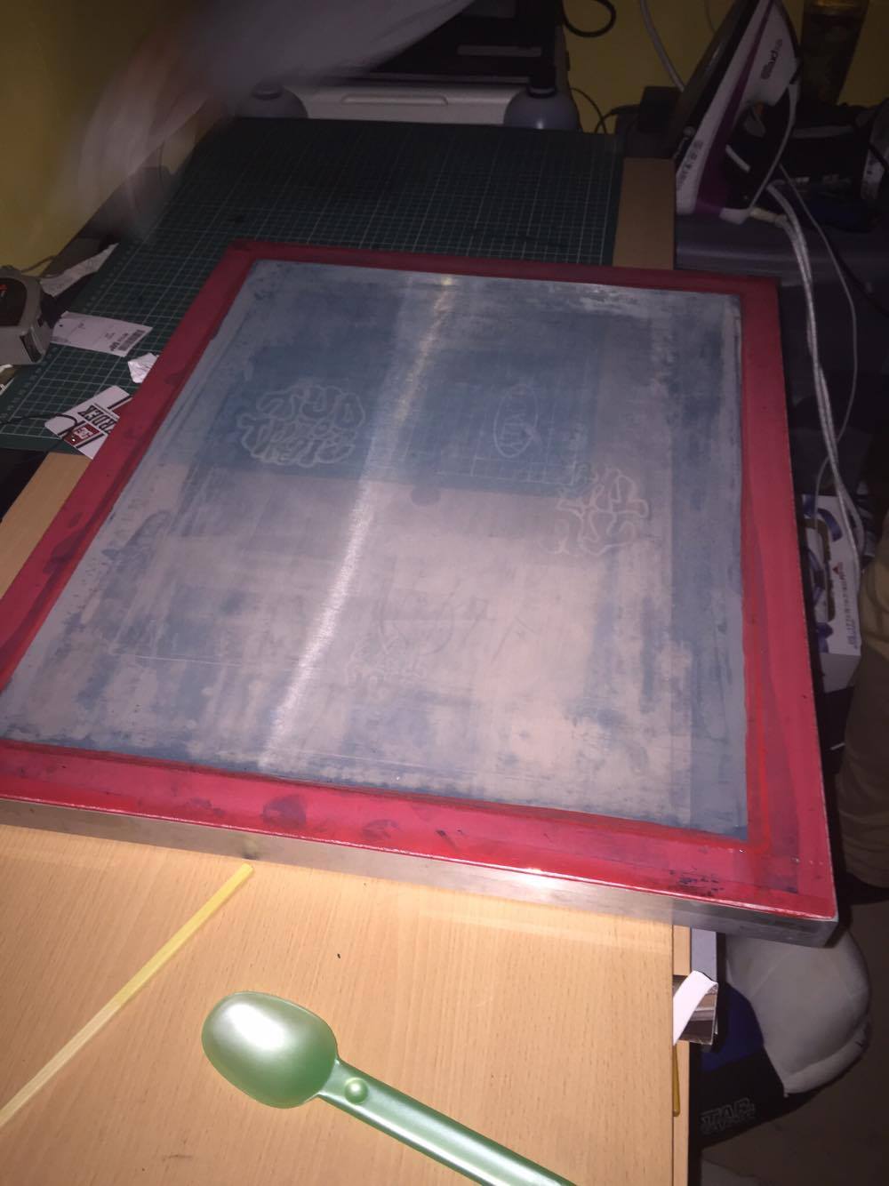
I then had to keep this is in a dark area for at least 24 hours before the next stage to ensure I didn’t expose the screen I kept it in a large cardboard box.
Whilst this was drying I then had to print my design onto acetate as the dark areas would be what is burnt onto the screen.
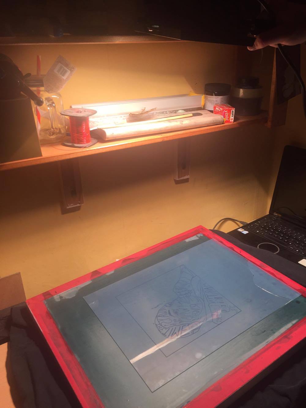
I then had to place the acetate design onto the screen when dry which would then be burnt onto the screen. To do this I needed a sheet of glass to encourage the image to burn onto the screen using light.


When placing the acetate I had to make sure It was reverse to ensure when printing it was the correct way round.
I then set a timer for 8 mins and began exposing the image using a halogen lamp at the correct distance away from the screen.
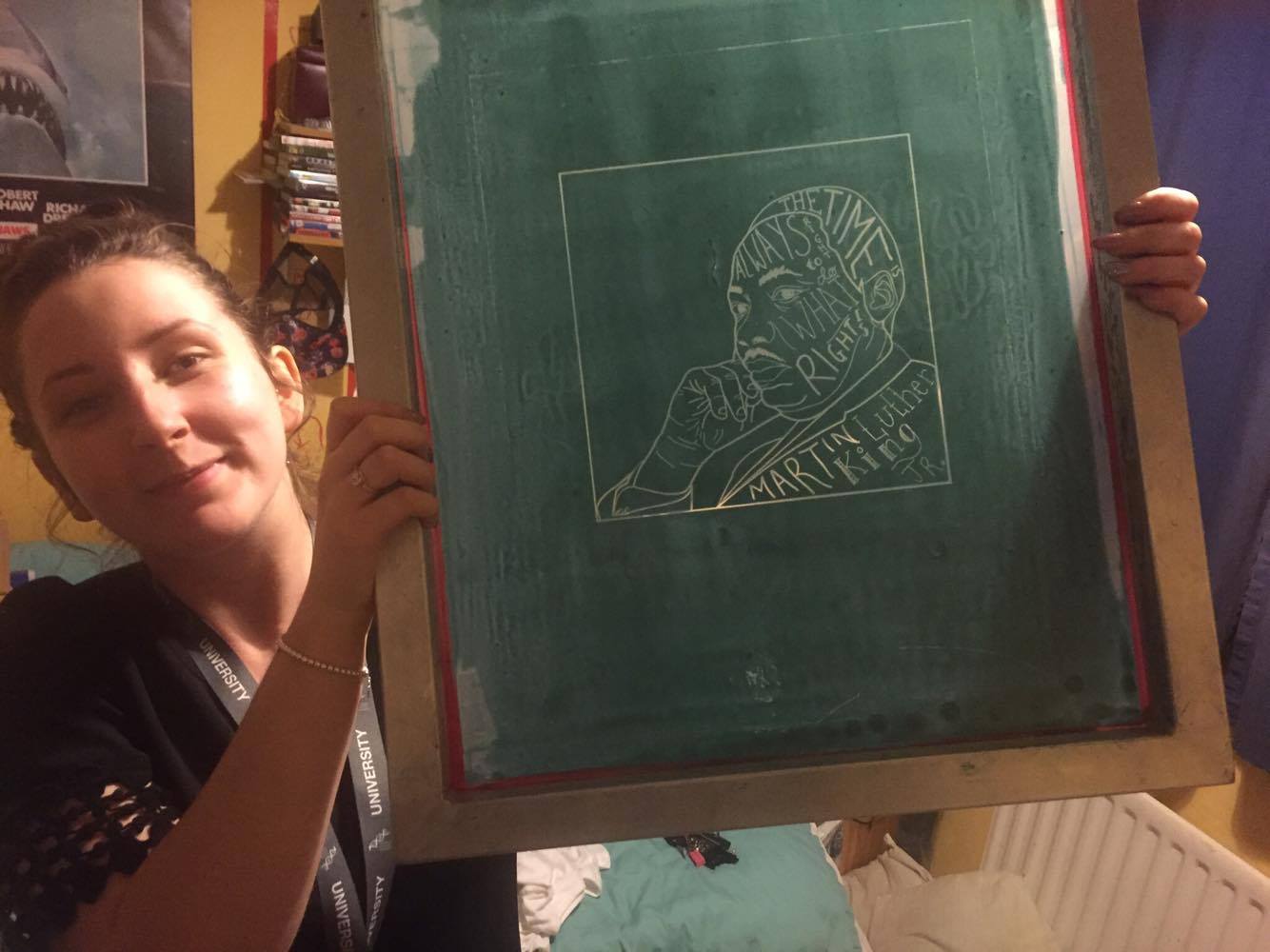
Before exposing I noticed a small hair on the screen in which I had to make sure was removed before exposing the image as this could cause extra exposure which could ruin the print and would have to restart.
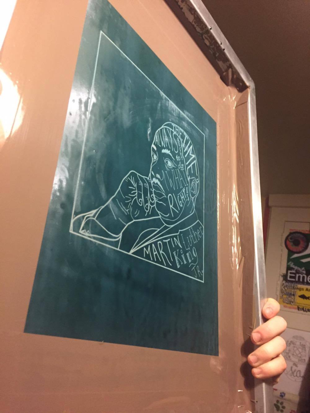
After exposing the image the screen them needed to be washed. I did this using a shower hose and a very soft toothbrush which reveals the image.
I then had to let the screen dry before printing. When the screen is dry it goes much darker in colour so I knew when it was ready to print.
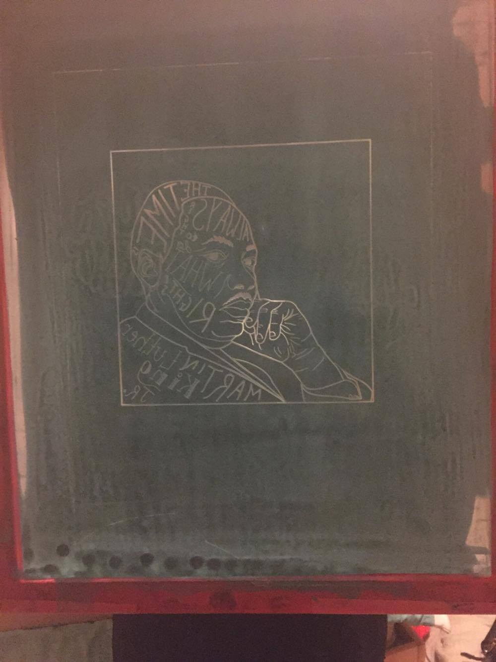
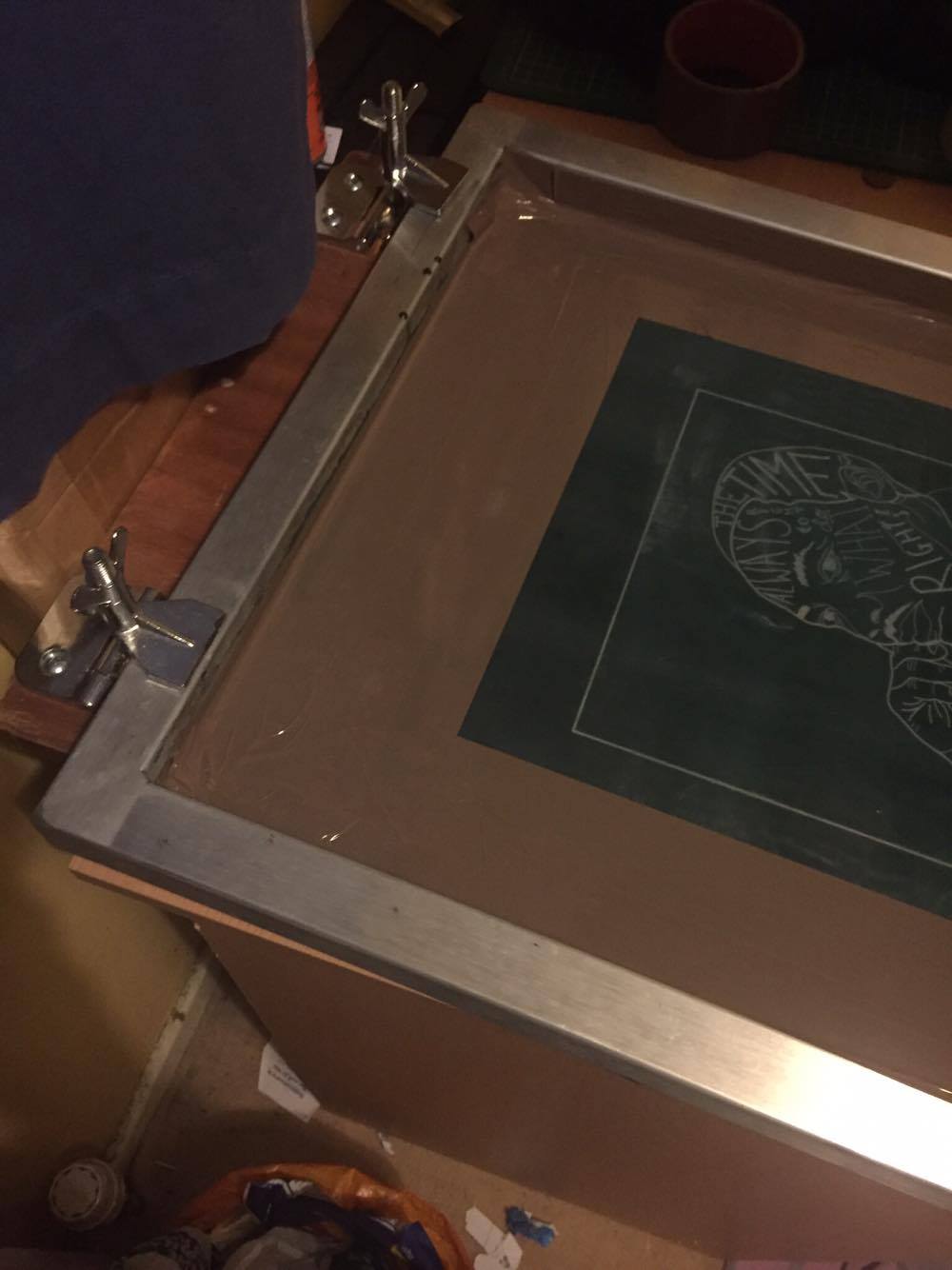
At this point there was a few imperfections around the screen so I then needed to use tape to cover them to ensure no ink gets through as well as taping the screen to protect ink from getting stuck around it.
Then I was ready to print. From this point I needed to clamp the screen down to keep it still and begin adding fabric ink to the screen.

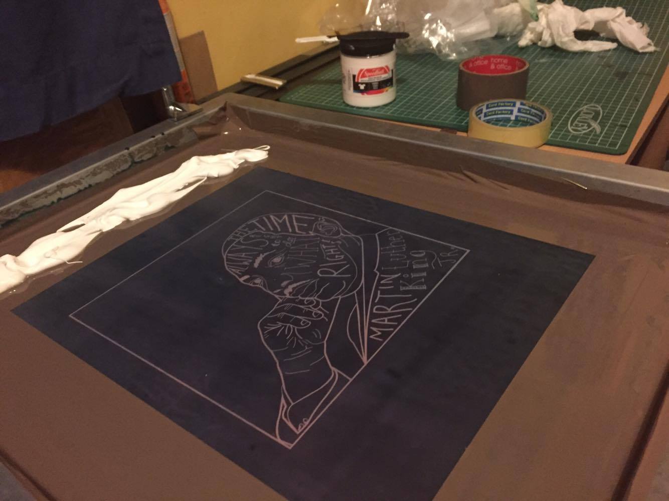
At this point using the squeegee I evenly spread ink across the screen to ensure an even print on my t-shirts.
Using my design placement experiment I made sure my t-shirts were in the correct position below the screen to ensure the placement was perfect.
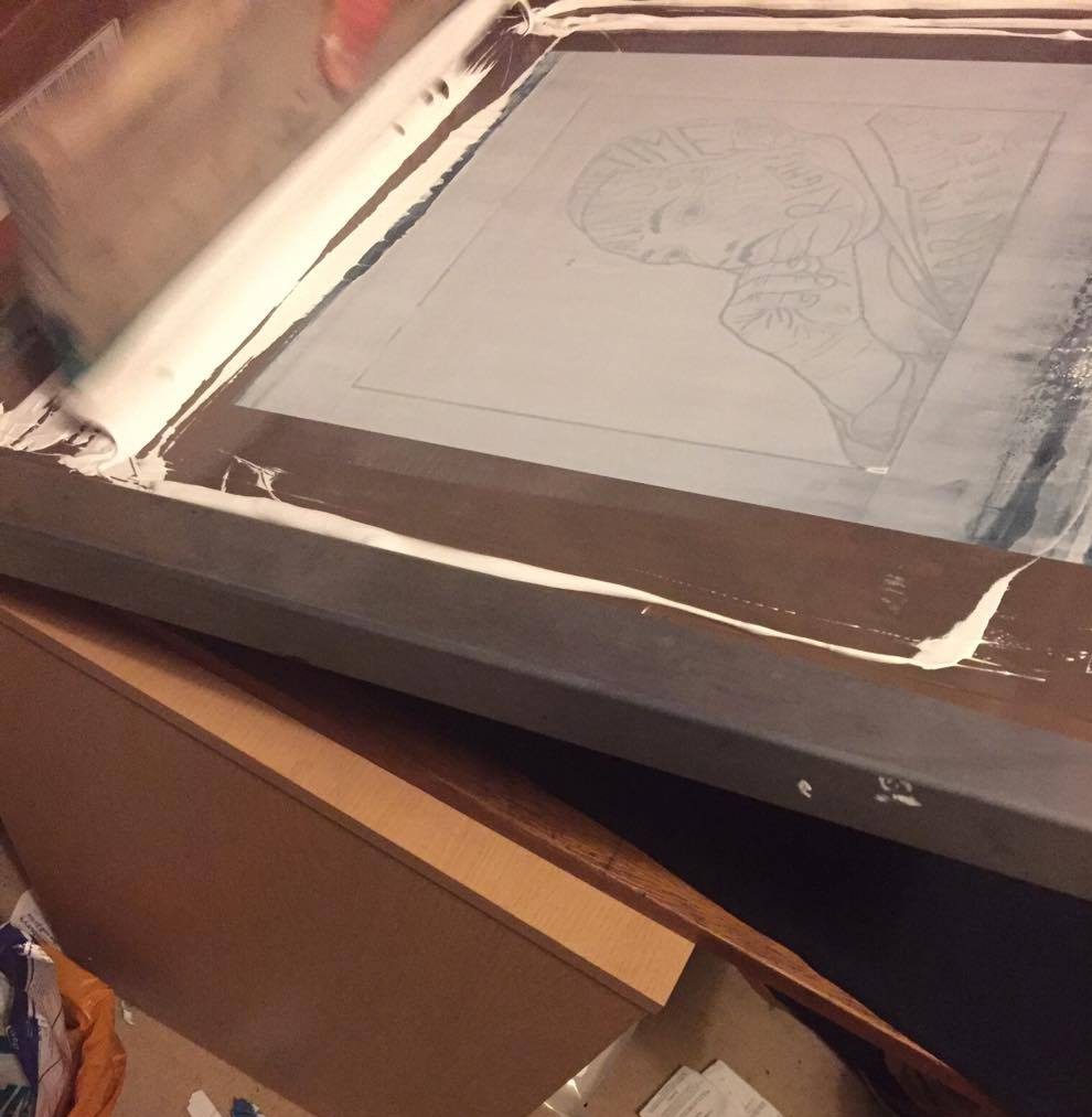
After squeegeeing the ink I was then ready to screen print!
When printing I notice there was slight imperfections within the image as some parts hadn’t completely burnt into the screen.

This was not going to print properly. So at this point I figured a way to fix this problem. I screen printed the image and then using tape I created a stencil in which I could fill in these marks which worked well.
Here are my outcomes.


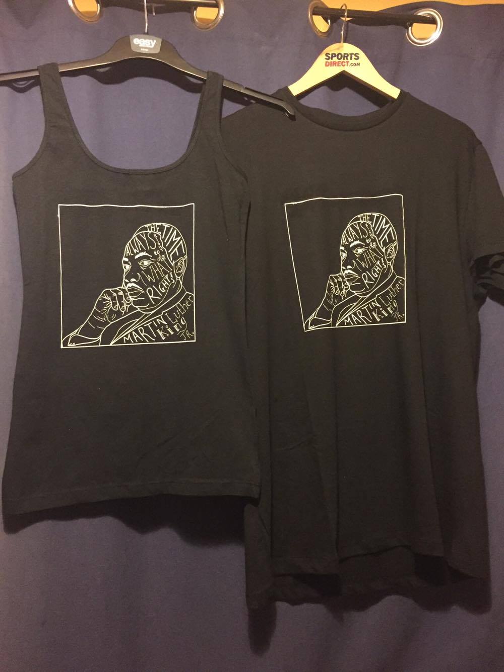
After learning this new technique I am very pleased with the outcomes but as explained these did not come without difficulties.
Researching Screen Printing.
To print the design onto my t-shirts I have decided to research how it is done to learn how to do this myself. I found a very helpful video explaining the steps. Here is what I used to help me.
From this video I found may helpful tips on how this should be done which I will be explaining during my process.
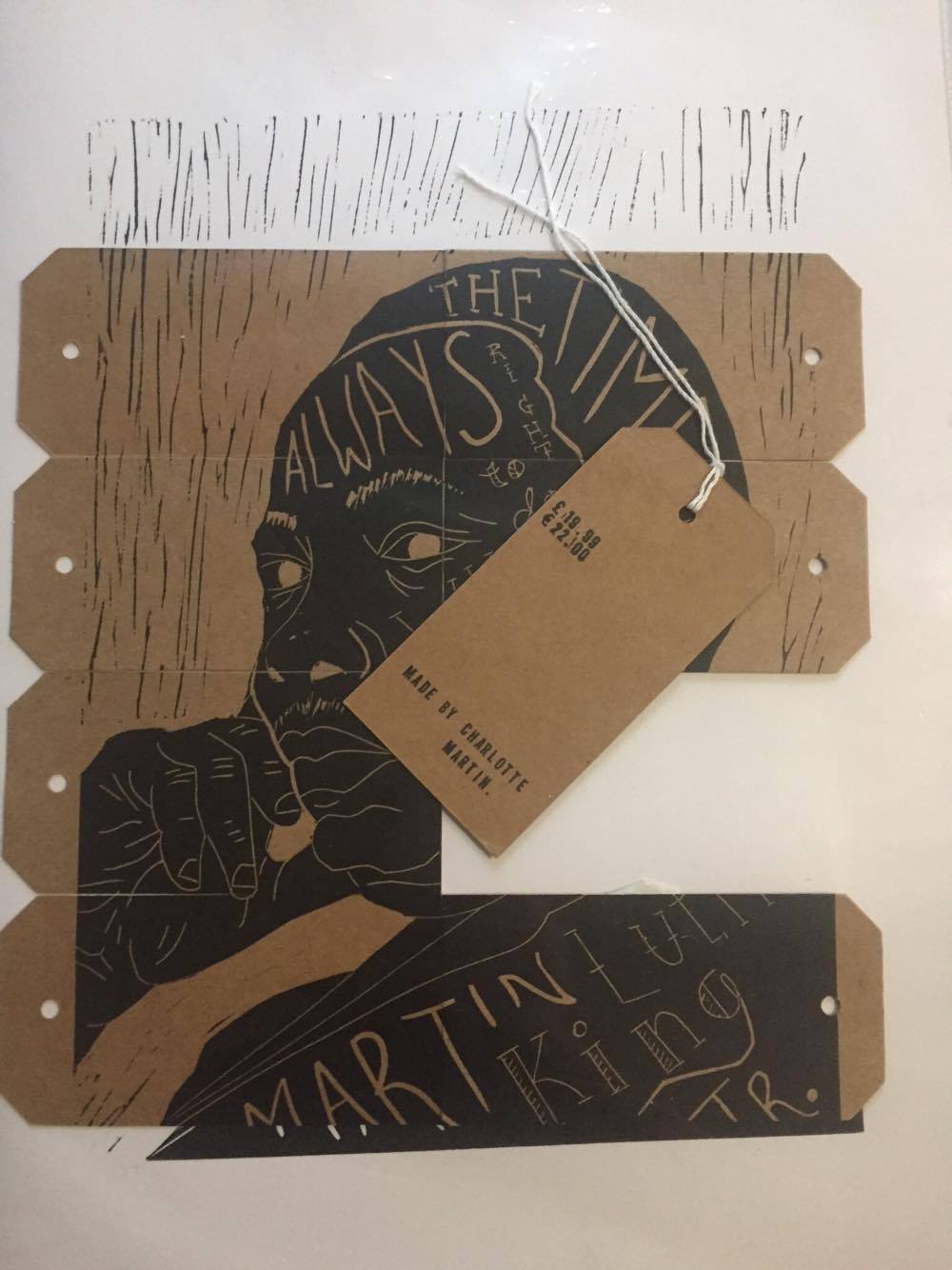
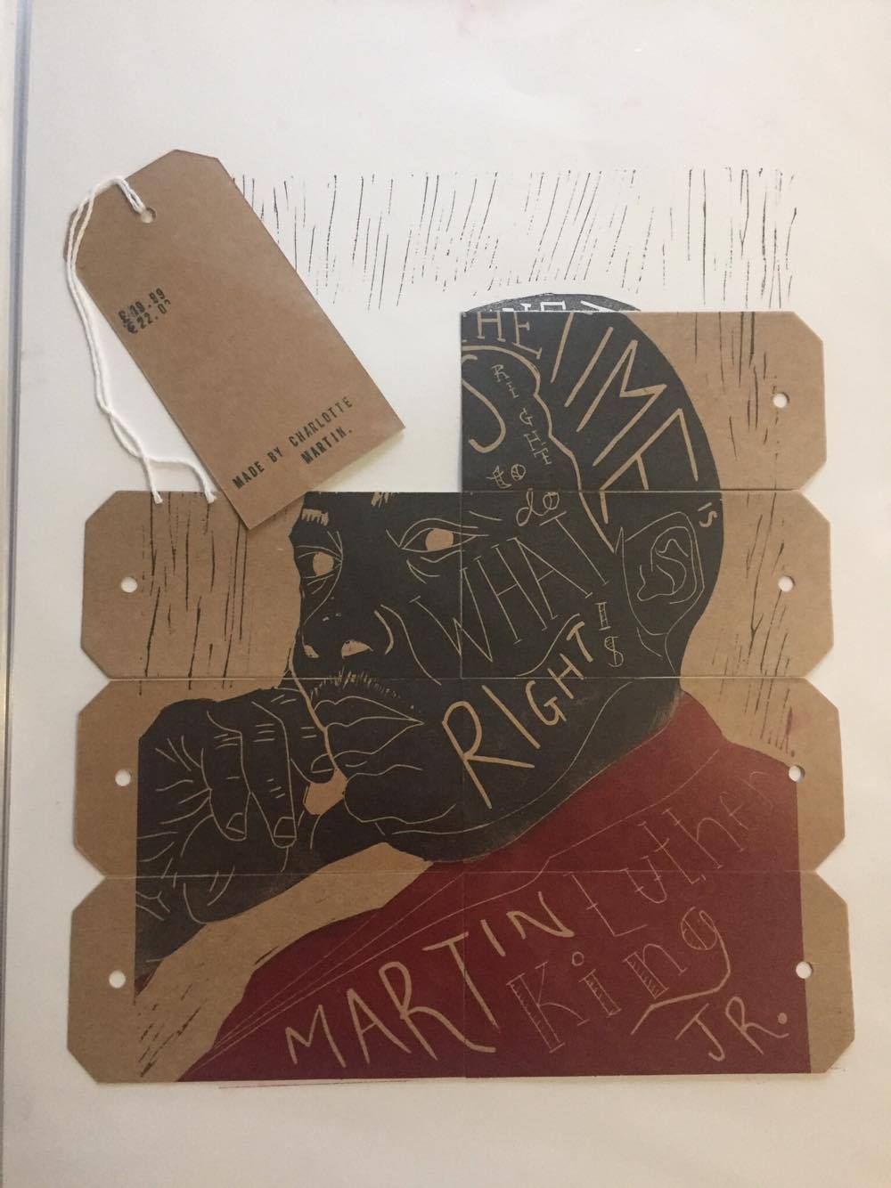
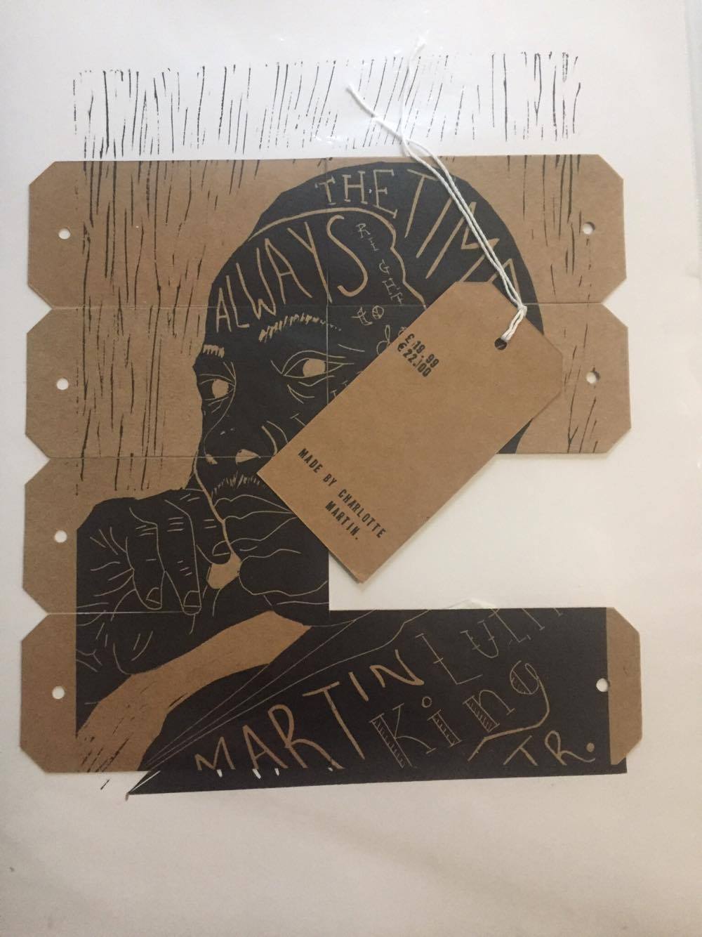
Lino printing tags.
To begin preparation for printing on my tags I began masking tapping them together to create a larger surface area to print the design onto. This began difficult as the design fit just over the size of the tags so I then had to make some decisions on which part was most important to keep on there. Here are my prints.

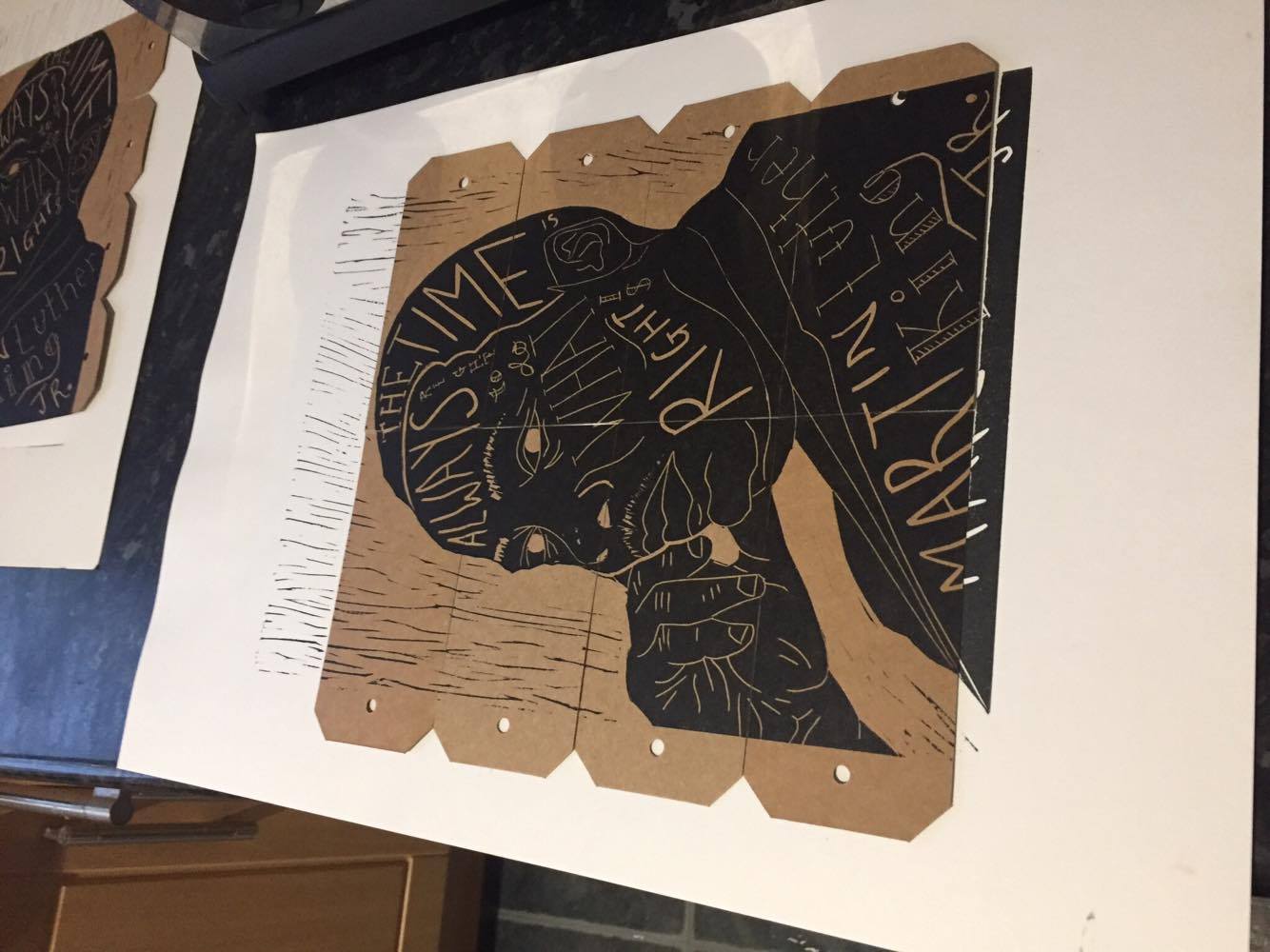
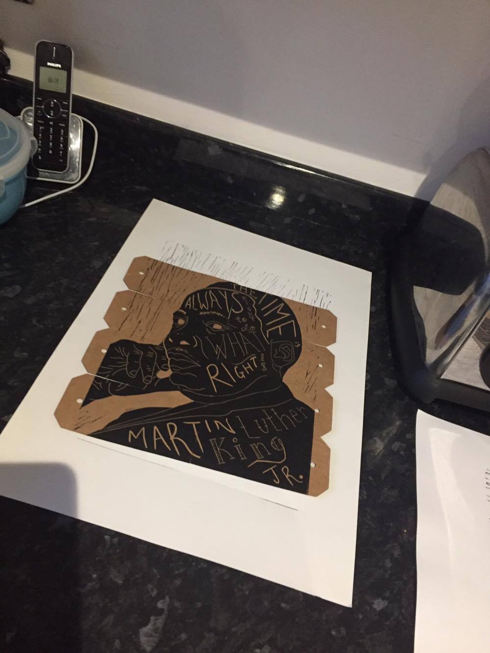
as you can see it would either cut a slight of the head or the type on the bottom of the design. I decided that it was more effective with the bottom of the design on the tags so will be using this style for the final. From doing this I then wanted to experiment using colour like Kyle Steed in my previous research.

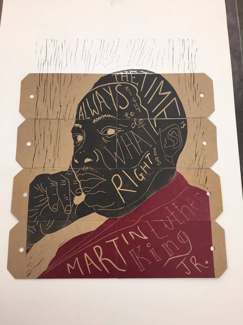
I found this was very effective and would be a nice extra to the tags as it would stand out from the other items yet using the same design.

Experimenting with stamps.
From my previous research into typography that should be used on the tags I decided that I would experiment using a typewriter style stamp. Below are my findings.

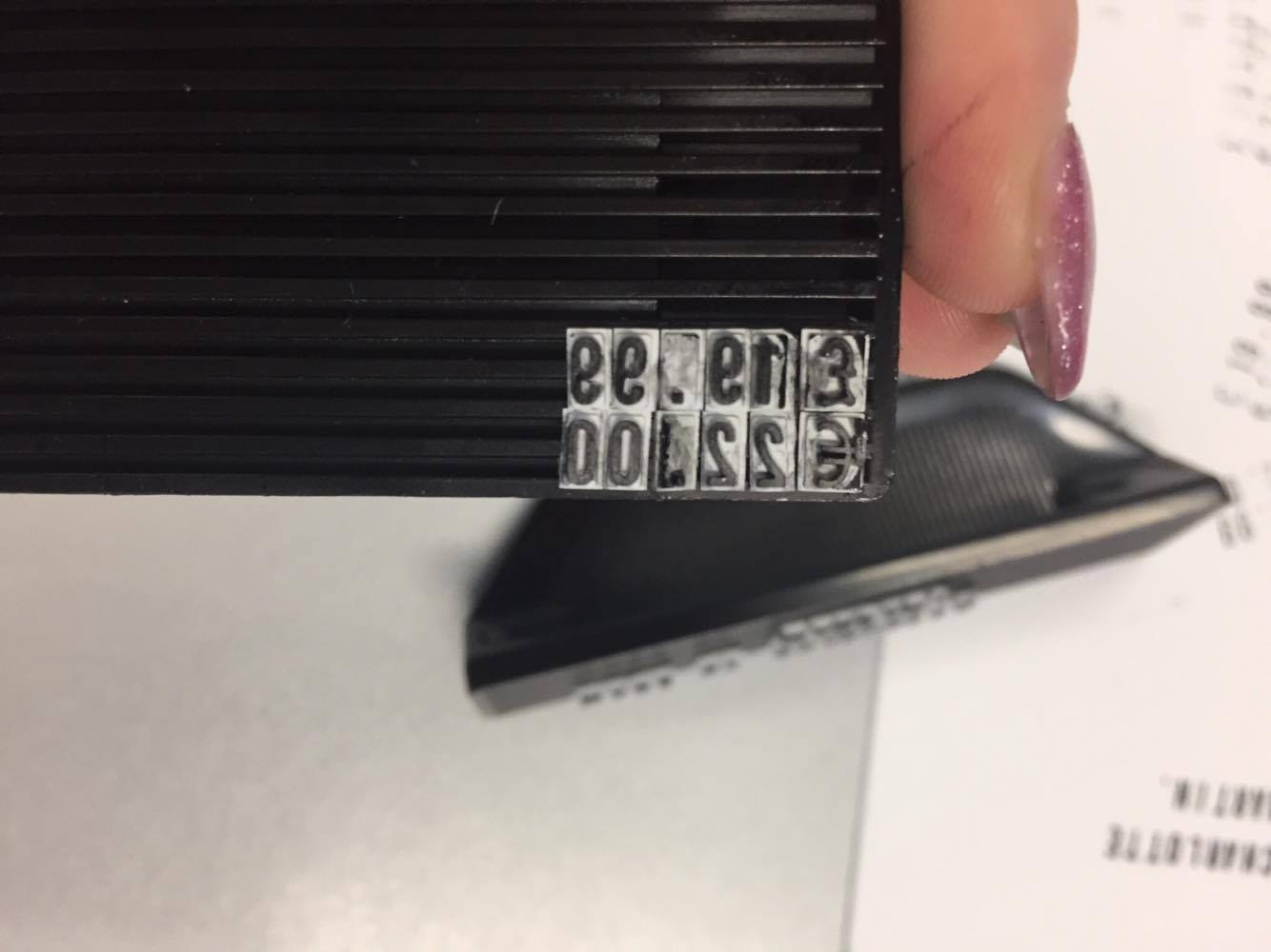
To begin I began preparing the stamps laying out the information for good placement of text when printed. I then began experimenting with the stamps pressing in ink and pressing on to cartridge paper.
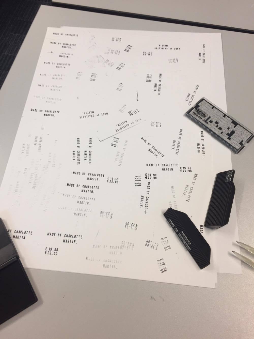


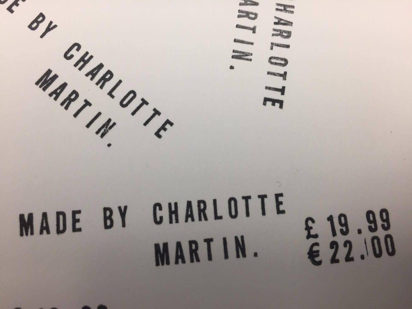

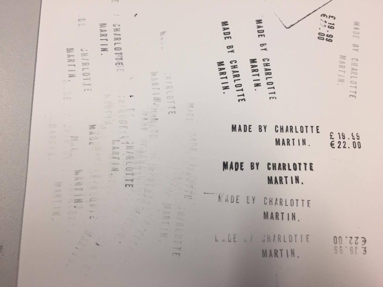
When experimenting with the stamps using different pressures and repeating the stamp using the residue of the ink I found lots of different styles of prints that could be used on my tags. I found that this would be suitable for the tags but needed to see what they would look like on the tags themselves so I then tried this out using one of the layouts I had created in my experiments. Below is what I found.

The typography and layout on my chosen style of tag I feel works very well in creating a hierarchy of information. It is also easy to read even with the imperfections of using a stamp which I feel also will give each one a hand made element. From experimenting with this I have decided to use this in the final.
On the front of the stamps to keep my design consistent I have decided to use the lino cut again to create sections of the design on each tag again giving the hand made look. I will be laying out all of the tags as if it were a puzzle to create an interesting piece of design in itself and will remove a tag to use for the t-shirts.
Stamped typography on labels.
I decided to look at hand stamped typography on tags and other items to get inspiration for my design. Here is what I found.


I found there was different styles of typography that can be stamped by hand but thinking down the more vintage route with older style typography I found this letter using a more typewriter font which really caught my eye and would make and interesting effect on my tags. I think using this style font would make them look hand made with the small stamping errors which gives personality to the items itself. From this I am going to do some experimentation with stamps to see how they come out and if this could be a suitable effect for the information on the tags.
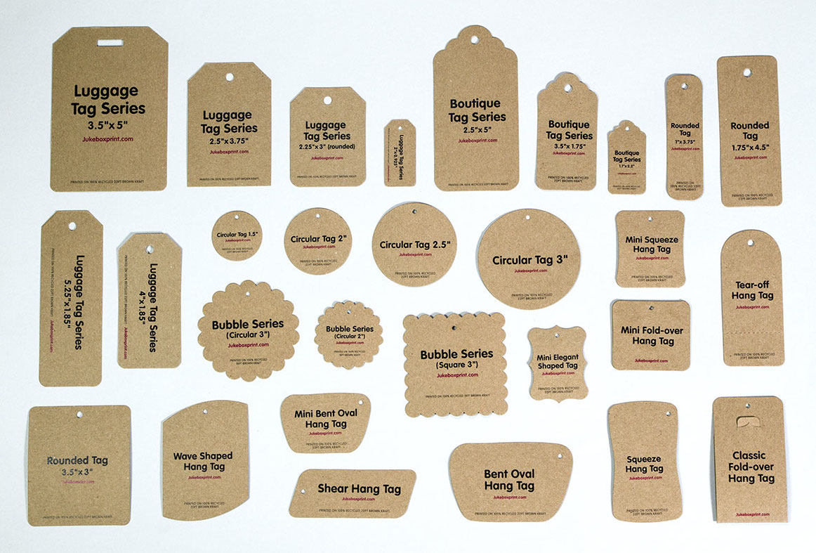
Researching clothing tags.
To begin my clothing tags I have decided to look into different shapes and styles of existing clothing tags to decided which style is most suitable which I am going to choose. Below is some examples I have found.
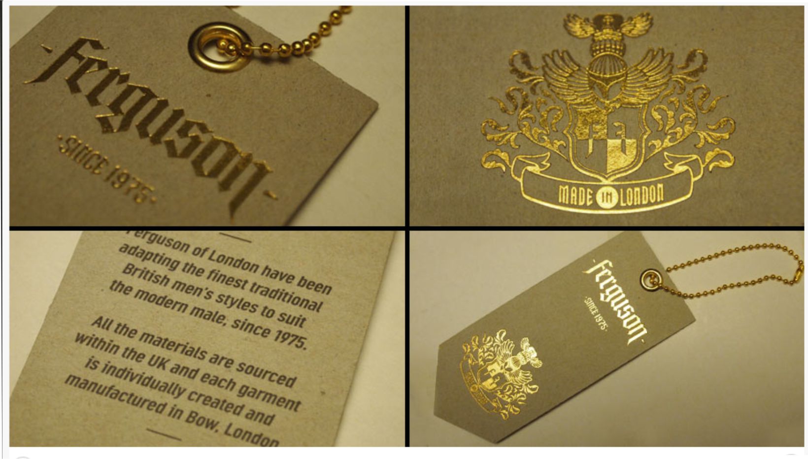
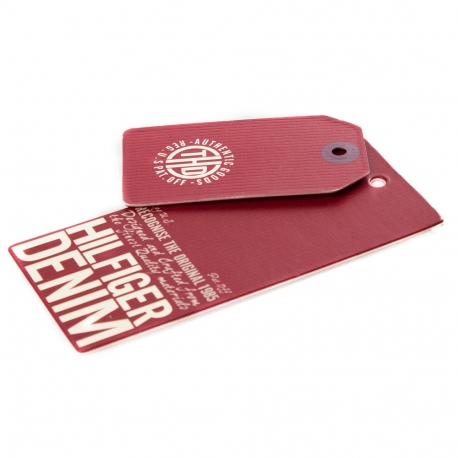
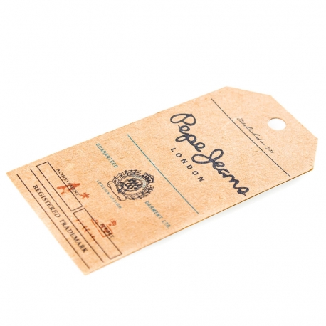
When looking at these different styles of clothing tags each style has a element of the item of clothing they are selling whether it being the name of the brand of what is on the t-shirt itself. On the Hilfiger Denim tags I found the layout is very effective in giving information about the item however I found the shape and style of the Pepe Jeans was much more bespoke looking and vintage style.
Looking at the different shapes and styles of the cuts of labels I found the luggage tags could be interesting with the style being quite vintage which I would like to be portrayed in my outcomes. From this I am going to research different styles of typography that could be used to make this item hand made rather than printed using electrical printers.
Printing the packaging.
From my research I decided to create a paper bag printed with my design which will also be printed on the t-shirts. However finding the correct size bag was very difficult. The dimensions of the paper bag were slightly smaller that I would have liked however I checked to ensure the main quote would fit and could be read.
Printing using the press found to be very difficult. As the bag had different folds and thickness’ the press had uneven pressure which made the print uneven below were my findings.
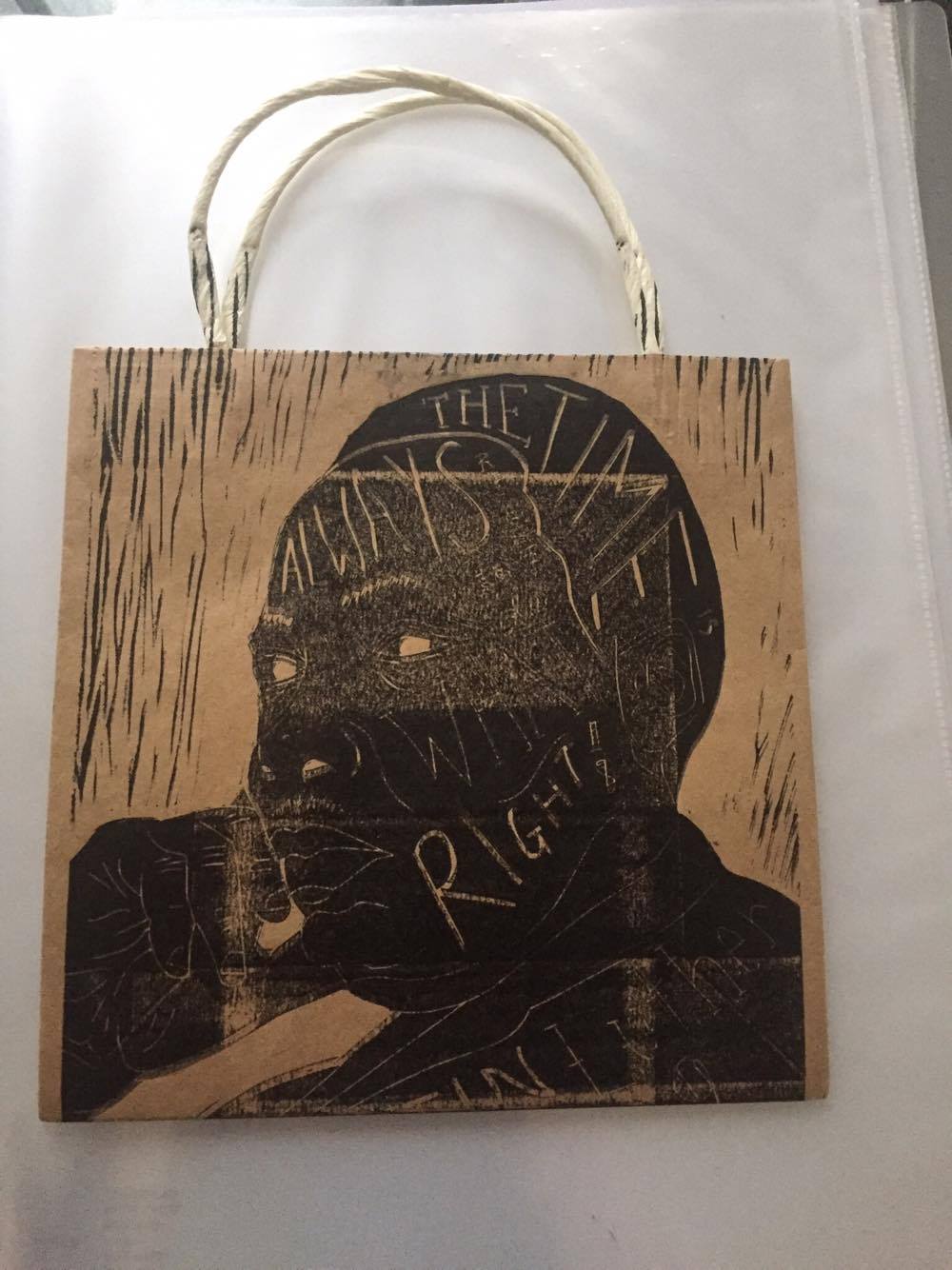
From this I had to find a way to fix this problem that I had come across. I decided that it could be an option to find a card stock very similar in colour to the bag to print on first and then spray mount on. I tried this and it came out very well.

Printing with linoleum.
After researching different techniques I went on to have an induction with the print technician called Lindsay. To begin I learnt how to spread the oil based ink evenly to create a thin layer of ink on the brayer to then roll onto my lino. I also learnt how to set up the printing press at the correct pressure feeling whether this was correct when using this press. Below are a few of my experiments.


When using this process I found that you have to check that your rolling the ink on evenly and covering the whole area and once you have put ink on the lino it is very difficult to tell whether you have covered the surface area. This is a problem I had see in the image above. This meant that the print wasn’t sharp as some of the design had not printed properly and only printed some of the old ink which was on there.
After experimenting with the press and becoming more comfortable I began to try using different colours on the same design. I had to clean the linoleum with white spirit with it being an oil based ink used. I had to make sure that the area was well dried before applying the ink other wise the white spirit residue and ink would repel one another which would ruin the print. Below are some examples of these.


I found using different colours together was very difficult as I did not want the oil based inks to touch which gave me a faint separation in between.
From this I decided I would begin the process of my packaging.
