How to use a Linoleum Printing Press.

To begin the process of printing my outcomes I began researching into how to use the printing press before having a induction from the printing press technician.

From this I learned how to spread the ink to make sure it is thin enough to be used on the lino cut itself and how important it is to check the pressure of the roller press before printing otherwise it will not give you a solid image.

Linoleum printed paper bags.

From my previous research into packaging design and sustainability I began looking at linoleum printed packaging which cam up with some interesting designs on paper bags. Here is what I found.

il_fullxfull-1005264213_uzxb il_fullxfull-1034476369_lrk1 81002fad07c6805565e2aa9ae09a7d4c

I found a company it which does this which were all hand crafted bags for gifts etc. This gave me an idea to consistently use the same design for my t-shirts for my packaging and tags from the example seen above using a pug design. I feel that this will make all of my outcomes relate to one another and could be kept in a similar manor.

From this I am going to try the same technique used in these examples using my lino cut for my clothing tags and packaging.

Packaging Research.

For my t-shirts I will be designing packaging. I have decided to look into packaging as a sustainable element for the environment as my printing technique would be better for the environment than general printers using electric as it could be printed by hand using the linoleum I have produced.

I began looking at at article called

‘Coconut fibre nano-particles, meat-skin, and edible silk coating: the wacky world of packaging innovation’

When looking into this it was very inspirational with this statement said by Gwenith Marcelo Fries (2017) ‘many companies are actively looking for ways to develop high-quality, durable sustainable packaging solutions for reuse’. (https://www.forumforthefuture.org/blog/coconut-fibre-nano-particles-meat-skin-and-edible-silk-coating-wacky-world-packaging-innovation, 1,1,17) For me although this article was very interesting in the fact it was a discussion about different ways food can be packaged to be edible which would be a major step for the packaging industry the word for me that stood out in that statement was ‘reuse’.

I decided that for this project I would like to create something that was hand crafted  throughout this project to make the items bespoke and better for the environment a much as I can.

For my packaging I have decided to create a paper bag with the linoleum cut design on that could be reused in someway or another whether it be recycled or just reused by the buyer itself to give a gift in maybe or just one of those bags you get from a company that you just can’t get rid of because its too nice, giving an advertisement aspect to it as well.

From this I am going to look into different materials that can be printed onto using linoleum and what route I can go down.


The Lino cutting process.

To begin my lino preparation I got all of the tools which were necessary which at this point were tracing paper, a piece of linoleum and lino cutter blades.

To begin the process I began tracing my design using tracing paper using the simple method to get the image onto my lino. When doing this I had to take into consideration that the design needed to be printed on backwards to ensure when the linoleum is pressed it would be the correct way round. Below are some images of this step.

16466708_10158471148160508_382331853_o

16443900_10158471082405508_705567035_o 16491484_10158471082835508_2121703718_o

It was first drawn the correct way round and then flipped to ensure it was backwards to begin cutting. Below are some images of how this came out.

16299012_10211622538910252_5920399224991665961_n

The lines were very faint but from this I could begin cutting. I began cutting using the thinest cutter blade to ensure I could create fine detail and make sure that when the typography was cut there would be a strong definition of hierarchy of information in this piece.

However during this process the linoleum was very hard and sometimes was a struggle to cut through so during this process I had to keep stopping and placing the linoleum in a warm space (near a radiator) to soften the material to ensure no mistakes were made.

Below is a further step of the cutting process in which I had finished the main design and began cutting the background. Using the research I had found when researching lino cutting I began cutting out the background in the same direction using a much bigger cutter blade to create texture within this print.

Below are images showing this.

16265268_10211622555190659_1020117289163441521_n 16426234_10211622562350838_806930829518852664_n

After completing and learning through this process I found that using linoleum is very difficult and detail is very hard to keep especially using much smaller fonts in this design. I also found it was very time consuming especially using typography. On the other hand I have learnt a new skill which can be developed further into this project.

From this linoleum design I have created I am going to be experimenting with the printing technique to try to create designs for my t-shirt tags as well as packaging design.

Researching Linocutting.

Before I began cutting my lino I felt it was important to research what it is and how its done.

It has been said that ‘Linocuts are very similar to woodcuts. It is a printing method using a sheet of linoleum, in which a subtractive cutting method is used to take away the parts of linoleum where you want to leave the white of the page, and keep the parts you want to be inked!’. (http://www.instructables.com/id/How-to-Make-Linocuts/, 1/1/17).

I also wanted to look into where lino cutting came from and where it began. When researching I found that ‘while linoleum was first invented in the 1860s, it wasn’t used as a medium for printing until the early 1900s in Germany, where it was first used for making patterns on wallpaper.’ (http://www.instructables.com/id/How-to-Make-Linocuts/, 1/1/17).

From finding this information I then went onto looking at videos explaining how to lino cut/print and what would be needed below is the video I found.

From this information I found that I would need lino tools to cut with as well as a brayer and oil based ink to print with. I also realised I needed to figure a way to get my image onto the lino before I started cutting to ensure no mistakes. When thinking about this I decided to use a simple method using tracing paper to trace my image then drawing back onto the other side to in effect print the image on.

Preparing for cut and print.

I have decided to carry out test prints to check the size of the print making sure detail is still kept on the image. Doing this I  tried A5, A3 and A4 I found A4 was the best size and fit the chest perfectly without loosing too much detail A5 lost too much detail and A3 was too big for the female style t-shirt but just fitted the male t-shirt therefore A4 was most suitable.

After this I needed to prepare for cutting and printing my image so had to step by step invert the final to black on white this actually showed up a few imperfections within the image which was really handy to find now before cutting the image. Here is what I found.

screen-shot-2017-01-27-at-14-10-14 screen-shot-2017-01-27-at-14-15-32

As can be seen on the right the lines were slightly overlapping on the cuff which really stood out to me so had to play around with the anchor points to make sure it was straight.

screen-shot-2017-01-27-at-14-20-43 screen-shot-2017-01-27-at-14-21-02

Here is another example of an issue I found which again was resolved using the direct selection tool, picking up the anchor point and moving them.

After checking the image over to ensure there was no problems I got to this.

screen-shot-2017-01-27-at-14-22-58

Playing around with placement.

I decided using the final design to play around with the placement on the t-shirt analysing what works and what doesn’t exhaling why. Here is what I came up with.

screen-shot-2017-01-27-at-13-05-15 screen-shot-2017-01-27-at-13-05-31 screen-shot-2017-01-27-at-13-05-51 screen-shot-2017-01-27-at-13-06-03

After experimenting with the placement on the t-shirts I have decided to go with printing the imagery on the front of the t-shirts as I felt having the imagery on the back of the t-shirts could be lost when the item is worn and hung in a shop. I also felt that on the back it is not the first point of view for the audience whereas the placement on the front of the t-shirt works well in a layout point of view and placement for both a male and women style t-shirt.

Step By Step.

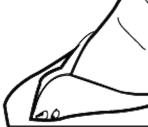
To begin designing for the quote ‘It is always the right time to do what is right’ (Martin Luther King Jr.) I decided to use some of my research which gave me inspiration which was a lino print by Kyle Steed.

Processed with VSCOcam with m6 preset


This was the main inspiration for this project especially after my experimentation with hand rendered typography. After reasserting gestures of Martin Luther King Jr. I decided on one particular image/gesture which I felt was most powerful due to the shuttle gesture of thought which I felt would be signified to my audience along with the quote that I am using.

screen-shot-2017-01-27-at-11-59-35

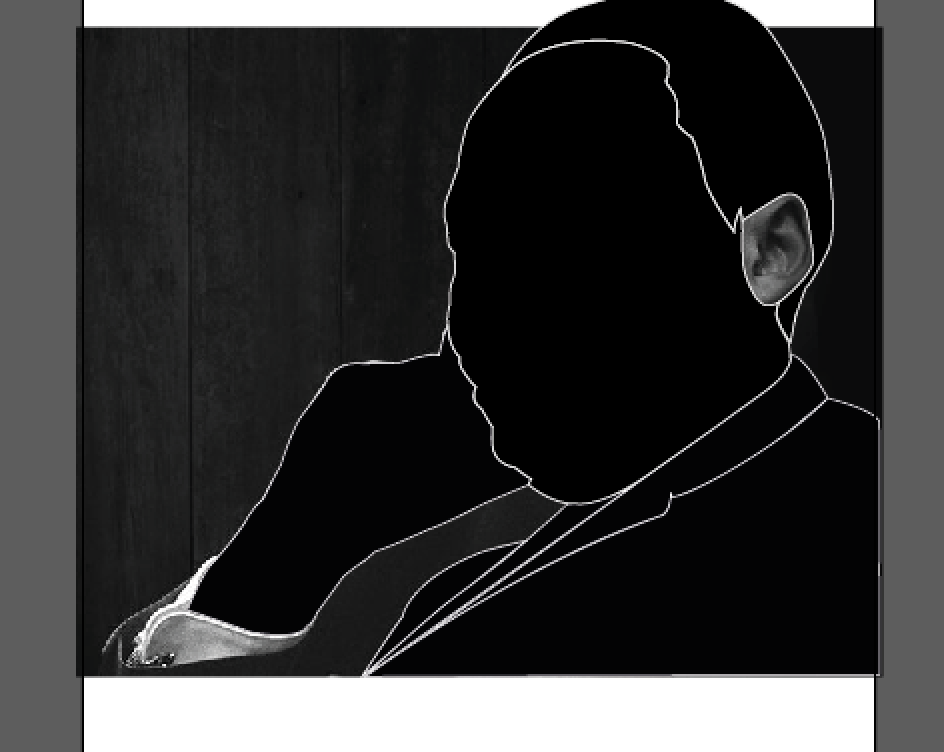
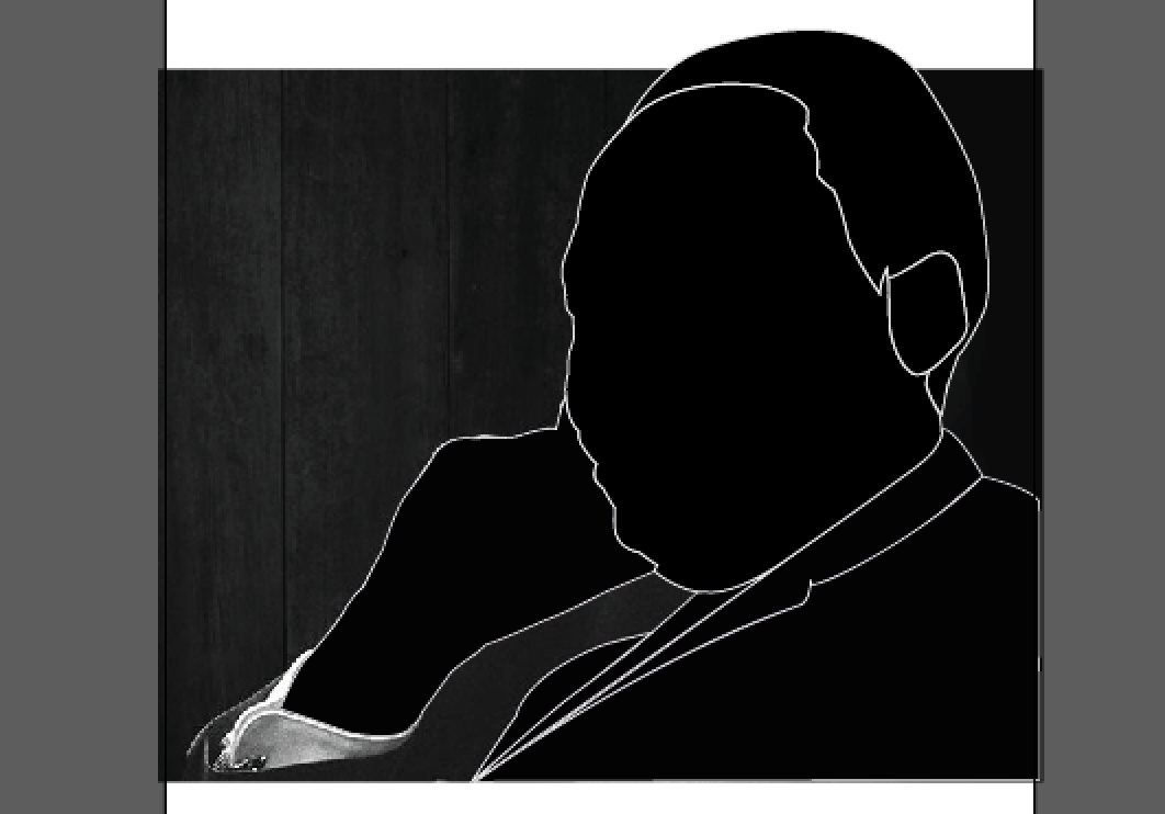
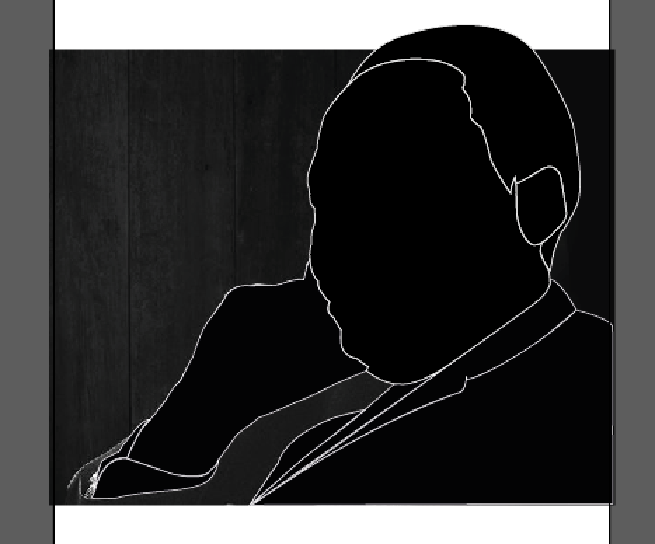
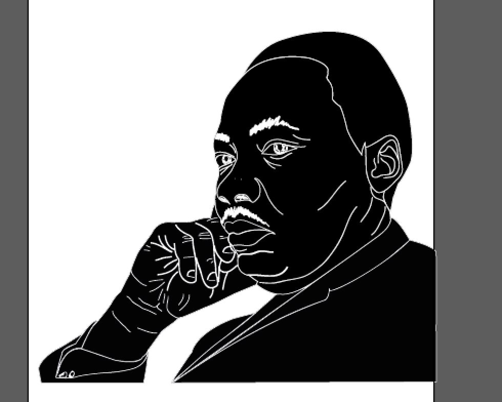
From this I began vectoring the image to create a similar style to that of Kyle Steed’s work to make it possible to lino print this piece.

screen-shot-2017-01-27-at-11-59-41

I began using black and white outlines using the pen tool to picture how it would look as I went along making it able for me to see how the lino print would come out like. This process was repeated to create the effect throughout the main body of the illustration.

screen-shot-2017-01-27-at-11-59-47

screen-shot-2017-01-27-at-11-59-53

screen-shot-2017-01-27-at-11-59-59

screen-shot-2017-01-27-at-12-00-04

screen-shot-2017-01-27-at-12-00-43

screen-shot-2017-01-27-at-12-00-51

screen-shot-2017-01-27-at-12-00-57

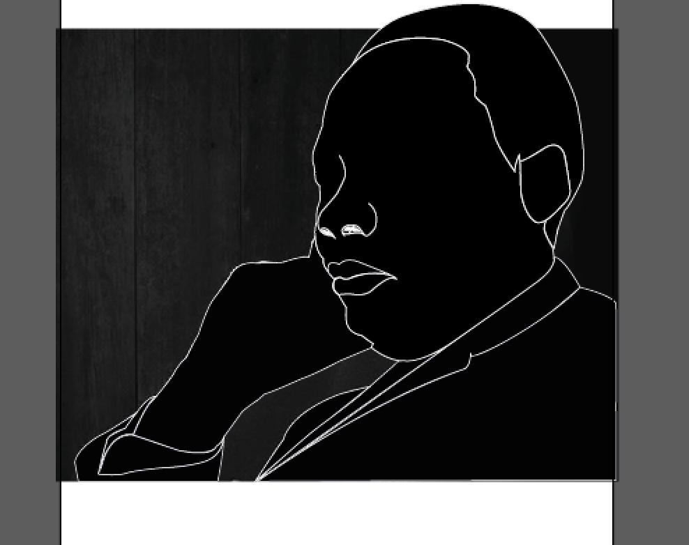
From vectoring the main part of the image I then began playing around with creating the facial features which proved difficult using the pen tool and did not create the same hand done look like the style I was trying to achieve.

screen-shot-2017-01-27-at-12-01-02

To solve this issue I began using the blob brush tool to create a more hand done look/style. This seemed to have a better effect so I the used this consistently when creating the facial features of Martin Luther King Jr.

screen-shot-2017-01-27-at-12-01-08

screen-shot-2017-01-27-at-12-01-14

screen-shot-2017-01-27-at-12-01-22

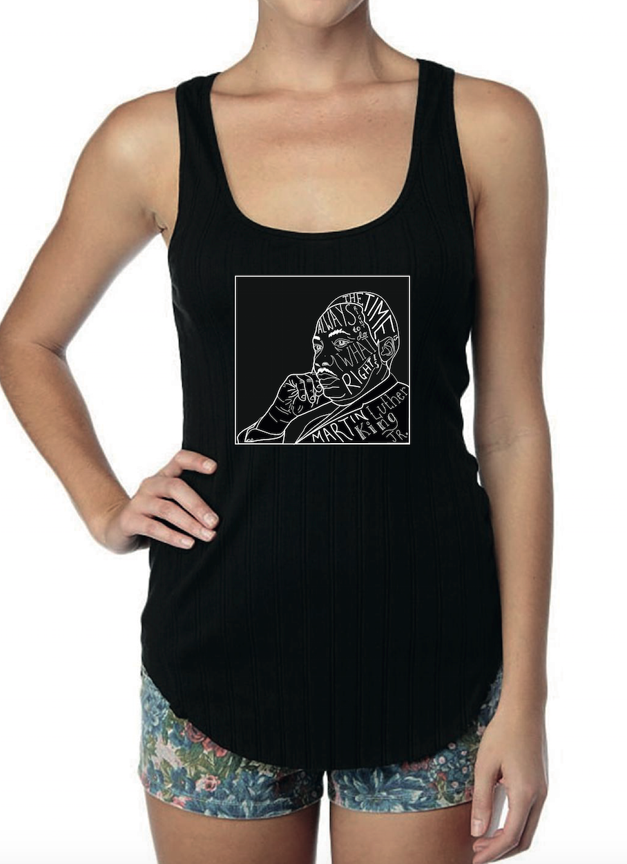
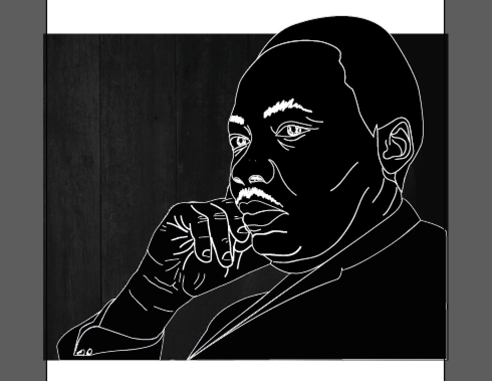
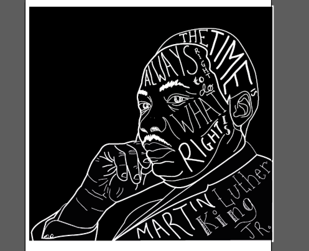
When the main image had been created I then using my previous experiments with hand rendered type began creating typefaces on the face, hair and body, using some of the font styles I had used previously again using a similar style to Kyle Steed.

screen-shot-2017-01-27-at-12-01-39

I then got to this stage and started thinking about what this might look like on a t-shirt and began adding black backgrounds to really make the imagery stand out as well as thickening the point size of some of the lines of the imagery to make the imagery stand out more without it becoming lost with the same point size as some of the text.

screen-shot-2017-01-27-at-12-01-48

screen-shot-2017-01-27-at-12-01-54

After playing around with the final I decided to then place a square outline around the illustration to think about how it might work placed on the t-shirt due to the squareness of the piece and came up with this. From this I am going to play around with mock ups on what they would look like on t-shirts and where the placement should be.


Looking into Martin Luther King Jr.

From my previous developments I have decided to incorporate illustration into my designs to signify more of what my chosen quote will be saying. To begin this I have decided to look into different gestures and images of Martin Luther King Jr. to think of different illustrations that can be produced for the t-shirt designs.

These are a few that I have found.

 mlkj2 mlkj4 mlkj mlkj5 mlkj7 mlkj6

From this research I have found many different gestures in which could be used in conjunction with the quote I am experimenting with using illustration. I found the clenching of his fist could signify having the power to create change which could be a good way of describing his quote. I also thought that the image of him on the bottom left signifies thinking which could be a good suggestion to the audience about the quote and what he is saying with ‘The time is always right to do what is right’.

Experimenting with hand rendered type.

To begin I decided to experiment with hand rendered typography using different typefaces to learn more about creating typography by hand. I also was playing around with what different serifs and sans serifs work together and experimenting with composition of the typography that I was drawing. Here are a few examples I came up with using the quote ‘I think therefore I am’.

1 2 3 4

From this I found using a variation of serifs and san serifs work well together although typography on its own I feel do not describe the quote which I am trying to get across in this design. I also learn ways in creating different effects using different sizes of typography. However I feel this is too simple and needs some style of illustration during this so to move forward I will be experimenting further by playing around with the slightly longer quote by Martin Luther King Jr. ‘The time is always right to do what is right’.