Evaluation.

poster1copy

poster2copy

poster3copy

Evaluation of Visual Communication

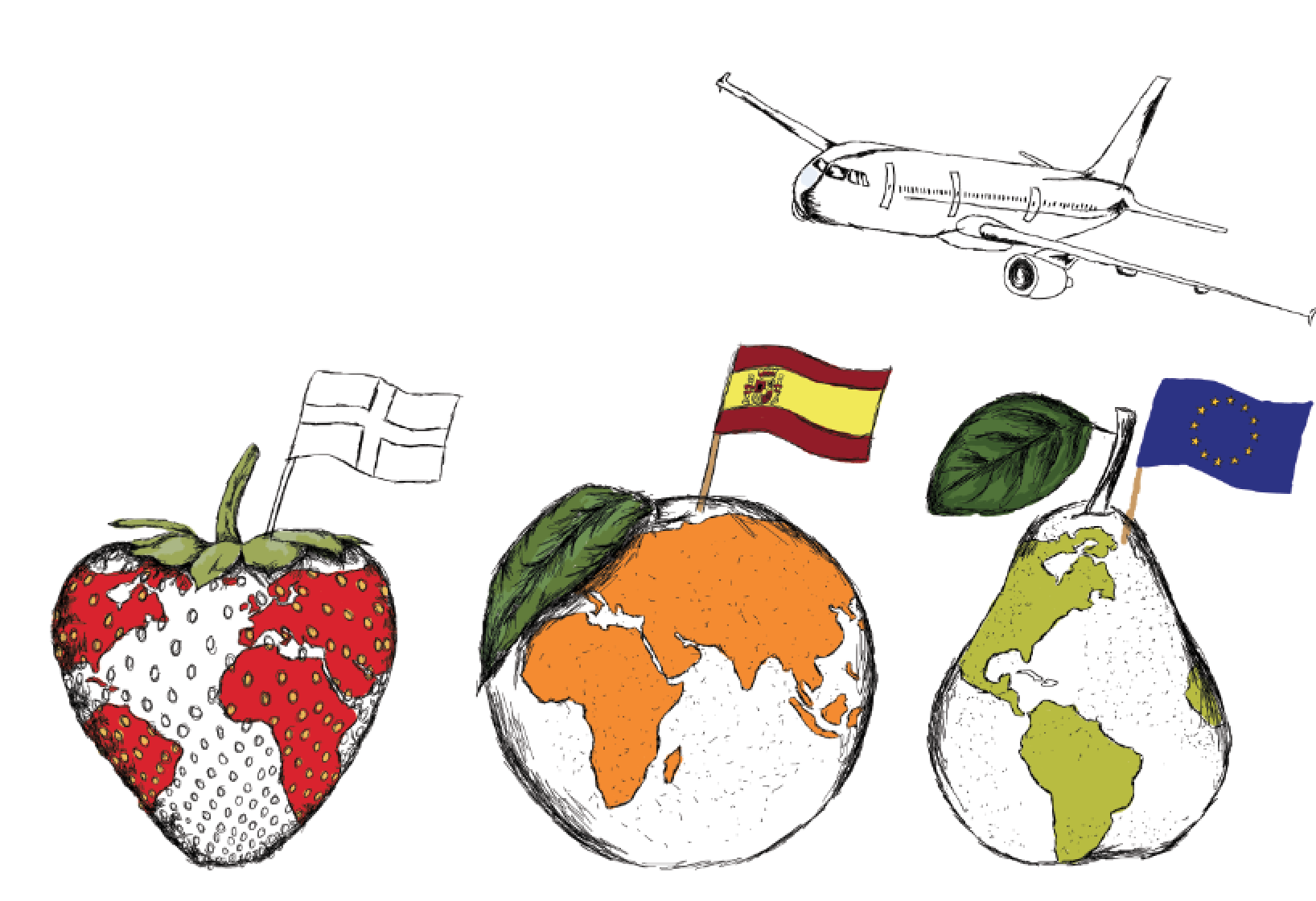
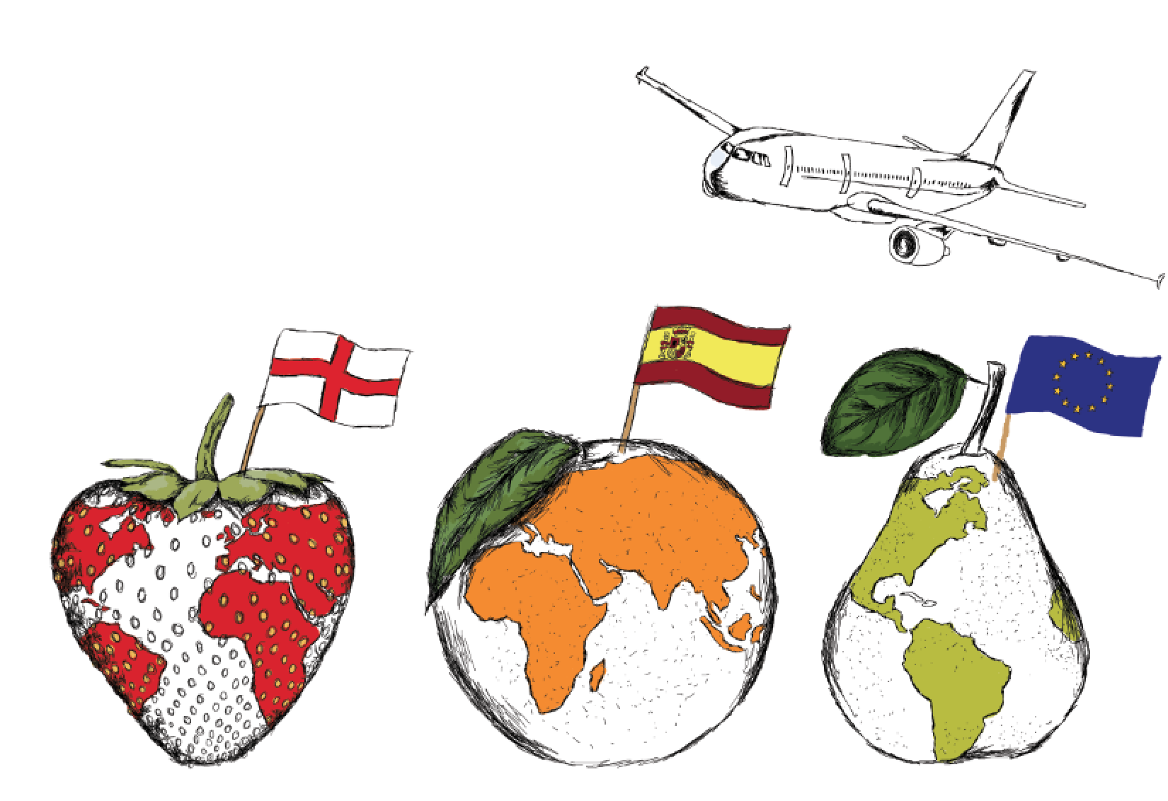
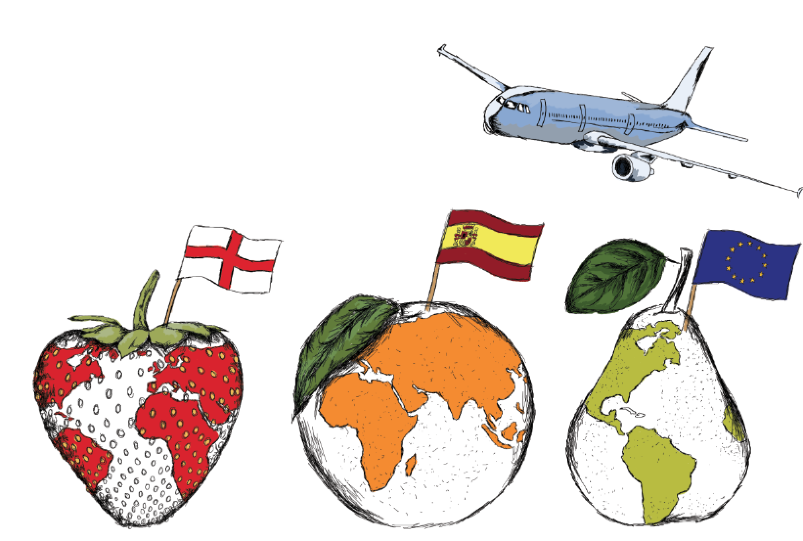
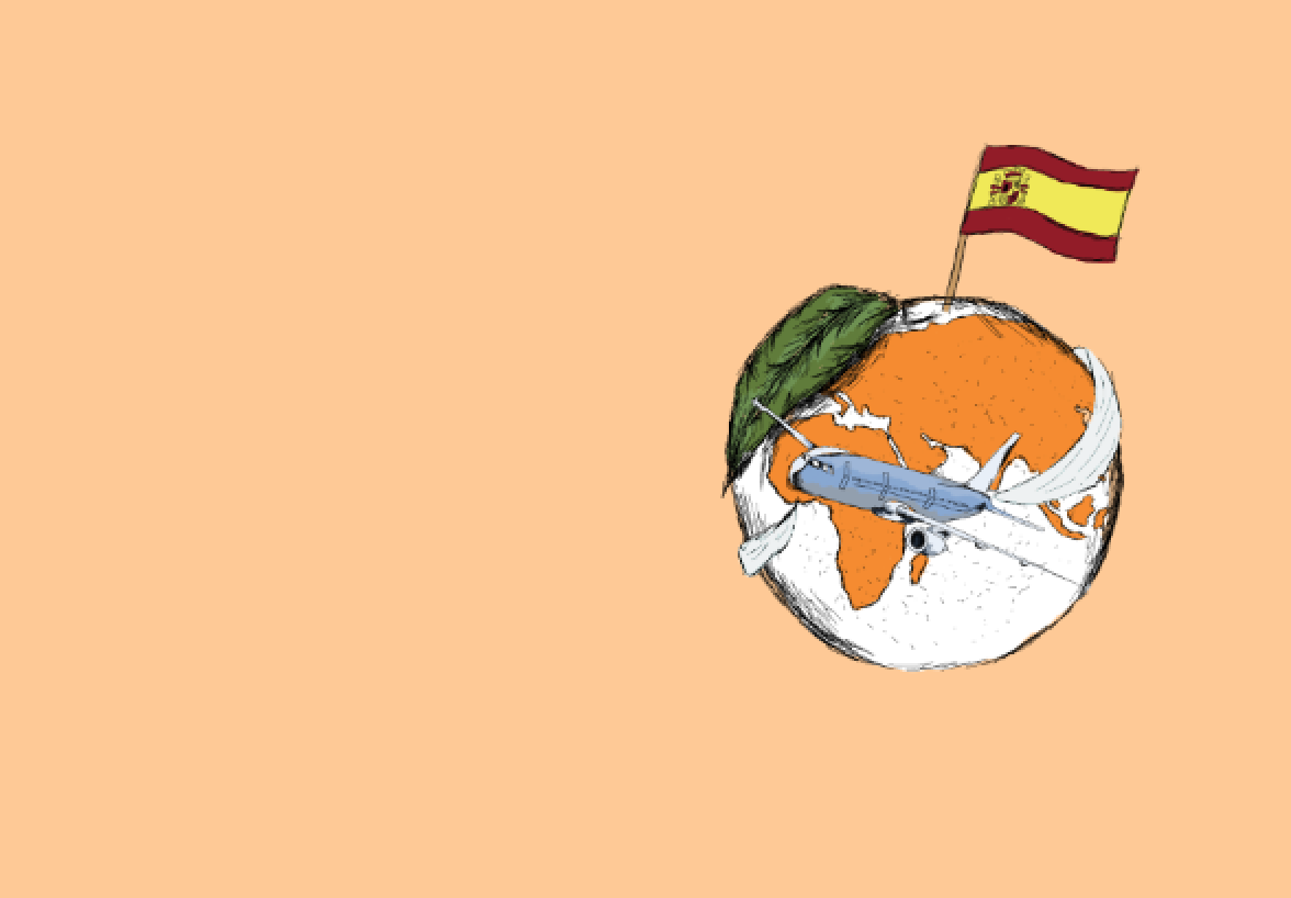
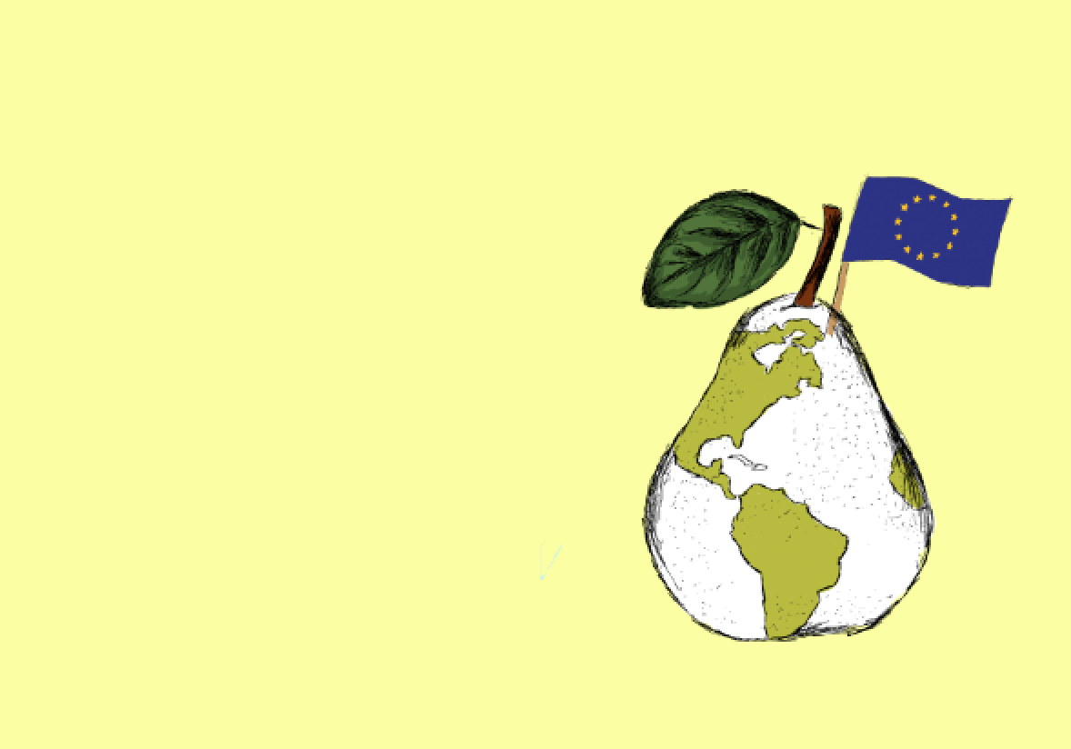
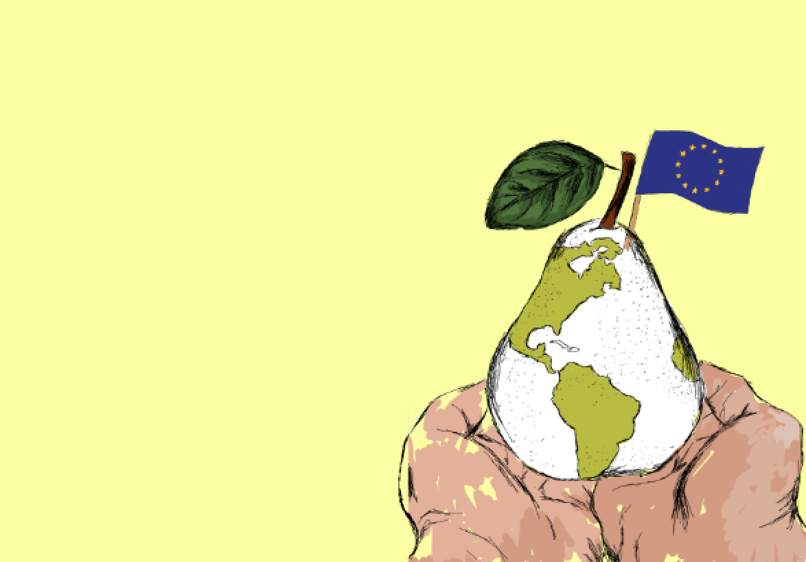
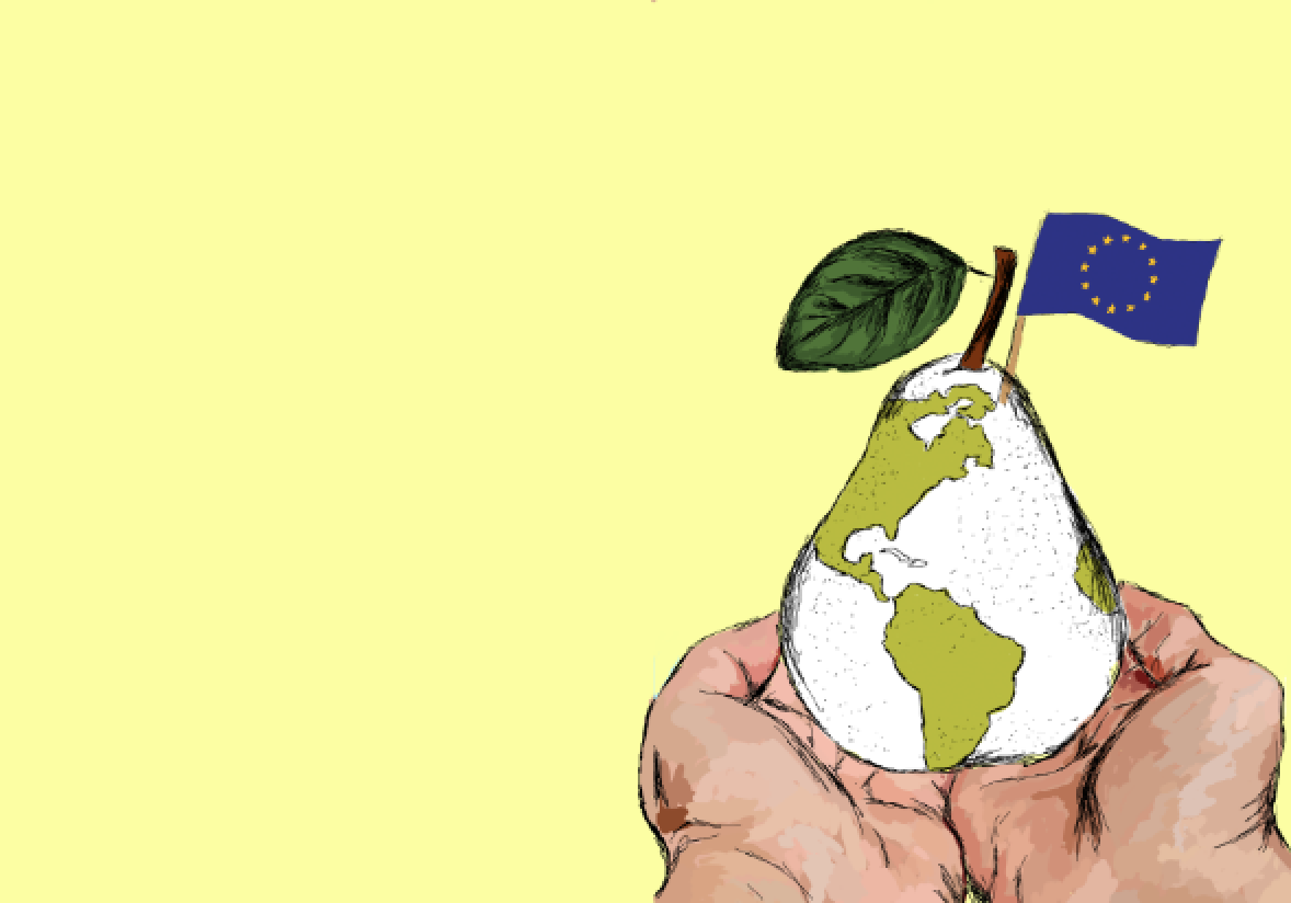
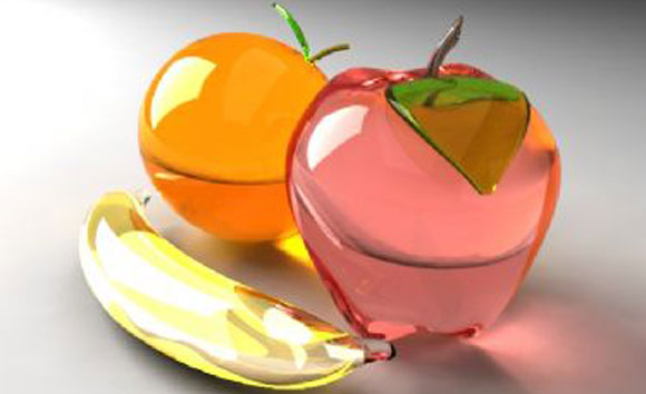
In each of these final outcomes I feel that each of them have visually communicated the message of reducing waste and taking care of the fruit as a worker. I feel that each of these designs have used globally recognised images that each of the workers in the factory will understand and fit the brief. I feel that using the 3 different outcomes in a loop will explain the journey that each of the fruits have gone through before getting to the factory showing what care they must have had to have travelled that far without being damaged at this point. I feel that each of these images successfully deliver the message that needed to be go across in this campagin.

Personal Reflection.

I feel that this campaign has fit the brief and is effective in explaining the message of reducing the waste of fruit as a worker. I feel the layout is effective in creating a hierarchy of information including visual and typographic. The colour scheme used is consistent throughout the campaign and relates to the fruit being friendly and attractive in use. I feel the illustrative style used in this piece would be attractive to the audience and will attract the audience to looking at it rather than a generalised poster. However on the other hand I feel the use of only 4 languages may not be enough as this may single out any workers that might not be able to speak these languages. If I was to take this piece further I would turn these illustrations into spirit animations showing the journey of each of them rather than having to add any text at all. I feel this would have been more exciting for the audience and would attract them much more than a still looped piece. I would have also liked to add a farmer character and a pilot to also add to the effect of visual communication itself.

Is this Good Design?

For this campaign I feel that the final outcomes are sustainable with the idea that they are on screen rather than print outs saving the amount of trees being cut down to produce it. I feel another way I have considered sustainability in this piece is that it not only prevents wastage in the work place but overall in the world with my idea that the fruit is the world and its in our hands to protect that! I feel that this project has been an improvement on my consciousness of sustainability as a designer as it really has been an eye opener to how much food is wasted by the world and finding ways to prevent that using my skills as a designer is a good source of motivation to me.

Step By Step.

Here is a step by step of the development of my final outcomes analysing and explaining the visual communication throughout.

screen-shot-2016-12-01-at-12-22-20

To begin I sketched each of the fruit in an illustrative style aiming to appeal to the audience trying to create such a style that this image would attract my target audience more than once.

screen-shot-2016-12-01-at-13-19-20

screen-shot-2016-12-01-at-13-20-00

screen-shot-2016-12-01-at-13-20-11

screen-shot-2016-12-01-at-13-20-19

screen-shot-2016-12-01-at-13-20-25

screen-shot-2016-12-01-at-13-20-36

I then began adding flags to ensure the message was easily recognised from the target audience. I added the colour of the fruits to the countries to signify the world being part of the fruit themselves and the skewer flags ensuring the audience to know exactly where these fruits have travelled from.

screen-shot-2016-12-01-at-13-22-57

screen-shot-2016-12-01-at-13-21-47

screen-shot-2016-12-01-at-13-21-26

I then began creating 3 separate outcomes adding in extra globally recognised items to ensure the message I was getting across for example the farming tools. I decided on having one side of the design to be purely visual being the first point of focus to ensure the audience can understand the first message. Then with a simple word in the four languages discussed previously to add to the visual communication.

screen-shot-2016-12-01-at-13-23-40

screen-shot-2016-12-01-at-13-23-49

screen-shot-2016-12-01-at-13-23-57

screen-shot-2016-12-01-at-13-24-04

screen-shot-2016-12-01-at-13-24-13

Here is an example of the development of the second outcome visually communicating the travel of the fruit from the farming of the fruits.

screen-shot-2016-12-01-at-13-24-30

screen-shot-2016-12-01-at-13-24-40

screen-shot-2016-12-01-at-13-24-54

screen-shot-2016-12-01-at-13-25-02

screen-shot-2016-12-01-at-13-25-19

Lastly it was the final outcome that had to have a lasting effect on my target audience. The idea was to have the fruit in the workers hands communicating to the audience that the fruit has been produced from around the world by many different people is now in your hands. This has been developed in this way to suggest the preciousness of what is in their hands relating it to the world. The colour schemes used in these outcomes are to relate to the fruit used in each outcome ensuring that it was consistent throughout along with the layout design which I feel works well in creating a hierarchy of information throughout giving visual communication also.

poster1copy

poster2copy

poster3copy

Here is the final outcome. This is to be displayed on screen in a loop to ensure cleanliness of the workplace as well as creating an interesting loop for the workers themselves also showing a journey. I feel on screen this will be a much better way of displaying these kind of graphics due to the waste of paper by posters themselves. This means that the graphics can be changed regularly ensuring that the workers do not get bored without wasting lots of paper by changing posters.

Initial Ideas.

To begin I decided to sketch each of the fruits and an aeroplane that I have decided to use in my campaign adding in the world map. Here are a few examples of the beginning of the campaign.

screen-shot-2016-12-01-at-12-22-20 plane

For each of the fruits and the aeroplane I began digitally sketching to create an illustrative style visually communicating throughout.

mff-strawberry orange pear screen-shot-2016-11-28-at-13-12-26 screen-shot-2016-11-28-at-13-13-06 the-world

As you can see I began with the sketching of the fruit adding the world map into the fruits visually communicating where they have travelled.

Visual Communication with Target Audience.

With this project in particular visual communication is the most important factor as with the language barrier the visual design itself needs to be understood by the target audience. To create a good use of visual communication is this particular case I will need to design using globally recognised items to ensure that each member of the audience reading them understand the message that I am trying to get across.

A problem that I am coming across thinking about communicating using just imagery is the ensure that my campaign is not too simple and comes across childish to my audience of working adults.

What I will be doing to solve this is making sure I am designing in a style that is professional and attractive to adults which should not offend anyone. I am going to use a illustrative style to create an artistic like feel in the campaign, also relating to the family business feel showing something that might be put up in a home.

Language barrier.

During the presentations given to the fruit factory panel it was stressed that there might well be a language barrier due to not every worker being able to speak full english. From this I decided to ask my classmates who have been to the factory to see what kind of languages are written inside the factory for the workers to be able to read. These languages were as follows

  • Polish
  • Latvian
  • Lithuanian
  • English

From this primary research I decided in my final outcomes I will use each of these languages as well as visual communication to ensure each of the workers will be able to understand my campaign.

Where the fruit come from.

When some of my classmates went to the factory itself they found out where they got some of their fruit from for example strawberries were described as being ‘so close you could throw a stone from here to where there from’. Meaning the strawberries that they get come from England.

From this I decided to focus on 3 different fruits that are prepared in the factory itself. So I needed to know where these were from. I thought I would focus on strawberries oranges and pears as these are commonly eaten fruits in the uk.

Oranges were imported from Spain and pears are imported from all over Europe.

Using these destinations I hope will show the workers how far they have come before entering the factory itself.

From this research I have decided I will incorporate the world map into my outcomes to ensure the message is put across clearly.

Existing fruit campagin research.

From the presentation feedback that we were given in groups I decided to look at a few different techniques using fruit in advertising to grasp some inspiration to move this project further.

3-best-ads-vegetable-art-magimix-preview 3d-orange-fruit-wallpapers 3db2a0df3ea3895933ac2ecfc76b9508 4d19fc01f5b44e42cddf58d51160c4a6 98094037 applemontage fruit typography_ads_by_meow_meow21-d3iapa4 water-fruit-ad-tutorial


The designs looked at here I found were very unique and interesting however I need to relate the campaign to the ‘journey’ of the fruit as this was what was brought up in the presentation feedback. From this research I was most inspired by apple that looks at though it has been cut showing the the world as the core. For my campaign I want to show the journey around the world where the fruit has come from to show the care that it has been given before it arrived in the factory.

Preventing Waste.

During this project a message must be constantly shown in the final outcomes. The most important message I am going to portray is ‘preventing waste’. The way I am going to do this is by showing that the fruit are precious and have traveled and have been farmed, being held by many different people that have kept the fruit with care. The focus on my campaign will be the journey.