Here is my step by step of creating my final imagery, book cover, spine and back cover.
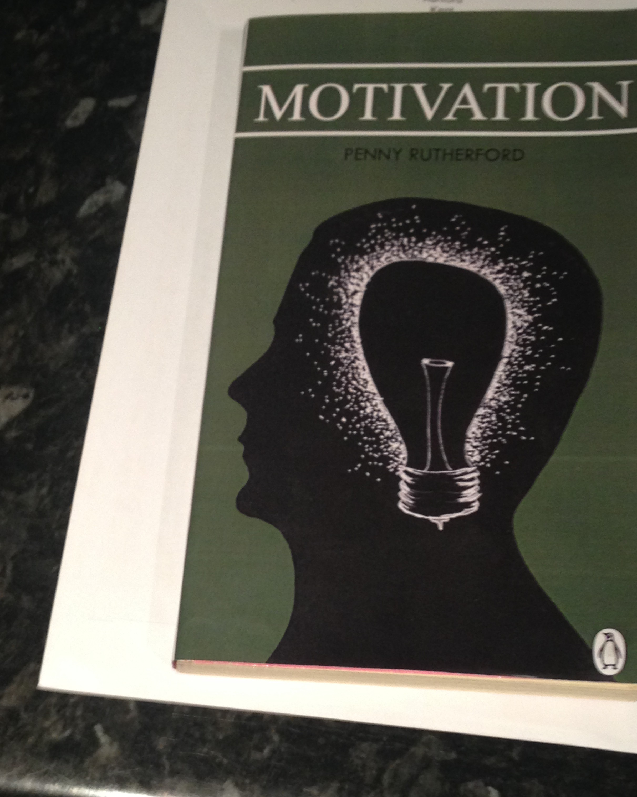
dimensions: width 110mm, spine 18mm, height 180mm

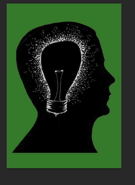
I began with scanning in my sketch of the light bulb and silhouette of the head. I inverted the colours of the sketched light bulb so I could place the bulb in the head. After inverting the light bulb I brought the silhouette of the head in and traced the head in Photoshop before placing the light bulb in the head portraying ‘motivational thinking’. I then thought back to my research on colours and decided to try a green to signify ‘dependable, and steady’ as well as ‘power’ as I felt after reading the blurb and researching that these were traits of motivational people and makes the audience feel that this motivational book can help the reader become motivated and steady gaining power by reading this book.

After using this lighter shade of green I thought it was too bright and needed something to make it eye catching but work well with the imagery. I decided to go for a darker shade of green as in my colour chart it told me that ‘Deeper greens signify money, prestige, and power’. Which from my research attracts people to motivate themselves, I felt this was the most appropriate colour and worked better in a darker tone with the imagery.

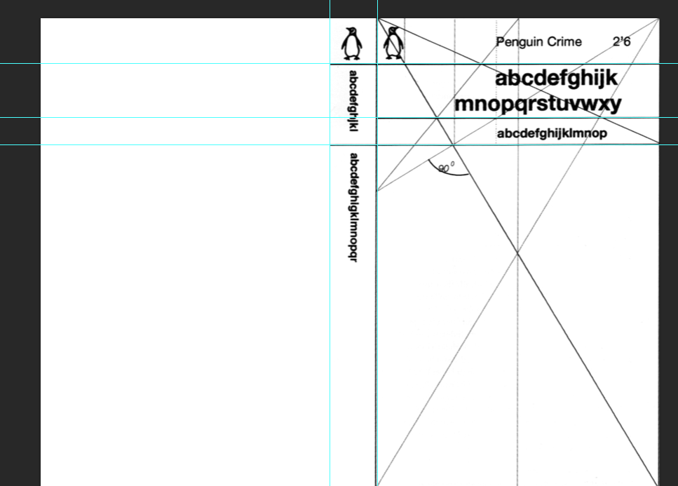
After finalizing my imagery I started with my layout choice. I decided to use the traditional penguin layout the Marber Grid but in my own style. Using this grid will make my book cover proportionally correct.

Using the ruler I added guide lines to create a similar style. For the main title of motivation I used Times New Roman as when researching fonts for book covers I found that using a mix of a serif and sans serif works well and I found out what fonts work well together. It was a more classic typeface and worked well as the title so I decided to stick with this font however the font Helvetica which I originally used for the authors name personally did not fit so I decided to look at other fonts that would fit with my title font.

I then added the penguin logo. I decided to stick with the classic logo as I wanted to keep the book professional and serious and would appeal more to the target audience of adults which I am aiming for as well as with my imagery. However I decided to remove the orange colour and change it to white to keep within my colour scheme.

When looking at other typefaces I decided to choose TW Century for the authors name as this worked better with the title than the other font. I decided to use the same font as the title for the blurb as it worked well with the theme of the book and looked better than the TW Century when I tested it out. I also began creating the spine and decided to put it in the same direction as other spines I have seen as this worked well in the existing book I have looked at and was the most common direction of spine text. I felt this worked well and used a smaller point size of text to keep the eye original on the front page however I still wanted to keep the font large to attract the reader from a distance when the book is on a shelf.

When looking at the piece I decided it needed something to break up the text from the imagery and added 5 point lines along the layout guides on the front and spine which I thought was appropriate in separating the text and worked well visually. However when I looked at the penguin logos I felt that they were disproportionate to the design so I decided to move them to the bottom of the pages/spine using guides to assure they were level.

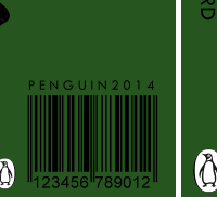
I then decided to add a barcode using penguin 2014 above in the font TW Cen. Using the ‘multiply’ tool I got rid of the white background to keep with the page but not stand out too much as this isn’t an important graphic until the book is brought. I placed it in the bottom left hand corner using my guides to give it a bleed from the spine so it would be easily picked up when brought.


When looking at my design I felt the head needed to face the spine for a better composition. I also added the imagery on the front to the back of the book smaller in size also facing towards the spine to create an even composition that works well on the book attracting the reader inside the book. I also added the penguin logo aligned with the others but in a slightly smaller size fitting next to the barcode.


When printing the piece I noticed the title was too close to the edge and needed more of a bleed so I made the title slightly smaller and moved it central with more of a bleed along the side this looked much better when printed. Above is the final product which I was happy with.