


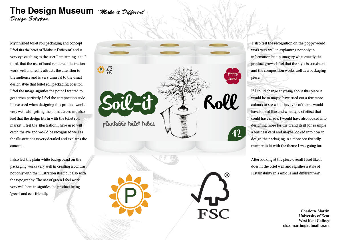

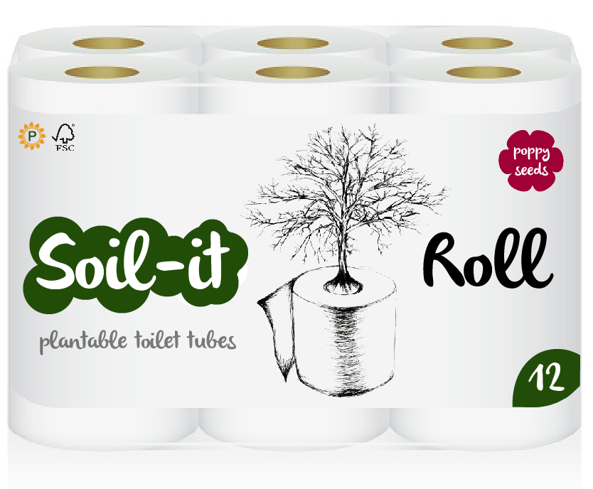
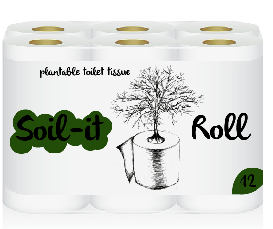
My finished toilet roll packaging and concept I feel fits the brief of ‘Make it Different’ and is very eye catching to the user I am aiming it at. I think that the use of hand rendered illustration work well and really attracts the attention to the audience and is very unusual to the usual design style that toilet roll packaging goes for. I feel the image signifies the point I wanted to get across perfectly. I feel the composition style I have used when designing this product works very well with getting the point across and also feel that the design fits in with the toilet roll market. I feel the illustration I have used will catch the eye and would be recognised well as the illustrations is very detailed and explains the concept. I also feel the plain white background on the packaging works very well in creating a contrast not only with the illustration itself but also with the typography. The use of green I feel work very well here in signifies the product being ‘green’ and eco-friendly. I also feel the recognition on the poppy would work very well in explaining not only in information but in imagery what exactly the product grows. I feel that the style is consistent and the composition works well as a packaging piece.
If I could change anything about this piece it would be to maybe have tried out a few more colours to see what they type of theme would have looked like and what type of effect that could have made. I would have also looked into designing more for the brand itself for example a business card and maybe looked into how to design the packaging in a more eco friendly manner to fit with the theme I was going for.
After looking at the piece overall I feel like it does fit the brief well and signifies a style of sustainability in a unique and different way.
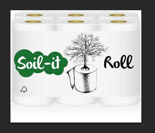
To begin I scanned my illustration in and designed a mock up toilet roll package to work from. I removed the background from my illustration to make it easier to work with. I also played around with layers to make the sketch darker to create a more bold effect on the packaging.

![]()
I began playing around with composition with my illustration and also typography as well as adding the FSC logo. When researching existing toilet paper packaging I found that a lot of the typography used were playful types signifying softness and comfort so I decided on a typeface called Oliver Regular which I felt was most suitable. I also played around with adding colour into the design by putting the leaf behind and playing around with colour. I found the leaf made the text slightly harder to read and the main focus of illustration was being over ridden.
I then decided to try experimenting with the oval tool creating a bubbly comfort shape to signify that just because the toilet roll is eco friendly it is still soft and comfortable.

I then began playing around with different shades of green to see which was suited best. But still thought there was something missing.
From this I decided to play around further with colours and adding more information onto the packaging itself. I added the words ‘plantable toilet tissue’ to make it obvious the the audience what the eco friendly points were which linked to the imagery playing around with composition more.

I found that the information needed to be below the type to create a hierarchy in the information shown on the packaging.

I found that the information was jumping out a bit more than I had liked so then decided to reduce the opacity to create more of an impact of hierarchy.

I found that the text ‘Soil it’ was being hidden in the colour green as well as the number ’12’ in the corner so decided to change the colour to white which I found was more eye-catching and really made it pop out on the packaging.
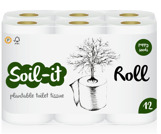
I then added my Plantable Product logo on the packaging which I feel worked well on a small scaled which I had considered when designing it. I also was playing around with adding more information about what this particular style can plant in this instance ‘poppy seeds’. I was playing around with colour of the circles and couldn’t figure out which would work best.
From this I designed a poppy shaped object to signify the poppy as well as the wording, using a pink/red colour which I felt was most suitable. Above is my final design.
I was looking into different logos I could use on my product to show that it is eco friendly and plantable. From this I decided to use the FSC logo and realised that designing a plantable logo would be beneficial to recognising the product globally.
Here is what I came up with.
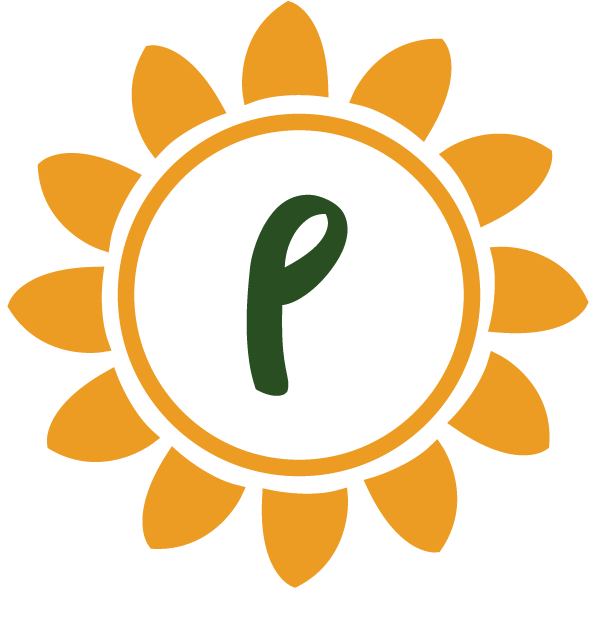
I Decided on a sun idea with a ‘p’ in the middle to show that it is plantable played around with different colours and typefaces and decided that the orange was most eye-catching but still had the elements of green showing it is eco friendly. I will be using this on my product.
I decided to look at ways designers have already gone about designing toilet roll packaging to see what styles of typography is used as well as composition to help with my design.
Here is what I found.
They generally used bubbly typefaces script style or sans serif style fonts which I will use in my final and bold colours. This has also given me an insight for composition and what information needs to be on my packaging.
To name my product I came up with several names which I feel suited the product best. I then decided to carry out a survey to see what people thought suited the product best below are my results.

The most favoured name was ‘Soil-it Roll’ which I will be choosing as the name of my product.
From carrying out my survey I have developed my idea and sketched it out on a larger scale here are my results.
From this I am going to put it into photoshop and increase the darks and lights and add text and information putting it onto the toilet paper packaging.
I decided from my research and idea to sketch out a few initial designs and do a small survey to see which one was most suitable. Below are my results.
The chosen most suitable idea was the 1st design of the toilet paper at the tree. The feedback I received was that it represented the growth from the toilet tube most effective.
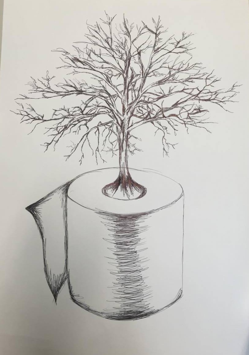
From this I am going to sketch a detailed illustration of the tree coming out of the toilet tube on a much larger scale.
I have decided to look into different possibilities of plants and vegetables that can be used in my design. I going to consider what would work best and what people might benefit most from. After researching I have decided to do different selections in different packs of toilets rolls themselves so when the consumer buys the product they can choose which one they feel would benefit them most or which ones they like best which could be a new advertising technique for the toilet roll industry.
Here are a few examples of possibilities of what we can grow.

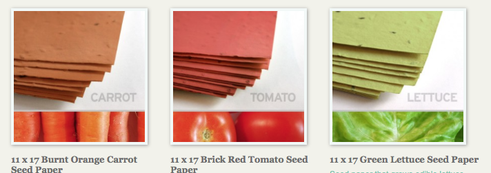


From this I have decided to look into a selection on vegetables, a selection of herbs and finally some general flowers that can be used just for pot planting in the house or in the garden.
Problems I might come across.
I thought about what problems I might come across when using seeded paper inside the toilet roll tube and my first thought was that toilet rolls are generally used in a moist environment typically ‘the bathroom’ and wondered if this would start growing the plant or vegetable when still in use. I looked into how much moisture would be needed and whether this would affect how I design this product but no this would not happen. To grow the seeds inside the card/paper you need a number of things to grow these particular plants or vegetables and a lot more moisture than from steam in a bathroom etc. Although this isn’t a major problem I am going to look into a seal that could possibly be put over it to prevent this from happening at all.
I found this video when looking at how seeded paper/card works. From this I have seen that you can buy pretty flowers to increase the aesthetics of your garden but as well as that you can grow vegetables like carrots. From this I thought of the slogan ‘One mans rubbish is another mans gold’. From this I thought that not only from the tubes can we make environmental issues better but we can also send our rubbish if unwanted to charities that can send them to LED countries so they can grow crops and feed the hungry.
