Evaluation.

Screen Shot 2016-05-25 at 12.50.20

Screen Shot 2016-05-25 at 13.18.39

13288880_10157221352075508_324628952_n

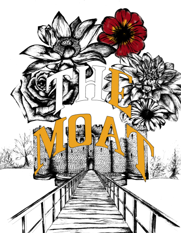
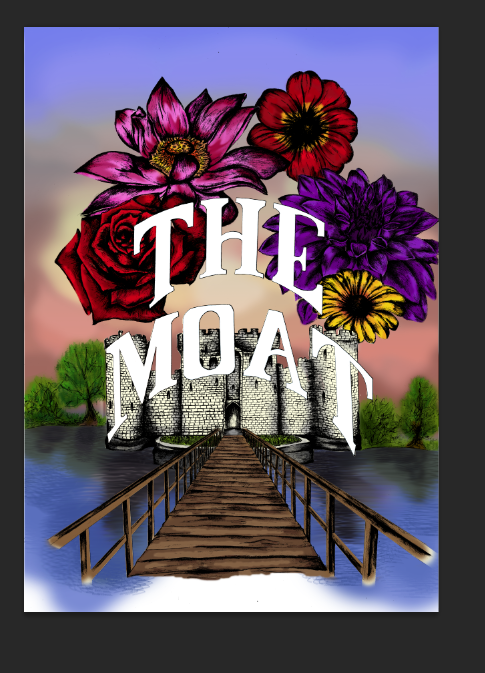
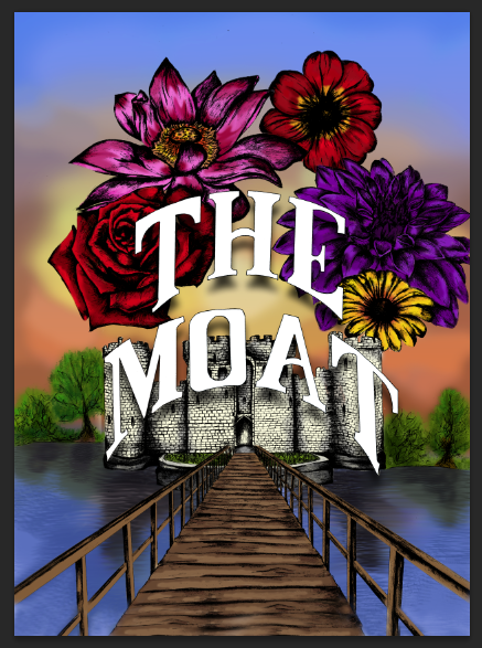
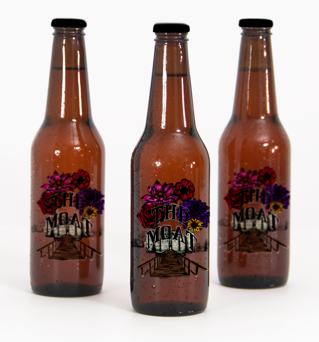
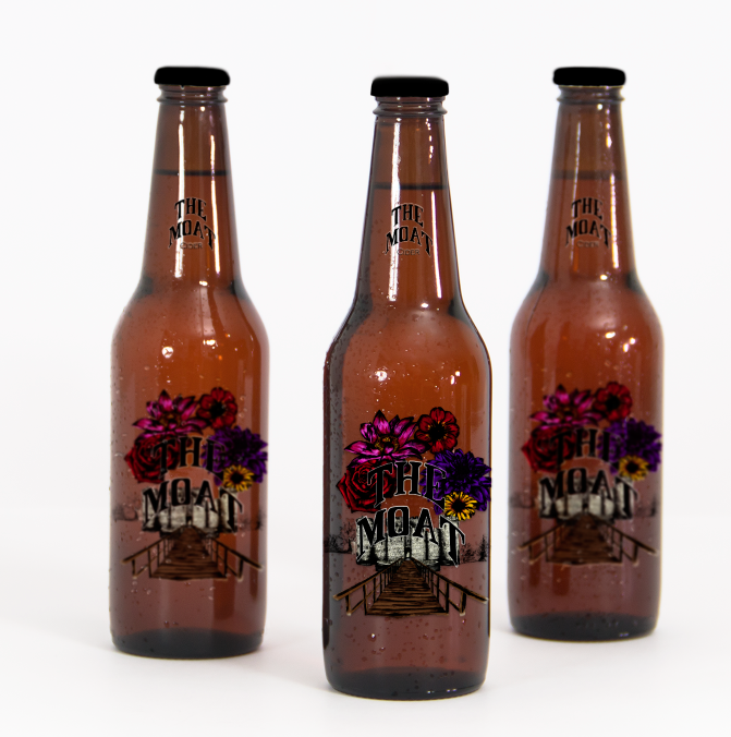
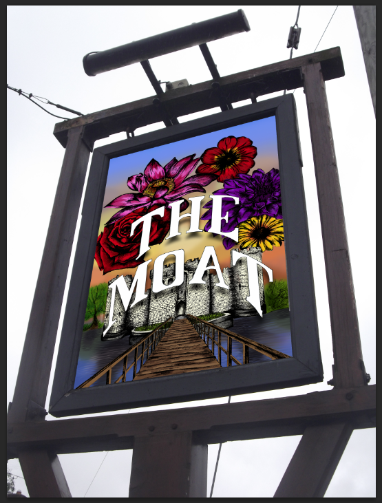
My finished Pub Branding I feel fits the brief and very eye catching to the audience. I think that the use of illustration and digital painting works well and really attracts the attention to each of the 3 outcomes and makes it feel very traditional yet professional but still has the literal side of the moat itself. I also feel for the designs the slight shadowing of the type makes it a bit more interesting and stands out from the imagery well but is still recognisable as the pub name. I feel that each of my designs are clear and are suitable for my target audience which I am aiming at. I feel that the design is very modern style as well as keeping the traditional pub theme itself.

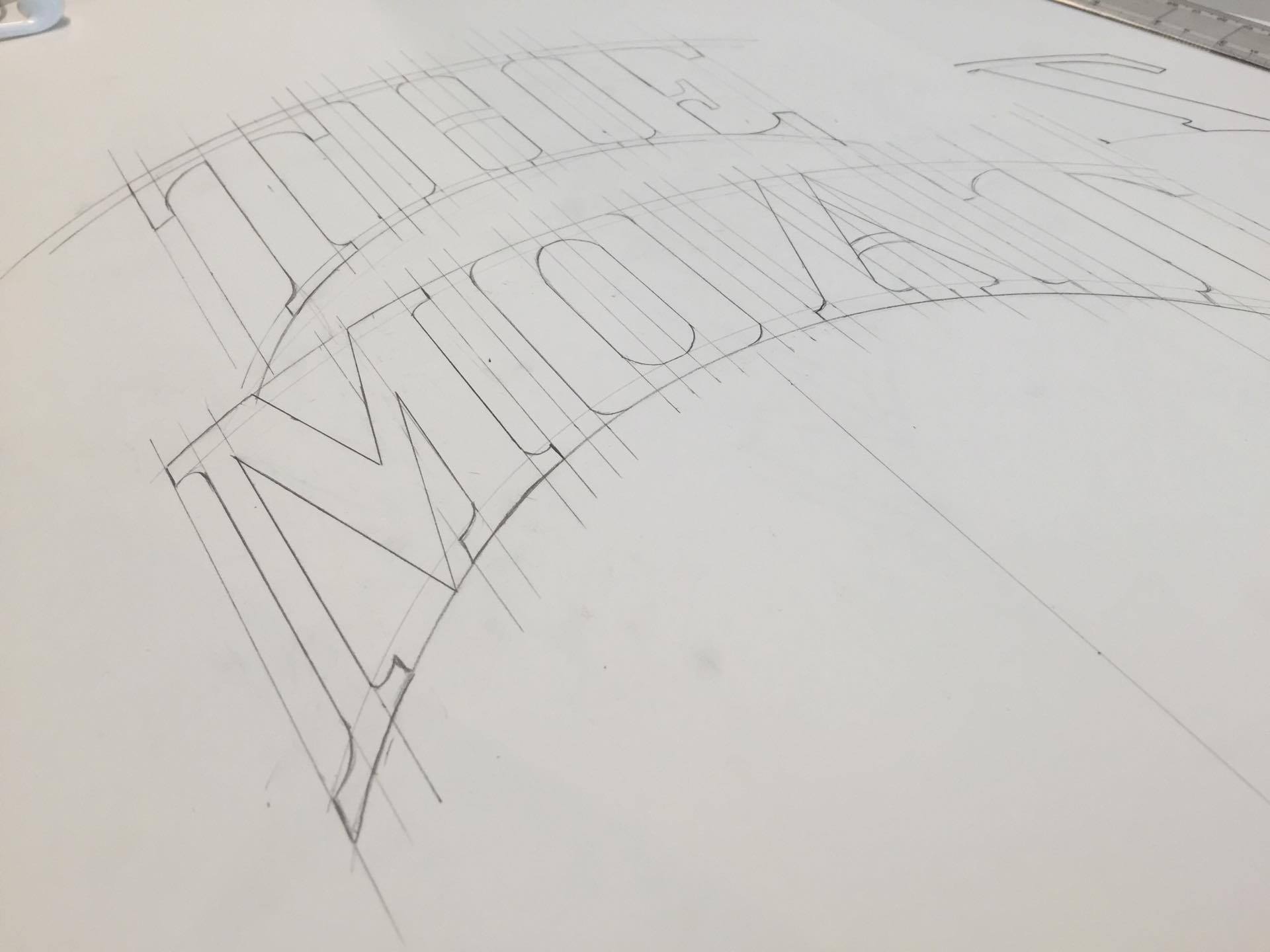
If I could change anything about this piece it would be to maybe have tried out a few different styles of painting and also trying out a few more materials that I researched. The only reason this wasn’t possible was due to cost.

After looking at the piece overall I feel like it does fit the brief well and signifies the traditional yet with a modern feel. Also attracting a more open target audience rather than just the older generation.

Step by Step.

To begin my design I sketched my type using the method I learned from Sean’s workshop. I decided on a traditional looking serif typeface to fit with the traditional countryside feel of the pub itself. During designing this font I was very much inspired by the typographic barges I had researched previously which lead me to this.

12986292_10157064326375508_1083527529_o

13009796_10157064326650508_1737322547_o

After making sure the typography was up to standard I began giving it a solid outline making it possible for me to scan it in to work with it digitally.

bodiam-castle1

Then using this image of sodium castle I began sketching my sign. Using different images below which you will see I have used as references to sketch the flowers.

Scan 1 Scan 2

Scan 4Scan 3


After finishing my detailed sketch I then began scanning it into the computer so I could begin manipulating it and working on it to create a colourful pub sign.

Screen Shot 2016-05-13 at 11.52.45

Screen Shot 2016-05-13 at 11.53.38

During scanning the sketch in I came across many problems with lining up each of the scanned proportions to put it together. I began using tools like the stamp tool to fill in gaps making the image full and my audience not be able to see any imperfections.

65d00016348260466d943b7ecb0806f8

img-thing

pink-water-lily-flowers

Screen Shot 2016-05-13 at 13.00.40

I then began playing around with levels to create a much darker sketch line. Keeping the detail but enabling myself to be able to add colour.

Screen Shot 2016-05-13 at 13.00.46

Using the colour picker I began adding colour to each of the flowers picking from the images above to create a painted look.

Screen Shot 2016-05-18 at 12.07.19

As you can see the painted flowers below gives an interesting effect which makes them come out of the screen more to attract the consumer.

Screen Shot 2016-05-18 at 12.07.25

Unknown

Screen Shot 2016-05-18 at 12.48.27

Screen Shot 2016-05-18 at 12.56.48

i began trying out different styles of painting which some worked well and some did not. I found the trees looked too rounded and the wooden bridge was not bright enough in comparison to the flowers themselves.

Screen Shot 2016-05-20 at 11.03.33

As you can see from the left tree in comparison the right. I have begun using different brush tools to create more of a leaf/bush texture.

Screen Shot 2016-05-20 at 12.28.27

I began using similar tools to create the water texture with the shadows.

Screen Shot 2016-05-20 at 13.28.31

Screen Shot 2016-05-20 at 13.32.20

Screen Shot 2016-05-25 at 12.49.49

Here is my final design.

Screen Shot 2016-05-25 at 12.50.20

Screen Shot 2016-05-25 at 11.37.47

For the bottle I used the design and mocked it up on the beer bottle however I felt this didn’t work and needed to look back into my research.

Unknown-2 geneva-lake-beer-packaging-design-3-540x454

From this I was inspired by these brands that I researched. I feel it has made my design more unique and stands out from the crowd.

Screen Shot 2016-05-25 at 11.47.29

Screen Shot 2016-05-25 at 11.57.56

Here are my final designs.

Screen Shot 2016-05-25 at 12.50.20

Screen Shot 2016-05-25 at 13.18.39

13288880_10157221352075508_324628952_n

Unique styles of beer bottle labels.

I have decided to research unique beer bottle labels to get some inspiration into how to make a beer bottle later stand out from the crown but also be related to the pub and brand itself.

Below are a few examples which have caught my eye which I may interpret into my design.

images-2

Beer-Bottle-Labels-00

geneva-lake-beer-packaging-design-3-540x454

Unknown-2

images-3

Most of these designs which caught my eye are the white print on top of a dark background which I feel work really well to attract the audience. But most importantly I feel having the label being able to be read through the beer bottle is a really unique effect which I would like to interpret into my design.

Stefan Sagmeister – Artist Research

When looking at typography for my outcomes I cam across some of Sagmeister’s typography work which really stood out to me. I like the way he has used different materials to produce typefaces which then have been photographed afterwards. This could be something to experiment with in this project to try different ways of creating type.

‘Stefan Sagmeister, of design firm Sagmeister & Walsh, is a New York based, Austrian graphic designer and typography artist who is very well known for his album cover design and has a reputation for producing really interesting and evocative work. Typography features heavily in his work and he uses a broad range of approaches to achieve his designs.

Alongside his client-based work he conducts personally driven projects such as the ongoing ’20 Things I Have Learned in My Life So Far’ which includes his real-world typographic compositions named ‘Trying to Look Good Limits My Life’. This consists of 5 separate pieces spelling out the words of the sentence using natural and industrial materials arranged in 5 different environments. This maxim is also applied to a leather belt with the words created using punched out holes that also serve as the belt holes. This project represents the dilemma Sagmeister faces in his work whereby he always strives to be nice to people and loves to avoid conflict in life which somewhat relates to a fear of rejection. This, he feels, closes doors and limits what he does.’

Stefan-Sagmeister-Hair-Art

Typography-Art-Stefan-Sagmeister

Unique coaster designs.

I have decided to look into uniques styles of coasters to look into how I can design something unique and eye catching to attract customers to look at it as well as put there drink on it to advertise there new brand of ale.

Here are a few different designs that caught my eye.

coasters

photo_28912_0

CB2-Wax-Seal-Coasters-15-four-unique-modern-nod

 ecede2d9d225ac8de574aaa29fac7538

images-2

I think these different techniques used really catch the audiences eye which I feel would work very well advertising the new brand of ale. These styles really stand out from the usual pub coasters we see on a day to day basis.