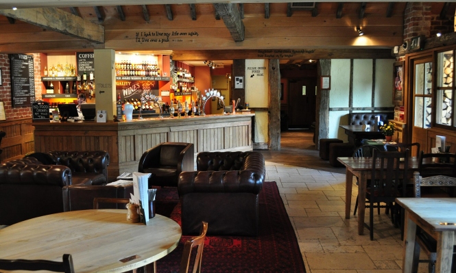
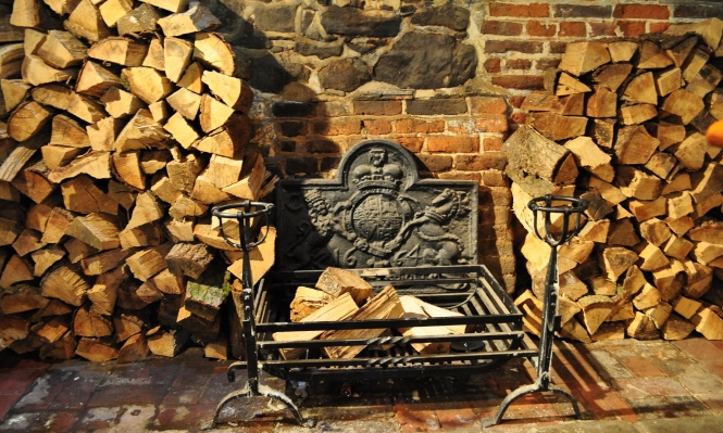
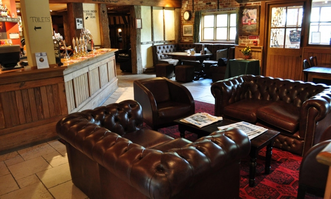
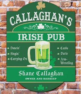
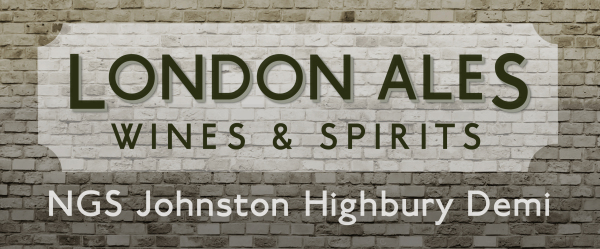
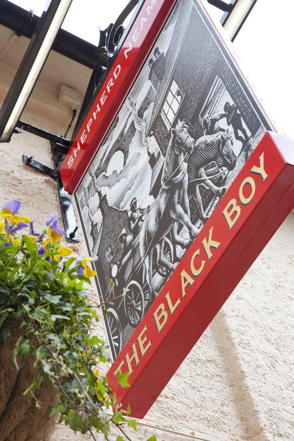
A country pub is currently being refurbished and is looking to get their exterior signage re-designed and their own brand of coasters promoting the refurbishments as well as their up and coming own brand of ale. First thing is first, the country pub want to have their logo freshened up and tweaked with each of the outcomes in obvious relation to one and other. The Pub is called The Moat and they are looking for a completely new logo for their signage, a label for their new brand of Cider and their coasters promoting the refurbished pub. The pub is based in the rural English countryside village of Wrotham, Kent. They are looking for a traditional, classic logo with a vintage, British feel.
Client: The Moat Pub
Product: New pub sign/logo, New Label ‘The Moat ‘Cider’, New Coasters
Job Description: Branding
Date: 24/2/16
What do we want the communication to achieve?
Encourage new customers to the pub whilst advertising their new product. Making sure their cider label stands out on the shelf from the others but is recognizable as cider.
Who are we talking to?
Cider lovers, but trying to attract a variety of consumer as well.
18+
What is the unique selling proposition?
Selling the brand. Promoting that this pub is the place to go to and their Cider is the one to choose.
What evidence is there to support this?
Researching existing beer/cider brands to see what makes them successful and stand out as well as researching country pub design to look into what has made them successful in their pub branding.
Who are the main competitors?
Other country pubs in the areas.
Media Requirements:
Pub Logo/Signage
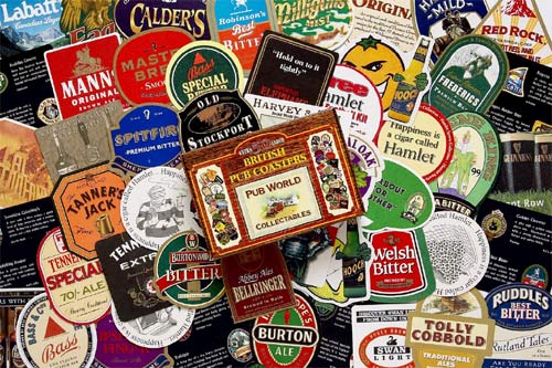
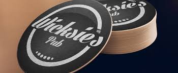
Pub Coasters
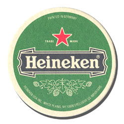
The Moat Beer Label Design