Final Clarendon Typeface Postcard Design.

Final History of Type Drop Cap Post Card Design.


Final Clarendon Typeface Postcard Design.
Final History of Type Drop Cap Post Card Design.
The brief set the blurb to be put on the back of the postcard which I have created a simple design here. I have also included the information compulsory to be put on the back of the postcards.
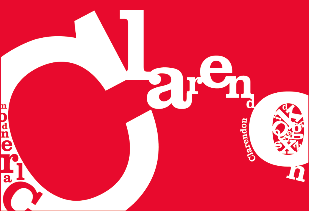
Clarendon Back Post Card Design.
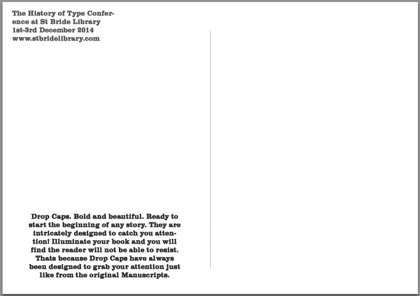
History Of Type Back Postcard Design.
I decided to go for a simple design to create the main focus on the front of the post card itself. I feel like a simple design doesn’t attract attention to anything but the information and the front of the postcard. I decided to used a lighter tone on the information in the top left hand corner to create the first focus on the back to be of the blurb and then the information of the library.
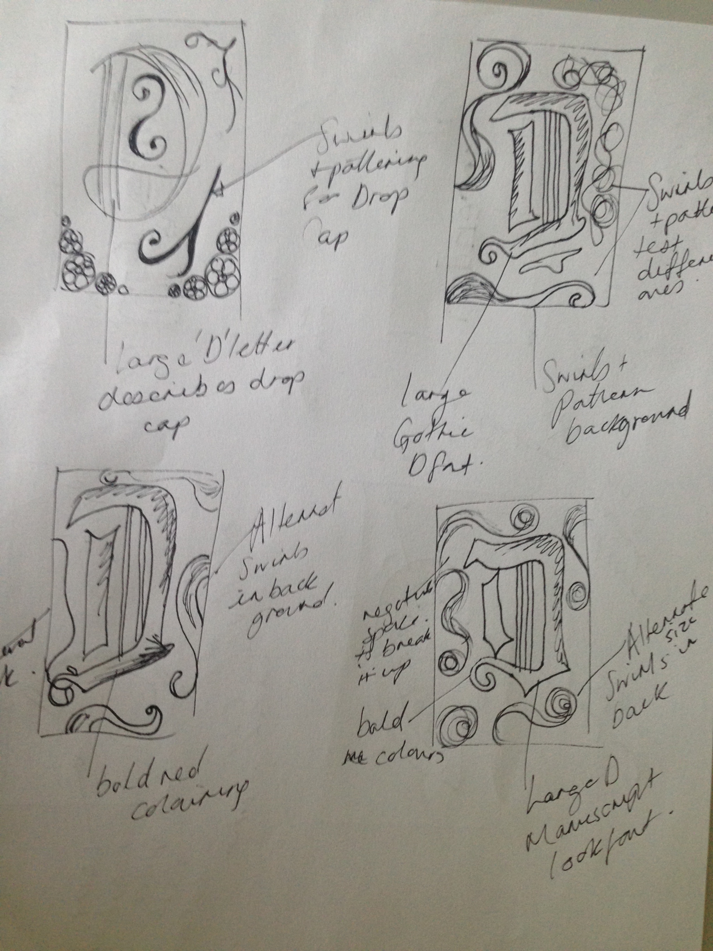
Here are my initials sketches that i did before creating my ideas on illustrator. These sketches just helped me play around with ideas and covert them into one.


The brief shows that I have to create a at least a 50 word blurb for the back design of my postcards so after researching my given font Clarendon and Drop caps I am going to come up with an interesting blurb of information for each post card.
Clarendon Blurb.
Goes by the name of Clarendon. Its designed to catch your ATTENTION! An english slab-serif typeface established by Robert Besley in 1845. It can be used as a striking headline, BIG or small it is just as effective. If your going to use this font be prepared for all the attention you will receive.
History of Type Blurb.
Drop Caps. Bold and beautiful. Ready to start the beginning of any story. They are intricately designed to catch you attention! Illuminate your book and you will find the reader will not be able to resist. Thats because Drop Caps have always been designed to grab your attention just like from the original Manuscripts.
Evaluating the final product.
Allocated ‘Clarendon’ Font Outcome.

My finished Clarendon postcard I feel fits the brief and very eye catching to the audience. I think that the use of positive and negatives work well and really attracts the attention to the font and makes it feel bold and very headline like which the font is used for mostly in design. I also think that the different rotations of the letters create a lot of movement within the piece and would make the audience intrigued to look closer at the smaller lettering.
If I could change anything about this piece it would be to maybe have tried out a few more vintage colours to see what they type of theme would have looked like and what type of effect that could have made. I would have also made the serif on the letter ‘d’ blend more into the letter n as I feel like all of the letter flow very well other than that one as the serif hasn’t been blended.
After looking at the piece overall I feel like although It could be improved it does fit the brief well and is pleasing to the eye so attracts people to the font.
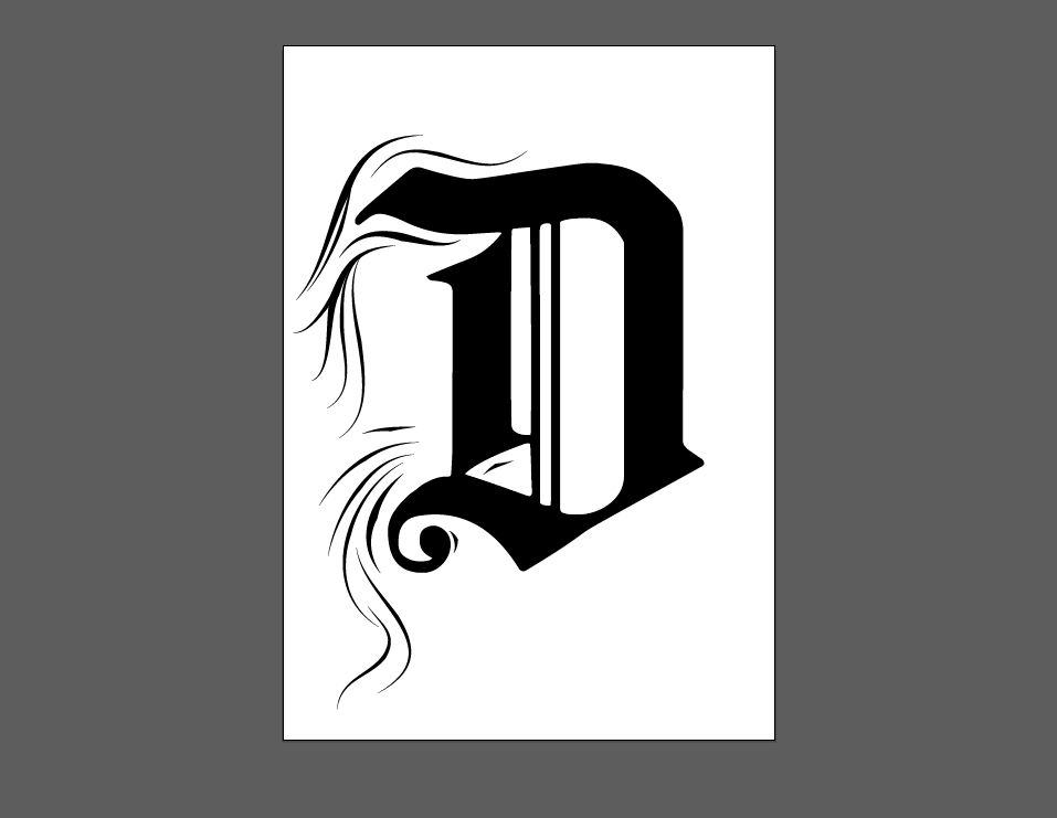
History of Type Outcome.
I think my overall design for my History of Type postcard fits the brief and works very well as a drop cap. I feel like the red colour in the ‘d’ creates a good recognition of the Manuscript illuminations and the font creates a good recognition as the old type used ‘Dearest’ is similar to the Manuscript fonts. I think the swirls and patterning also relate well to the drop caps in Manuscripts for my History of Type postcard.
If I could change anything about this design I would have played around more with involving the background to the main letter. I had done it slightly but not as much as I would have liked. I would have also tried out gold leafing to make it more manuscript like and maybe added more traditional traits to the History of Type theme. I would have also looked at different colour schemes further that were used in manuscripts and incorporated more colours in my design.
Although there are positives and negatives about this piece I fell that it does describe History of Type well and fits the brief perfectly.
I have been looking into the Manuscripts and have been looking at the red illuminations of lettering in the books I found this interesting and have decided to interpret it into my design. I decided to look into this when I was stuck in what colour I should use in my piece. Here are some example I saw from different Manuscripts.

This stood out to me the most with the letter ‘d’ which I have decided to use as my drop cap. The letter has been painted red as an illumination. I feel like it makes the letter pop from the book and really catches the audiences eye with the capital also.

Again only slightly can you see the red in this piece. But how I feel the red works is that is stands out to me even from the imagery itself and I feel like interpreting this colour into my design will create a form of recognition to the Manuscript style and will also be eye catching to the audience itself.
I decided to look at some typefaces to use for my postcard design for my History of type postcard as I would like it to fit the Manuscript theme although I am designing the drop cap in the more modern style. I have looked for a Medieval type of typeface to match this look.


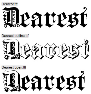
After looking at the fonts and deciding that I am choosing the letter ‘d’ describing drop cap, I have decided on the font ‘Dearest’ as I feel that it is the most manuscript looking. However I am going to alter the letter and remove the patterns that’s are on the letter as I would like to personalise it to my own drop cap look. I will be removing the swirls on the inside of the letter and on the left side, including the swirl that’s separated from the letter at the bottom. I feel like this Medieval look captures the Manuscript look from the book of Kells and History of Type itself.
After looking at different drop caps and looked at my design ideas I have decided on this design as I thought It really describes History of Type perfectly. I had decided on the letter D to stand for ‘drop cap’ as that is what I am designing in a more modern style that is describing an element of History of Type. When trying to created this design I found it very difficult to get the effect I wanted with swirls as you can see below.

I began with trying out different brushes to create a wispy effect which didn’t work the lines were too bold and didn’t create the look that I was looking for so I decided to produce my own brushes in illustrator to try to create the thick to thin effect I was looking for.
Here I had created a range of brushes too try to create different effects. I thought the brushes worked well although there was still something missing so I decided to look at dingbat fonts that had swirls to create the drop cap effect like the ones I had researched.

I then used the fonts and made them into a path so that I could alter and join different ones to create something interesting also adding touches from my brushes to create something more wispy and interesting. I found that the design was too simple and didn’t jump out at me as being an interesting extravagant drop cap. It didn’t show the personality of the letter form which I needed to portray in the post card to make it more recognisable even though I am creating a more modern version.

After deciding that the original design didn’t work I decided to try something a bit different I have incorporated swirls from the typeface () that work very well combined with the old/gothic type letterform that I had chosen to create. I was happy with the touch of the swirls although the shape inside of the letter did not work as well and I found it overcrowding.

I decided to use the same shape as put on the letter but in different sizes and different parts of the swirl itself to create that drop cap look I think this worked well although it needed more relation to the old recognisable drop cap so I have decided to add colour and remove the piece inside of the letter.
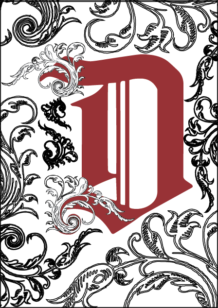
After adding the colour I thought that it did have that recognisable look as the illuminations on the old manuscript drop caps were red. Although I felt that the background was too busy and could loose the focus on the main letter itself.

I decided to try to change the opacity of the background swirls to make the design stand out more and give the letter a bold black outline to pop out to the audience. I thought the opacity worked however was too pale which made the postcard design less interesting and bland.

I then decided to change some of the opacities back to 100% and some of the opacities to a lower percentage 20%. I felt like this worked better and still made the letter stand out as well as the background still being interesting.
Here is the final design. I still felt there was something missing from the design so I had a look at some more drops caps and noticed that the backgrounds were incorporated into the letter used so I decided to incorporate the swirls into the letter using the vector points in illustrator. I think this design fits the brief and is an effective drop cap that describes history of type in my own way.
I have started to play around with different designs after drawing up my initial ideas and chosen and have decided to look at some different ways to make the type more appealing to others.
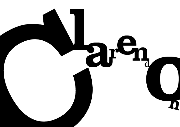
Here i have been looking at how to join the typeface to make the letters flow within the postcard. I have tried to join the serifs using different angles which was inspired by the piece by Daniel Zalewski, after doing this I decided to look at how i can play around with making the typeface a bit more exciting and eye catching.

I tried repeating the word Clarendon for recognition of the typeface using a positive and negative effect as I liked the way the black type on a white background created such a bold effect which again describes the typeface in itself. Although doing this was a good experiment it was too jumbled and busy and distracts the audience with where to look and blends more into the background which didn’t work at all so i decided to try something a bit different.

Here I looked at doing something a bit more subtle but still using the positive against negative effect I got my inspiration from the design by Kevin Gorisnic I looked at before. I felt like this worked well although there was still something missing.
I then decided to add some finishing details. I used the Clarendon font using different sizes and caps/lowercase letters to give the ‘o’ an interesting touch which I was inspired from the design HannahTDesign that I had looked at when looking for something to make the design more interesting to the audience. I also used a curvature in the word clarendon to give the ‘o’ more shape emphasizing the curve giving more movement to the letters. After adding the smaller touches I also decided I needed a change of colour which was inspired by the colourful vintage designs I looked at, so I decided to play around looking at a bright colour which I then decided that bright and playful wasn’t the fonts personality so I decided that I would need to change it.

Here is my final outcome. I decided that black and white was the most effective as I believe it describes the personality of the font with it being quite bold for it as a headline font, but with the difference in sizes of the letters shows that the font can also be effective in smaller sizes as well as big.
The 2 postcards must be A5 in size with a blurb of 50 words on the back with a theme of my give font Clarendon and History of Typography.
14.8 x 21.0cm