
Category: Web/Digital Design
Evaluation.


My finished web design I feel works very well, it fits the brief and in my eye very well proportioned in layout. I think that my use of the minimal black and white colour scheme made the piece work very well and really attracts the attention to the imagery and signifies my workspace as being tidy and my work being professional. I kept my layout simple with the title to begin and then to the imagery and links. I also think that the headers and footers work well in separating the images and text along with the lines I have used consistently in my pages. I feel the layout design is consistent throughout my website. I think the black and white imagery on my home page worked well with my chosen theme keeping it minimalistic to focus on my work itself. I also feel that my design worked well and relates to my inspiration of Sagmiester & Walsh which I researched previously. I feel the navigation is very simple and works very well, I feel that I have designed the webpage well enough to make sure on any screen it will be able to show the website in the way I want it to as well as designing my webpage view on a mobile.
If I could change anything about my page it would be to maybe have tried out a more unique layout and also experimented with colour to see how that would have worked.
After looking at the piece overall I feel it does fit the brief well and is a well proportioned layout design and signifies the point I was trying to getting across of me as a designer.
Coding.
I decided to use some coding in my website to explore different ways of creating a website below is how I did this
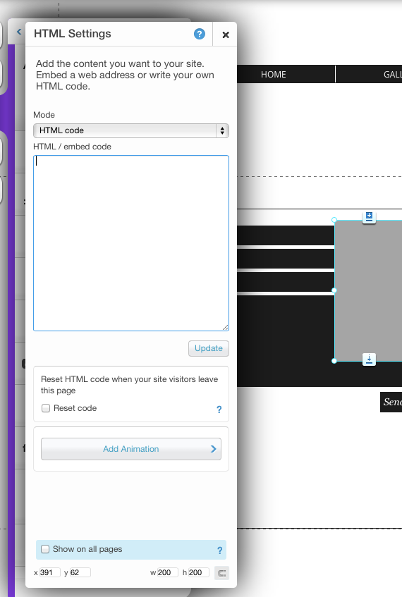
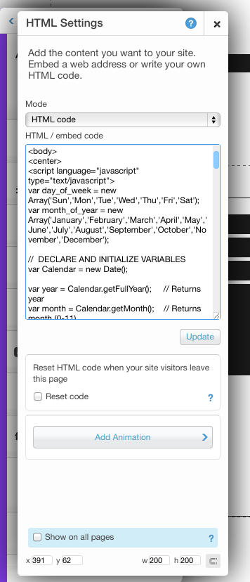
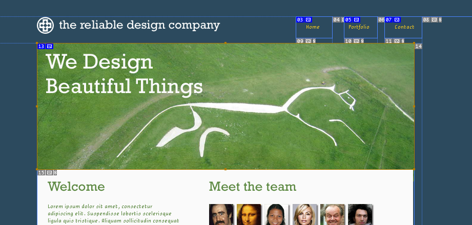
Embed code onto a Wix site with the HTML app.
To embed code: From the left side of the Editor, click the Add icon > click Apps > click HTML.
Click the HTML App to select it > from the pop-up menu, click Settings > under Mode, chooseHTML Code > under HTML/embed code, paste the code > click Update.
For the first few times of trying out coding I had issues with access of coding on the mac because of issues with the college system but when using my own computer it worked perfectly.
When creating my coding I made sure it fit with my colour scheme and theme of my website and then attached it to all of my webpages to make it consistent.

Considering Disabilities.
I have decided to take into consideration disabilities when creating my website to ensure all different type of users can experience my page.
‘People with visual disabilities are individuals who are blind, have low vision, or have colour blindness. People who are blind need text equivalents for the images used on the Web page, because they and their assistive screen reader technology cannot obtain the information from the image. A person who has a visual disability will not find the mouse useful because it requires hand and eye coordination. Instead, this person must navigate the Web page using only the keyboard.
For example, the Tab key is used to move the focus to the item that needs to be selected. A screen reader then announces the item so the user knows where the focus is on the page. The user then presses the Enter key instead of “clicking” the mouse button. Those who have low vision need the assistance of a hardware or software magnifier to enlarge the text beyond simple font enlargement. People who are colour blind or who have low vision benefit from good contrasting colours.
When information is presented by colour alone, a person who is colour blind misses that information. Similarly, if information is presented using any attribute by itself (for example, contrast, depth, size, location, or font), a user who has low vision might not detect the difference.’
From researching this I am going to expand my page so that the visually impaired will be able to know what the imagery is etc.
When you access my webpage with the voiceover on it explains about my webpage. Here are some examples of this in action.

Step by Step.
Here is my step by step of creating my website.
To begin I looked at my initial sketches and decided to try out on photoshop putting my work together to then create an idea of what I would like my website to look like. My main inspiration for this was the Sagmeister&Walsh website so I decided to put the buttons in the middle of the page and keep my logo and colour scheme simple.
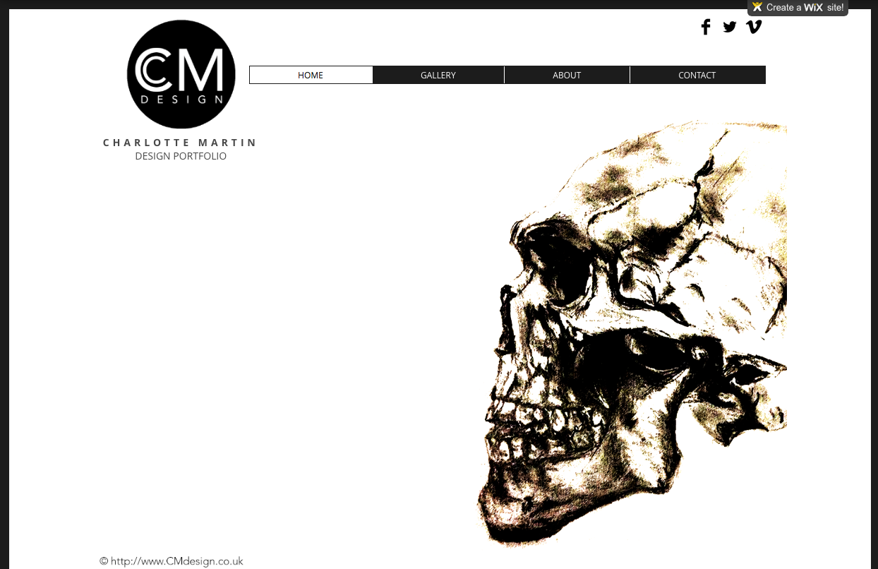
From creating my initial layout on Photoshop I decided to then design my website on Wix and began with a blank canvas. I started adding my logo and decided to add a bit more information below to explain what the webpage is plus my name. I then added a series of buttons in the style I had originally designed on Photoshop. I decided to have my buttons change colour when clicked on on ensure the audience knows what page their on plus what they are hovering over. I then added a simple bar of social networking sites to signify that we are aware of the audiences interests.
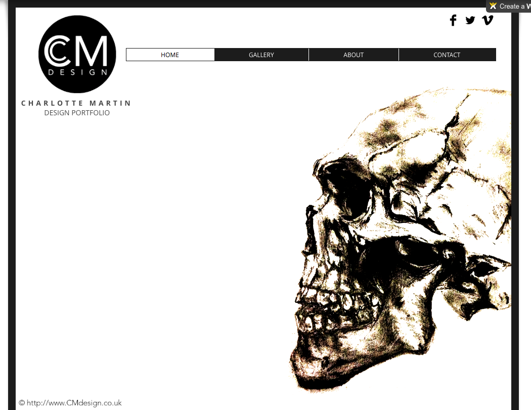
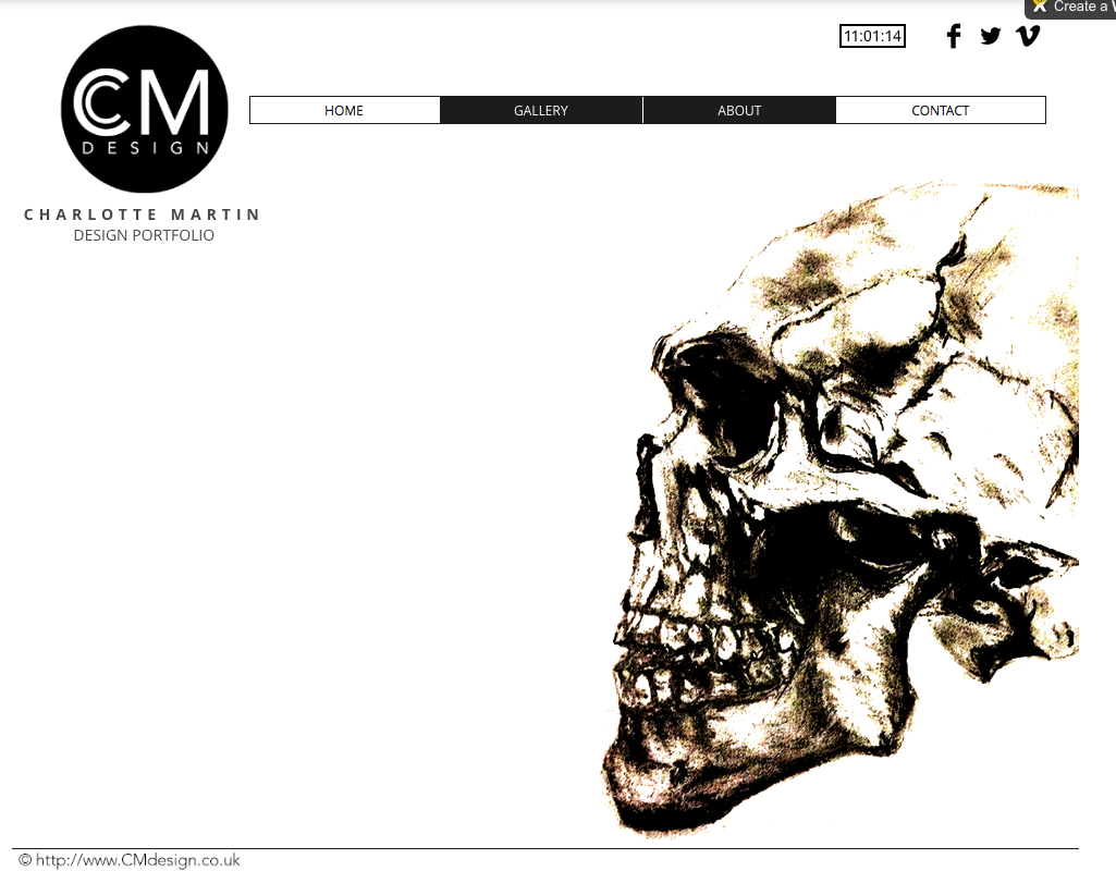
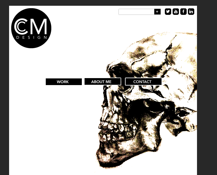
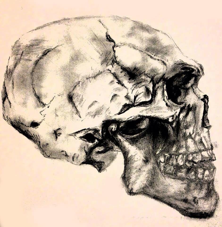
I decided on my skull sketch as my main imagery for the front page to show my skill and attract the audience to looking at my work as illustrating is one of my best skills. I feel the skull worked well also because of the colour scheme in place and wanted this to be consistent. I also tried using a bold outline on my webpage which was again inspired by Sagmiester&Walsh. However when doing this I found that on different sized computer screens it was different in size and certain things could not be seen which didn’t work so I decided to remove it.
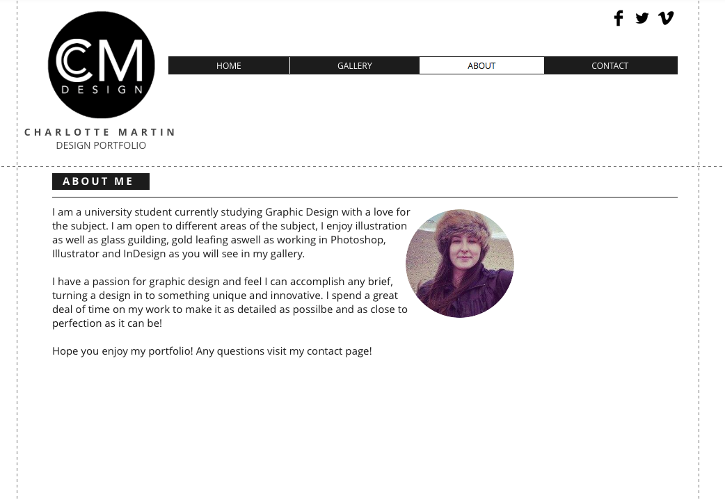
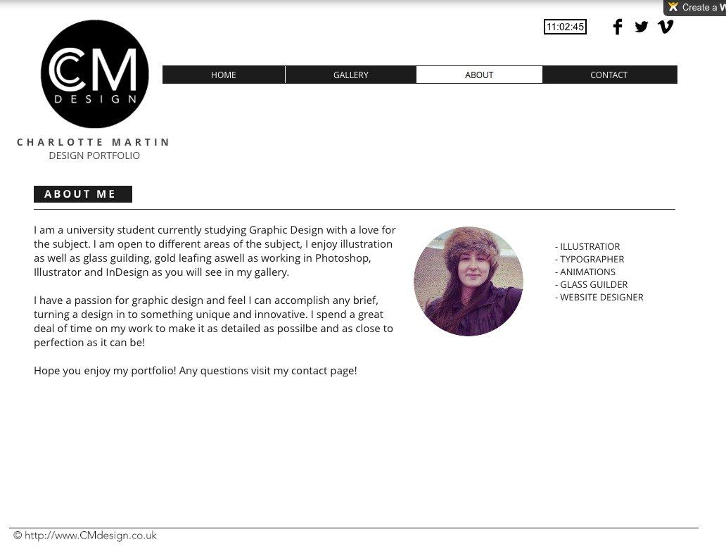
On my ‘About’ page I decided to keep the colour scheme again consistent throughout and again with the page titles in the simple black box. As you can see I have used different versions of the typeface to then show the different heirarchy of text throughout. I decided to add a thin line above the title and the text to create a focus on the imagery and text together to make sure the information doesn’t get too jumbled which I think works well here. i chose to have a circular image to fit with the theme of my page and also to fit with the paragraph of text which I feel brings them together. Still here there was something missing.
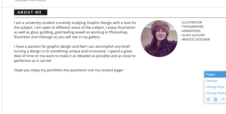

When I found there was something missing I decided to add more text next to the imagery to make the page feel more balanced throughout. I aligned it central with the imagery still making the text aligned up from the paragraph as well.

For my gallery page I decided to play around with different grid layouts for my content, I found many of the different layouts were a bit too much and cut out a lot of the imagery which didn’t work. It was also very jumbled which I didn’t want so I decided on something more simple.
I decided on a simple 4 column grid to keep it simple with about a 5mm gutter throughout to make sure it was balanced. I again have kept with the same title throughout to keep it consistent and am going to add a line again to keep the focus of the work.


I decided to create a darker filter over the images when hovered over to ensure the audience knows they can click on it. It also shows a description and name of each of the pieces.

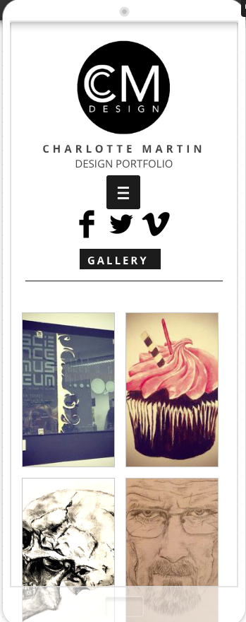
When I was happy with my website I decided to design what it would look like on a mobile device I kept the design the same but mainly all central for the layout to make it easy to read and scroll. Also for the mobile site I decided to use a drop down menu to make it simple and easy to navigate. Here are the finished mobile views.


Website Logo.
To begin I started on designing a logo for my webpage. I sketched out ideas and then began designing on Photoshop.
To begin I came up with this idea which was aligned using the ruler tools however I felt it wasn’t in proportion so then tried to make it larger to fit the circle and visually look balanced.
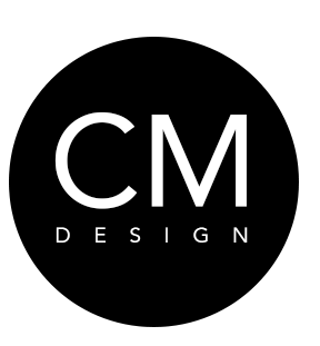
Here is the more balanced looking design with the larger typeface which I feel worked better however I still though there was something missing.

From this I decided to add an oval shape inside the c to make it more visually appealing however I feel that this looked too much like ‘COM’ rather than the initials of CM.
I then added a smaller c shape inside the larger c which i thought made it more visually appealing yet still balanced in the circle. This is my chosen logo.
Typography.
Exploring different typefaces and colours is what I am going to be doing at the moment. I will not be using any more than two different typefaces in my website but I would like to be using a font with a large family so I can consistently use the same typeface with different hierarchy of type using different types e.g.. bold/thin. Overall I will be choosing a font that is easy to read for long amount of text and maybe be more playful with titles and call to actions.
Seravek
Avenir
After looking at the typefaces I have decided to choose Avenir as it has many different families in the font which will show the different hierarchies of the information I will be using. Avenir has a very organic and welcoming feel for a geometric sans-serif which I will use on my webpage.
Initial Sketches.
After looking at existing website I decided to sketch up a few ideas to begin the design process. Here is what I came up with.

I am still unsure of which design to use as I haven’t experimented with which works best so I am now going to begin the design of the website to see which layout is the most effective.
Content for my website.
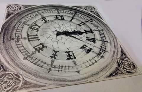
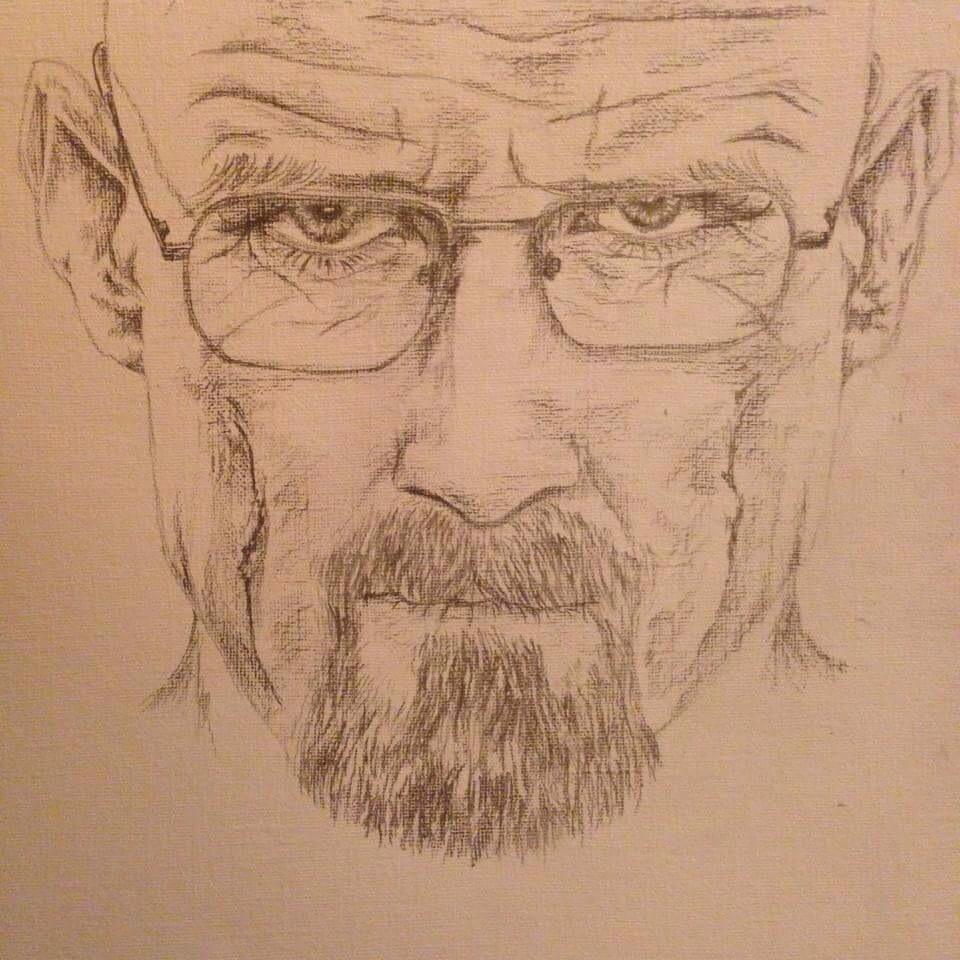
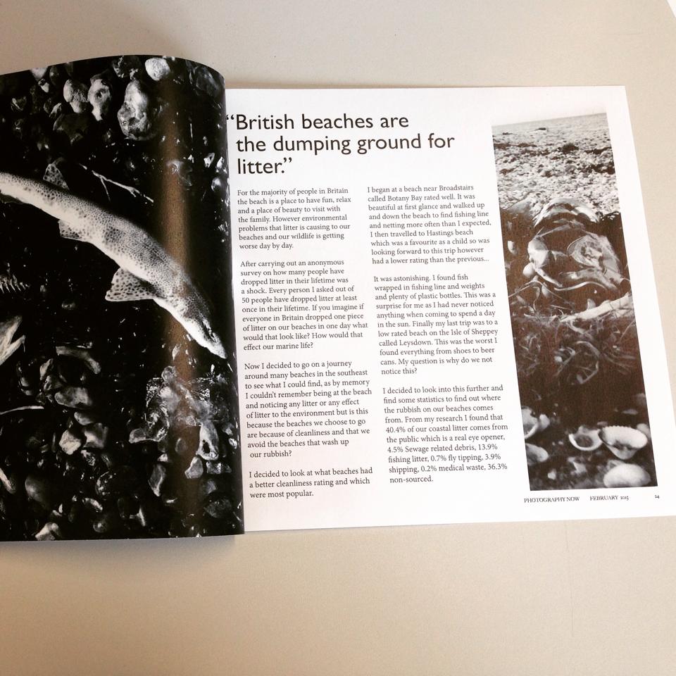
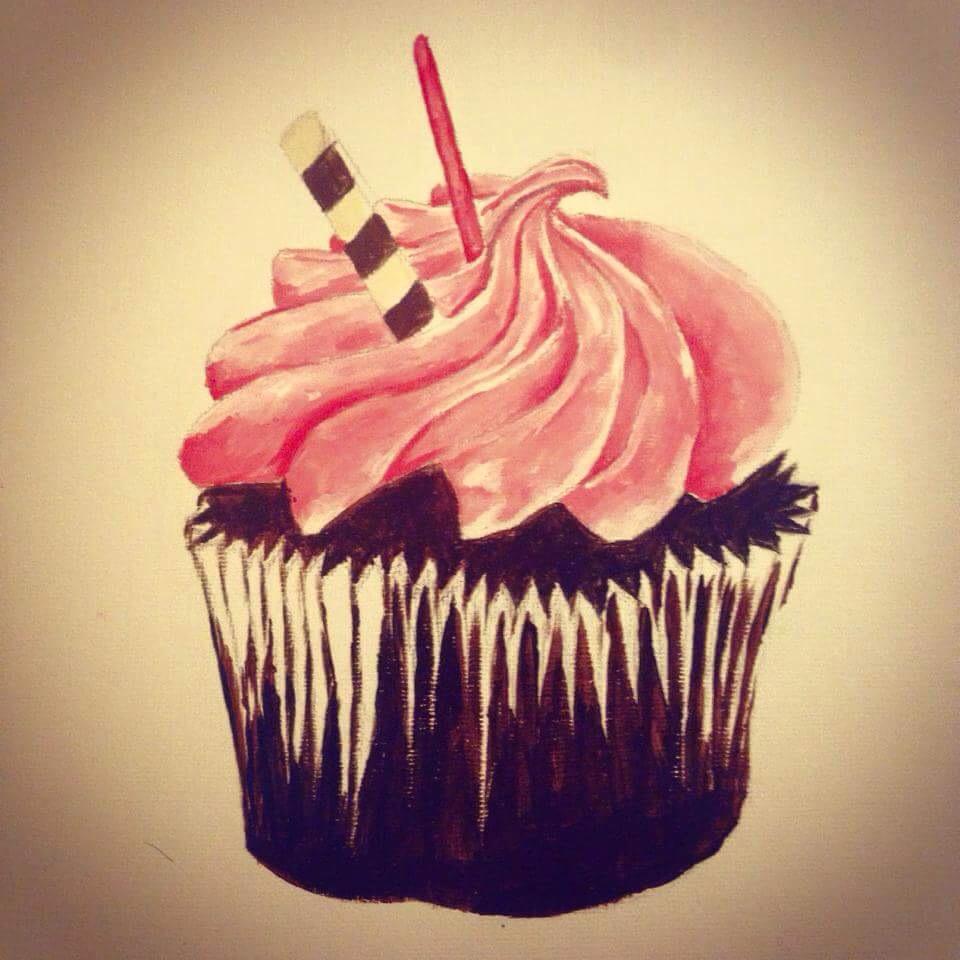
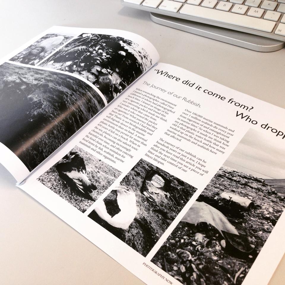
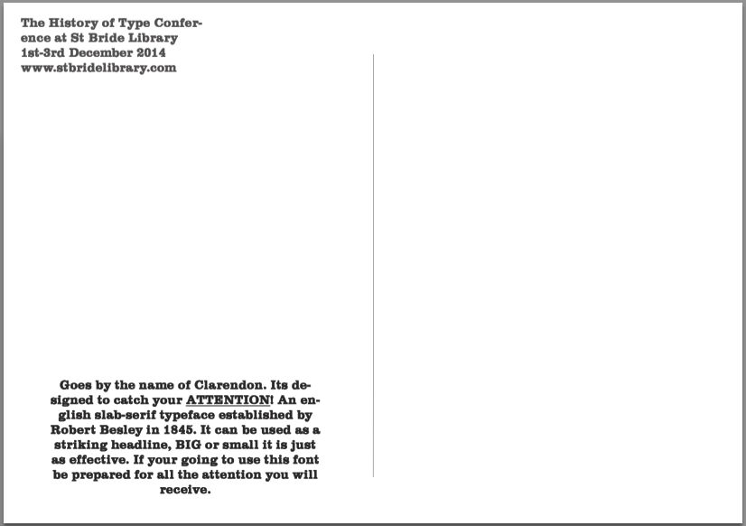
I have been looking through my works and here is some of the content that will be going into my portfolio. There may be editing of these before they go on but this is them previously.


Experimentation with Web Buttons.
Here I looked at ways of creating web buttons on photoshop as I have not done anything like this before so I tried out the slice button to make type into a button. Below are the steps I took to create this.


I selected the box using the slice tool shown above and clicked edit slice options.
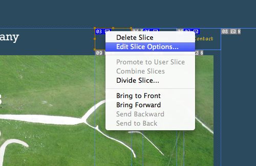

I then changed the name of the the slice and gave the ‘alt tag’ a name.
This could be a possible option when making my website to create linked buttons, it has also given me an insight to how these things work.
 charlottemartindesigns